The upcoming Tokyo 2020 Olympic Games have had a bit of an issue with their logo for the event. Specifically, their original design was plagued by accusations of plagiarism (which we covered in depth last year). Thankfully 2016 is a new beginning and it seems like the team in Tokyo are working on fresh outcomes with 4 new potential logo designs being released this week.


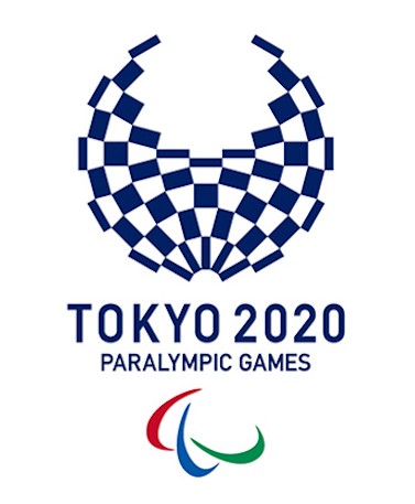
The four new potential Olympic logo designs (along with their Paralympic counterparts) were selected from almost 15,000 submissions by designers worldwide. Each logo meets the challenge of combining the Olympic rings with designs that are quintessentially Japanese and reflect a modern Japan.


The above, for example, drew inspiration from the country's wind and thunder gods as well as from the sporting athletes who will rise to the challenge in 2020.


The next designs are about harmony achieved through shared participation and spectatorship, but still manage to deftly weave the traditional Olympic colours with a modern Japanese sensibility.


And finally a chequered design (based on the "ichimatsu moyo" of the Edo period) manages to be both intrinsically Japanese in its shaping and pattern yet still totally international (with chequered design equivalents being popular overseas as well).
Do you have a favourite? The general public are invited to head to the official 2020 Olympic website to share their thoughts before the end of April 2016. And if you don't have a whole lot to say about these designs, perhaps at least they will inspire you to combine local and international ideas in your next design process!
Blog entry inspired by: http://www.mymodernmet.com/profiles/blogs/tokyo-2020-olympics

