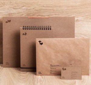
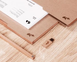
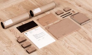
We came across this effort at creating a branding identity for a young team of Russian architects which we thought was rather cool and quite impressive. Using products and branding that goes back in time to a bygone era, the visual image is natural, warm and very inviting.
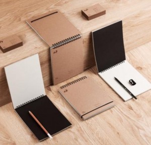
Products made from natural materials with natural colours make up the majority of the merchandise here. Where possible products made from modern materials of plastic and metals were avoided.
The Branding Effort
The branding was created by a designer called Pavel Emelyanov. The logo consists of the first name of each of each partner of the firm which is called KYD Buro. The logo and merchandise is supposed to capture the key identity of the company which is: Unity, Logic, Simplicity and flexibility when it comes to designing architecture. To tie in the logo and the merchandise a website was also created which has an identical look and feel to create a seamless visual transition between their online branding efforts and their offline branding efforts.
Why We Love This Piece of Corporate Branding
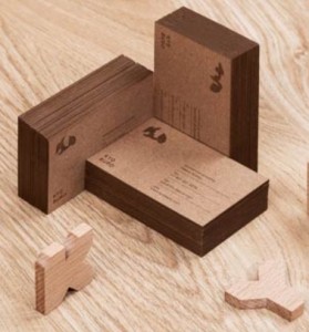
Personally this piece of branding to us is amazing because all these products can conceivably be created during any era in time. The items and branding are retro which means they will not look out of place during the 40's, 60's, 70's, or any other era (with the exception of the promotional flashdrive of course). The branding uses a traditional engraving and screen printing to great effect.
Some of the products used includes: Branded pencils | notebooks | business cards | folders and letter envelopes.
