Nothing is more memorable for a brand than their corporate logo. So when prominent organisations seek to revise the look of their logo, there is a lot on the line. So far in 2017 we've seen some pretty large organisations revise their branding, for better or for worse, and we've checked out 5 of the most memorable (thus far!) this year.
Popular Logo Redesigns for Branding in 2017
5) Mozilla
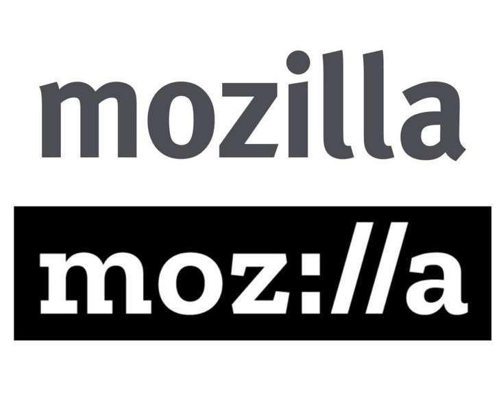
A big redesign we saw in January this year was for open source giant, Mozilla. The team behind the new logo wanted to reflect on the group's past, as well as imply the non-profit's direction in the future. The original logo (top) was little more than simple sans serif text, but the revised logo features an entirely new typeface developed just for the project ("Zilla") and a bold new way of reading the "zill" part of the logo. Does this simple revision for a simple design work for you?
4) Action for Children
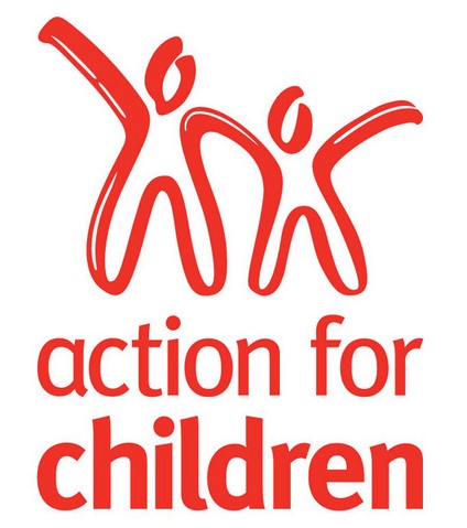
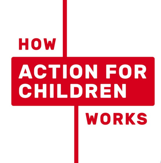
Action for Children is a sizable British charity organisation and their branding has always been a very clear bold red against white. For their 2017 rebrand rather than changing these stable elements, they've opted for a redesign that asks the audience to engage with the brand by questioning "How Action for Children Works". This new logo style is particularly eye-catching on items such as promotional non-woven tote bags, where you can "answer" the question with branding on the alternate side. Pretty cool idea!
3) SXSW
One of the biggest music and film events on the calendar is SXSW (South by Southwest) and every year their branding is a defining element of the interactive event. While the 2016 design was quite busy with several colours and a "cut and paste" look, the 2017 logo rebrand is bold in its simplicity. Swapping colours for black and various fonts for just one clear and bold typeface makes for a big change. This would make their branding a lot cheaper, but does the stripped down look work for you?


2) The Huffington Post
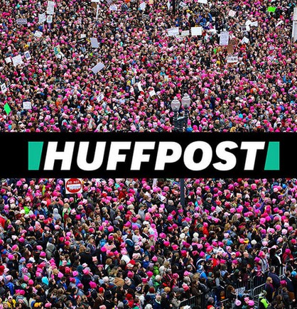
The original Huffington Post logo was very simple and refined, reflecting back on the old school typefaces it sought to emulate. In 2017 the digital news source embraced the future by investing in a bold, modern logo design that is eye-catching without losing the green colour often associated with the site. Some have complained it looks a bit more like a tabloid now (similar to "OK!" magazine) but there can be no arguing that the new logo has certainly gotten people talking.

1) Calvin Klein
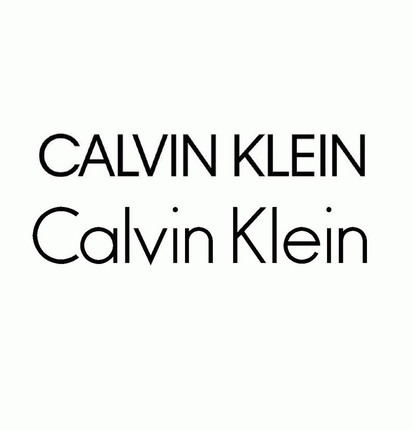
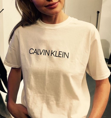
And finally one of the most recognisable logos in fashion has had a do-over with Calvin Klein launching an all-caps logo that does away with the lower case text that made the "C" and "K" stand out in their corporate design. Apparently, the team at CK wanted to go back to the original spirit of the fashion house through the graphic designer, Peter Saville (known for working on Joy Division/New Order's album art and logo designs).
So before you rebrand in 2017, check out the above examples and see how your design measures up. It's important that even if you develop a new logo, that you don't make your brand unrecognisable to your existing market. So allude to the past, but don't forget your logo is going to be on all your promotional products - so look to the future as well!
Logo designs first spotted here: http://www.creativebloq.com/features/the-8-biggest-logo-designs-of-2017-so-far

