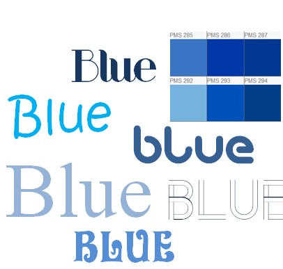
Colour may dramatically change the way we perceive things. Google realised this when it had a $200 million increase in revenue simply by changing the shade of blue colour on its online advertising network. When it comes to designing things like logos and the visual way that internet content looks small changes can and will lead to a dramatically different perception by viewers.

Creative Design Vs Big Data Sampling
Designers love going with current trends to make things look contemporary, clean and modern. At times though the process of making things look good may get in the way of practicality or in this instance by Google it effected revenue.

Dan Cobley the Managing Director of Google in England explains how Google switched the shade of blue on its advertising network on Google mail which lead to an increase of $200 million in revenue. That is a LOT of money. So how exactly did he come to that conclusion and what process was used to determine that indeed the colour blue can make all the difference?
How Did Google Gain $200M by Changing a Shade of Blue?
About 6 to 7 years ago Google started displaying advertising on its immensely popular Gmail email product. As you would know the number of gmail users is absolutely huge! Marissa Meyer who is now the CEO of Yahoo was then in charge of a project in experimenting with the use of colour and how they are perceived by users. In other words Marissa Meyer wanted to encourage people to click through into advertisements which will of course benefit advertisers and Google.
To quote Cobley the CEO of UK Google, he recognised that the links inside Google mail was different to the blue used in the links within Google's main search engine site. Instead of merely just changing the blue to match or to ask a graphic designer to pick a pretty shade of blue, he decided to run experiments. Google used up to 40 different shades of blue and experimented with users to see which one people liked the most and how their online behaviour changed when seeing the blue. This was the result
A) People tended to click a shade of blue that had more shades of purple in it.
B) People clicked less onto a link if the blue had a green colour to it.
Easy Decision on the Colour Blue

The decision was easily made by Google to change the Blue colour to obtain more clicks. As a result given the size of visitors to Google's email program the change resulted in $200 million worth of additional advertising revenue. Now not everyone was happy, in 2009 the top designer of the company called Doug Bowman decided to quit, as he essentially lost creative control towards data driven experiments like this one.
article first seen on: http://www.theguardian.com/technology/2014/feb/05/why-google-engineers-designers

