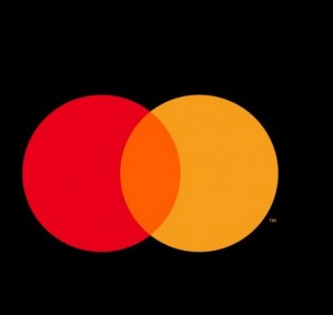
Increasingly we have been fielding requests for promotional merchandise to be branded with no text. In the past, this would have surprised us. Today in 2019? Not so much. There are now so many multi-national brands and organisations that are so familiar, that they need no introduction and need no text. The new Mastercard logo is the latest company to dispense with letters entirely.

Brands That have No Text
There is an increasing trend of brands that have no text on their logo. These brands rely on iconic symbols and colors to serve as visual shorthand for what the company stands for in the minds of consumers. Established companies such as Apple, Nike and McDonalds all use logos purely composed of abstract elements or images - they are instantly recognizable despite being stripped from any literal labels.
As a result, these visuals take up less real estate; allowing a clear recognition even when viewed at very small sizes often used for web and mobile applications. When successful in its design execution, such a logo serves almost like a signature – embodying not only the values of its brand but also the emotions of its patrons.
There was a period in time when text was all the rage. Think Luis Vuitton; the text is the logo. Today though, there are many examples of logos without text. Some famous examples include:
- Nike
- Adidas
- Mcdonalds
- Apple
As of 2019 this year, we can add Mastercard to this list. There is a reason behind this. Aesthetically minimising visual logos makes sense in today's world of reducing visual clutter.
What Does Mastercard Say?
According to the marketing communications officer in Raja Rajamannar, commented that 80% of people recognise the Mastercard symbol already. The text, therefore, is not necessary to identify the brand.
Where will this New Logo be Used?
Locations such as Mastercards websites, any new credit cards, and undoubtedly their marketing as well as promotional merchandise will now feature this simplified logo.
It was not that long ago that Mastercard updated its logo interestingly. It was only in 2016 that a new logo was created to help the brand display itself in both a horizontal and vertical format. The design of both the current 2019 logo and the 2016 logo was by a company called Pentagram.
I am sure that we will be seeing more of this simple two circle (3 colour) logo in event materials and advertising a lot more this year.
Images first seen on the website:
https://www.news.com.au/technology/online/social/mastercard-drops-new-logo-internet-responds-accordingly/news-story/2cc92ed2404c87d01d4c5c536d6eaec1


