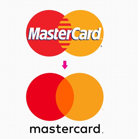
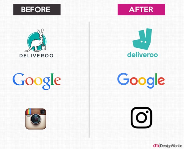
These days, with responsive design on the rise, it's important to look at how your own logo can adapt to change. After all, with apps reigning supreme it's difficult to utilise a complex logo these days. That's why it's great to check out classic brands that have already started to minimise the look of their logo designs.
- Simplify complex logos for effective branding.
- Use simple fonts and limited colours.
- Adapt logo for different sizes and platforms.

Simplified Promotional Logo Graphics
The "less is more" approach to logo design isn't new, in fact, simplicity has been key to the success of most memorable logos over the past 40 years (the Nike swoosh and the partially bitten Apple logo, for example). That's all well and good if your logo is fairly simple from conception, but what can you do if you need to minimise your logo for branding? Turns out that even the most complex designs can be simplified!

Take for example the Heineken logo - and its most cluttered it includes the name of the product as well as a set of leaves, in addition to the red Heineken star. When minimising, you need to eliminate everything except the essentials without losing the spirit of the original. We suggest that you remove excessive outlines or drop shadows from text, streamline the number of colours used and aim for simple, sans serif fonts. What makes the Heineken, Guinness and Kodak logos above work so well is that they can be reduced in complexity right down to one image only (for icons) without losing their link to the original logo.

Another great set of examples is the Walt Disney and Google logos above. They can be reduced to varying degrees without losing any oomph because each still utilises a key element of the original logo. With Disney, it is the highly memorable handwriting of their founder even when reduced to a single letter, you immediately recall their branding. With Google it's less about the font (they've changed theirs quite a bit over the years) and more about the colours. Everyone recognises the blue, red, yellow and green from their logo even when they're shown on a tiny app icon.

So how do you apply this knowledge to your own logo? Note the elements that make it "yours" be they colour, typography, iconography or something else entirely. You then start breaking the logo down in steps per the above - perhaps you could do away with some extra borders or text, maybe only one colour really says "you". From there, simplify and reduce until you achieve the look you want. When your design is streamlined, you'll also find your choice of promotional product branding opens up as well!
Simplifying Your Logo for Promotional Products
Designing a logo is a significant step towards building a brand, and many businesses make the mistake of creating a complex and intricate design that doesn't translate well onto promotional products. Here are some tips on how to simplify your logo for promotional products:
- Use a simple font: Choose a sans-serif font to make your logo more legible when printed at smaller sizes, especially for items like promotional keyrings.
- Limit your colour palette: Stick to no more than three colours to make your design more visually appealing.
- Avoid fine details: Small details may not be visible on promotional products, so keep the design as simple as possible.
- Adapt your logo to different sizes: Your logo must work equally well at any size, from the favicon on your website to the banner on your storefront.
By following these tips, you can ensure that your logo represents your brand accurately and looks great on promotional items, regardless of their size.
Takeaway
In conclusion, when it comes to logo design for branding and promotional products, simplicity is key. By minimising your logo, you can ensure that it adapts well to changes in design trends and looks great on various platforms and sizes. Remember to focus on the essential elements of your logo, use simple fonts, limit your colour palette, and avoid intricate details. By following these tips, your logo will accurately represent your brand and make a lasting impression. Cheers to successful branding!
Responsive logos first spotted here: http://justcreative.com/2017/01/29/the-designers-guide-to-responsive-logos/


