Lego is one of those brands that's been around for so long, and has established itself so well, that it's difficult to imagine a childhood without them. After all, Lego toys are in most Aussie homes and have been for generations. While the Lego brand logo is one of the most recognisable in the world right now, it actually took quite sometime to develop. Check out the unique history of this highly memorable logo below.
Lego's Promotional Branding Over The Years
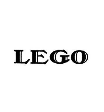
While the above the current Lego logo above is probably the one freshest in our minds there have been a lot of logos come and go for the brand over the years. Interestingly when Lego first started it was a general product company making things such as ladders, chairs and children's wooden toys. The first logo off the block was a simple black text versions developed for the company's naming and formal launch in 1934. The company name LEGO stands for "leg godt," meaning "to play well" in Danish -- though the brand's wooden toys wouldn't feature a logo imprint until 1939, when the yellow/maroon/black logo was introduced as a decal on their products.
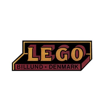
Oddly enough it would take until almost 1950 before the customised Lego-style plastic building bricks we now associate with the brand were launched as "Automatic Binding Bricks". The first red logo below was added to the Lego brick boxes in around 1952, as the bricks began taking on a popularity that outclasssed the company's many other toys and commercial goodies. As the 1950's went on, an oval style logo was introduced that started to show the promise of the more modern Lego designs. This would be the first style of logo using a bold red in the background against the brand name in a playful, outlined font .
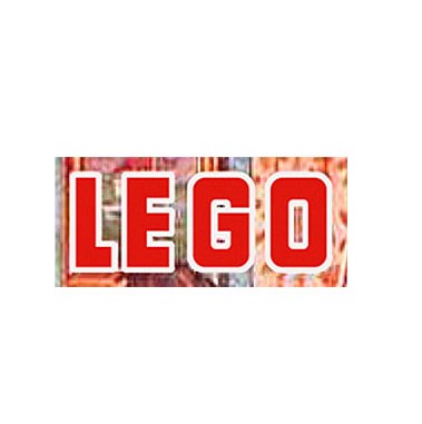
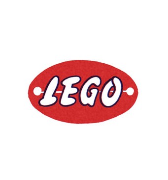
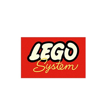
The use of a bright red proved a winner for the company and after the success of the 50's logos they wouldn't reverd to plain blacks or muted colours ever again. Lego, as brand, wanted to promote fun and games -- so their logo began clearly reflecting this in colour and font choice. In the 1960's with the Lego brick "systems" (sets) achieving incredible popularity, a red/yellow/black/white logo was born for the Lego System. This first mix of these colours worked well and the logo wasn't revised again until the 1970's with a brand new logo that looks very similar to the present day one - a classic, fun font with vibrant colours.
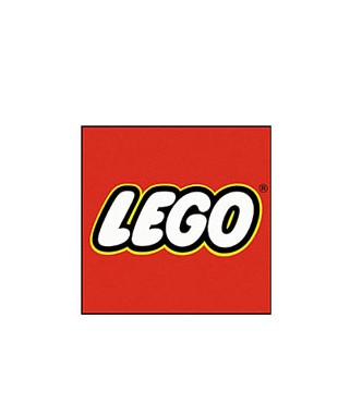
Now we have a slightly adjusted version of the "classic" logo, meaning Lego's branding has been fairly consistent for the past 40-50 years (which in itself is pretty incredible). But until they experimented with their early clunky logo designs, they didn't have a design nearly as memorable as the one they have today. So when you're working on your own branding try out colours and fonts that tie in with your brand message and don't be afraid to experiment. After all, it worked for Lego!
Logo evolution first spotted here: http://www.logodesignlove.com/lego-logo

