We enjoy checking out new logos and corporate rebrands from around the world, but this week's Kickstarter rebrand is of particular note because of how unenthusiastic the design community's response has been! While there's little doubt that the brand's previous logo was a bit stale, the replacement hasn't been met with a lot of joy. We look into why this may be the case below.

Unpopular New Promotional Logo
Kickstarter is a patronage platform which allows the public to participate in funding creative projects, The group had been looking at a debuting a refined new look this week, but thus far the response to the new logo and website scheme has been mediocre at best. 2017 has seen some fantastic promotional logo rebrands, so why is the Kickstarter redesign so unpopular?


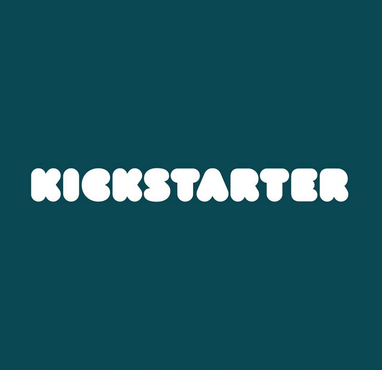
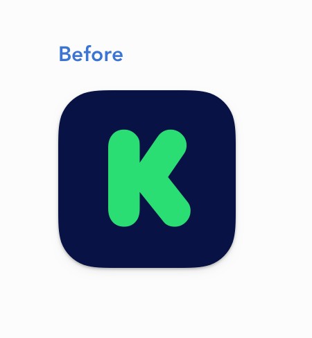
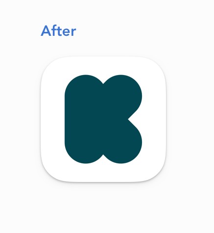
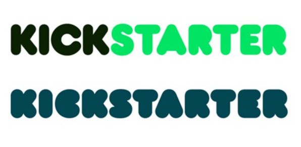
Typography experts and designers alike have cited the new font as being one of the major issues with the Kickstarter rebrand. While the previous logo featured some fairly chunky, bold lettering the new logo is borderline illegible due to how "puffy" and over-styled the letters are. What was once an easy-to-read title and app icon becomes rather difficult to parse, especially for those who have vision impairment or are on a low-scale monitor.

Another complaint is the move back to a simple, single colour for the logo - though this one is a little more on the side of personal preference. Many companies in 2017 have opted to go for single colours over multiple colours in their logos to promote a simple, streamlined and modern look. In addition to the logo rebrand, Kickstarter have also revamped their website with a miniminist design that puts emphasis on the individual projects. When taken as part of this greater move towards simple, easy access perhaps the new logo isn't that bad after all.
An important tip to come from this rebrand for those thinking of revamping their logo in the immediate future is that clarity of design and readability is important to those engaging with your brand. Ensure your text is clear and can be easily understood and you'll be well on your way to a memorable logo design!
Rebrand first spotted here: http://www.creativebloq.com/news/creatives-arent-backing-the-new-kickstarter-logo

