Real Estate Agencies in Australia have on the whole developed a very unique sense of style and many pay very good attention to their corporate branding and their corporate identity. Not surprising after all a typical Real Estate Agency focuses on its need to not only be professional but also to have branding that appeals to their immediate community and relay a sense of trust and continuity.
That is why when I came across the work by Jekin Gala who developed a brand identity and website for CentrePoint Homes that made me especially curious.
Real Estate Agency Brief
The brief provided to the designer was to create a brand that is bolder and has a greater visibility than other real estate agencies. After all I can imagine that virtually all real estate agents have essentially the same core values as one another, the same service and the same type of corporate identity. So making CentrePoint Homes a bolder and having the branding louder than others was definitely a step forward.

The Branding Result
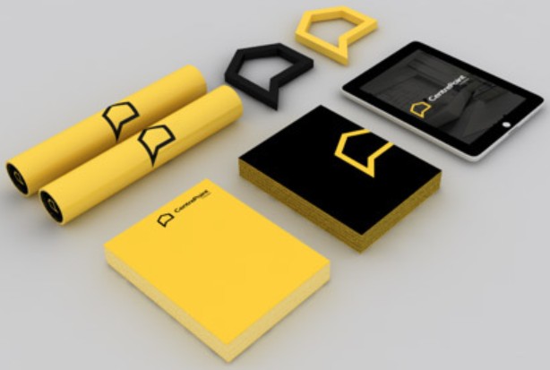
The branding result using Black and its direct contrast colour yellow (after white) was used to good effect. I know colours convey meaning with black symbolizing mystery and formality. The emotive feeling that it conveys is bold, seriousness and luxury. Whilst yellow conveys Joy, life, energy and fresh. Put black and yellow together and you have something quite special indeed. Check out the results of his work here:

Their are a few things that stand out with the design here. Note aspects such as:
1) Solid Deep Black colour tones
2) Bright chirpy yellow orange tones
3) Relatively small branding with a large background area creating an even sharper contrast
4) Flat colour tones only


This design extends further to their tablet application and also their website too.

What I love about this particular branding is that the owners of this agency chose to start fresh and have everything re-created brand new. Nothing about this attempt was half hearted and the owners chose to take a leap of faith and have everything created and completed all at once to have immediate synergy with both their on-line and off-line corporate image efforts.
Check out more detailed pictures on their range of merchandise including:
- Notepads | Pencils | Document tubes | Business cards | Coffee Cups | Sunglasses


Design first seen on website: http://weandthecolor.com/real-estate-branding-jekin-gala/36424

