
Capturing Colour
Last Updated: 17 April 2026
Key Points
- Getting the exact colour right matters—small differences can change how your brand is perceived.
- Tools like colour scanners make it easier to match shades accurately across products and print.
- We recommend sticking closely to your brand colours, and when needed, our team can help match Pantone shades so your merchandise stays consistent.
For those with an eye for design, or fashion, or art, or maybe even just colour, there’s probably been many times in life where you’ve come across a shade or hue that you simply had to have. A cool blue? A vibrant yellow? A brilliant red? Of course, it’s easier said than done when there are just so many shades out there, each with a different name. How are you supposed to get that exact shade of colour?
That exact hue? Are you supposed to memorise it? Hit the colour charts and flip through hundreds of pages? Try to vainly describe the colour to a baffled paint salesman? It’s quite a laborious process. Until now that is.
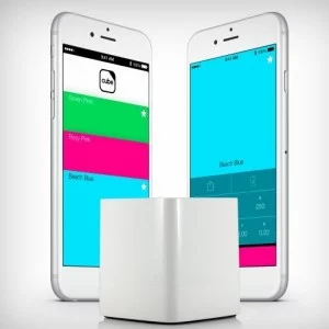
The CKIE Cube is a brilliant little device for aspiring artists and designers. Able to detect colours just by pointing the sensor at it, it then proceeds to send the colour to your smart device, allowing you to build an entire palette of colours.
Just think about it, you walk down the street, see an absolutely amazing colour, decide you need to know what it is, and bam! You can have it. Just bring out the cube and scan the colour, saving it for later use.

You can then use your library of colours to print, customise, and brand anything you could want, with the exact colour you want. Any colour could be instantly matched to the equivalent one on the Pantone Colour Match chart, allowing you to instant brand anything and everything with the colour you want.
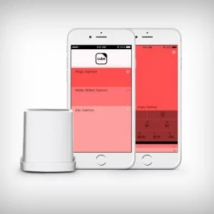
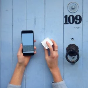
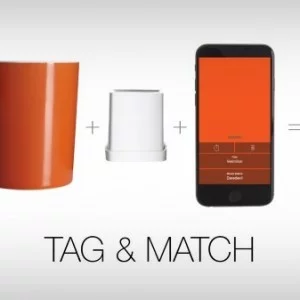
With the CKIE Cube, the possibilities are endless. Imagine being a fashion designer and coming across a breathtaking shade of green on a flower. With a simple scan using the Cube, you can capture that exact hue and incorporate it into your next collection. No more relying on memory or searching through countless swatches to find the right shade.
Even for everyday individuals, the CKIE Cube offers a world of convenience. Let’s say you’re redecorating your living room and stumble upon a unique color scheme in a magazine. Instead of struggling to describe it to a confused paint salesman, you can effortlessly scan the image with the Cube and instantly have the precise colors at your fingertips.
Furthermore, the Cube’s integration with smart devices allows you to build a comprehensive color palette. You can categorize and organize your scanned colors, making it easier than ever to access and utilize them in various creative projects. Whether you’re painting, designing, or branding, the Cube empowers you to achieve the perfect color match with ease.
In addition to personal use, the CKIE Cube has also found its place in the professional world. Graphic designers, marketers, and branding specialists can now ensure consistent color representation across different platforms. By matching colors to the Pantone Colour Match chart, they can seamlessly translate their creative vision into reality, maintaining brand consistency and leaving a lasting impact.
Closing Statement
The CKIE Cube revolutionizes the way we perceive and utilize colors, especially helpul for promotional items. By providing a simple and efficient method to capture and replicate any shade, it empowers individuals and professionals alike to bring their artistic visions to life. Say goodbye to the struggle of finding that perfect color and embrace the endless creative possibilities offered by the CKIE Cube.
First seen on https://www.yankodesign.com/2015/06/17/pantone-pokeball/