The Branding Mistake That Made A Client’s Conference Merchandise Look Cheap
Key Points
- Overcrowded branding can make even high-quality conference merchandise feel cluttered and less professional.
- Clean layouts, smaller logos, consistent colours, and simple branding usually create a more premium look.
- Our account managers recommend focusing on useful, well-presented products instead of trying to place too many logos, slogans, or graphics on every item.
Conference merchandise can heavily influence how attendees perceive an event. When branding becomes overcrowded or inconsistent, even premium products can lose their impact very quickly. In this blog, we cover the branding mistake that caused one client’s conference merchandise to lose its premium appearance, why it happened, and what businesses should focus on instead when preparing conference packs and event giveaways.
The Products Were Actually High Quality
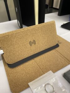
The client selected branded notepads and pens for the conference. The products themselves were excellent choices. The issue came from the branding approach applied across every item. The client wanted a big logo on the items, multiple sponsor marks, event slogan, and QR codes. But the pens have a limited area for printing.
The Merchandise Felt Visually Overcrowded
Instead of feeling premium, the products looked busy. The tote bags became one of the clearest examples. The branding included:
- large front logos,
- multiple colour combinations,
- sponsor logos,
- and heavy text placement.
The final products lost the clean, professional feel the client originally wanted. Ironically, simplifying the branding immediately improved the overall presentation. It’s a good thing that they asked for a pre-production sample of the items they chose from us.
Why Overbranding Weakens Premium Perception
Premium merchandise usually feels balanced and intentional. For example, when you choose a black box and a red ribbon to go along with the gift box. This not only makes the item look consistent. It also feels premium. Regina Mangubat, one of our account managers, noticed that when businesses try to place too much branding on every product, the logos compete for attention, making it look cluttered. You wouldn’t want this, especially if you’re looking to order gifts for VIP clients. Ariane Milarpez, another account manager, recalled that one of her clients requested four logos on the 300 custom polo shirts they ordered. After the mockup arrived, she knew it would look cluttered, so she suggested to her clients to choose only one and put it on the chest (Thankfully, the client agreed!).
Conference Merchandise Needs Different Thinking
Conference attendees interact with products differently compared to expo giveaways. Conference merchandise often sits in:
- keynote sessions,
- boardrooms,
- networking events,
- and client-facing environments.
We’ve supplied merch for companies that sponsored or attended conferences. Their go-to orders are sticky notes, notepads, notebooks, and pens. What one common thing about them is: they specifically requested that the logo print be as small and as minimal as possible.
![]()
Why Collaborative Clients Usually Get Better Results
One thing Shealeigh Keeney, one of our experienced account managers, enjoys most about account management is helping clients turn creative ideas into meaningful brand experiences while keeping the process smooth and collaborative. That collaborative mindset becomes extremely important during conference branding approvals. The best conference merchandise usually comes from:
- refinement,
- editing,
- and thoughtful simplification.
Why Consistency Matters More Than Complexity
Charles Liu, our founder, has attended a lot of conferences around Sydney. And one thing he noticed among the merch he has received during the events was: consistency. The logos were small, but they look consistent. He cannot see even 1 discolouration.
Better Conference Branding Usually Includes
What Attendees Actually Remember
We’ve been to trade shows ourselves, and most of the recipients don’t remember how brilliant your logo placement is. What gets remembered is how useful the products were during that time, how they looked, and if they felt intentional and curated. We had one client who was amazed by the bundle we gave out during an expo we attended last year. It included a drink bottle, a brochure, a pen, and mint tins, all packed in a tote bag.