CMYK vs RGB Branding
Last Updated: 23 April 2026
Key Points
- RGB is for digital use, while CMYK is for print—mixing them can cause colour shifts in final products.
- Printed items often look different from screens due to lighting, materials, and ink processes.
- For consistent branding, PMS (Pantone) colours are preferred across promotional products.
CMYK and RGB are colour systems used for different outputs: RGB is for screens (digital), and CMYK is for printing (physical). If you send RGB artwork to print, your colours can shift because printers convert it into CMYK or another ink system. For the most accurate branding on promotional products, we typically recommend Pantone (PMS) spot colours when possible.
What Makes CMYK Colours Different From RGB Colours?
![]()
![]()
- CMYK (Cyan-Magenta-Yellow-Key) is a subtractive model of colouring which means every time you add a layer of colour; it removes itself from the previously printed colour. Once all colours are removed, you end up with black (also referred to as “key” in this model). CMYK is the ideal method for printing on paper products like business cards because these items tend to have a white base and require various levels of print.
- RGB (Red-Green-Blue) is essentially the opposite of CMYK; it is a model that uses additive colour. So every time you print a layer, that colour adds itself to the previous colours. Once all these colours are added together, they become white. RGB is a natural colour model based on how human eyes perceive colour, and it is the model for colour that we see on our digital devices like TVs and computers.
What Does This Mean For Custom Branding?
First and foremost it means how colours look on our screens (RGB) may not match up with the physically printed object if a CMYK or “process colour” is used without a colour code to base it on. This is because the models display colour differently on a fundamental level, and it is easy to see colours incorrectly on a screen (remember The Dress from 2015?
Was it black and blue or gold and white?) So when printing with CMYK we always will try to confirm the exact colour code for the shade you would like to use, that way there can be no confusion about the anticipated results.
What About PMS Colours?
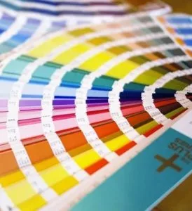
PMS Colours (or Pantone Colours) are our preferred colour model for promotional printing as they are not restricted to use on certain surfaces (like CMYK). PMS colours are each assigned a particular colour code (like “PMS 149”), and you can be certain that if selected, this colour will print to look a certain way on most surfaces.
Quick pick guide: which colour mode should you use?
Use RGB when:
- The design is for websites, email banners, social media, screens
- You need bright, glowing colours that only screens can show
Use CMYK when:
- You’re printing on paper (brochures, flyers, packaging inserts)
- You’re doing full-colour photo printing on paper-based items
Use PMS (Pantone / spot colour) when:
- You want brand consistency across multiple products and materials
- You’re printing logos on merchandise (drink bottles, pens, apparel, bags)
- You want the closest match to a known brand colour
Cubic Promote opts for the Pantone Matching System in all cases that don’t involve printing on paper products (which require CMYK colours). So, if we ask you for your colour code, or offer to match it for you, then know that we are striving to give you the best quality print on your promotional products possible.
CMYK vs RGB vs PMS (Pantone)
| Colour system | Best for | How it works | Strengths | Limitations |
|---|---|---|---|---|
| RGB | Screens (digital) | Light-based (additive) | Bright, vibrant on displays | Not a print standard; converts unpredictably |
| CMYK | Paper printing | Ink-based (subtractive/process) | Great for full-colour images on white paper | Colours can look duller vs screen; varies by stock/press |
| PMS (Pantone) | Brand logos on merchandise | Pre-mixed “spot” ink | Best consistency and matching for brand colours | Not always available for every decoration method; can cost more |
Why your printed colours don’t match your screen
Even with the right colour mode, colours can shift because:
- Screens emit light; prints reflect light (they’ll never look identical)
- Material colour changes ink appearance (white vs kraft vs black items)
- Surface texture scatters ink (woven fabric prints differently to smooth plastic)
- Branding methods matter (screen print vs digital print vs embroidery vs engraving)
- Coated vs uncoated paper affects saturation and sharpness
What File Format We Recommend
To reduce surprises and speed up production, we recommend:
- Vector logo: AI / EPS / PDF (best for crisp branding at any size)
- Your brand colour codes: PMS codes (preferred), or CMYK values for paper
- Do not rely on screenshots or images pulled from websites (often low-res and colour-shifted)
- If you only have PNG/JPG, send the highest resolution available (and expect limitations)
Recommended colour approach by product type
| Product type | Best colour approach | Why |
|---|---|---|
| Business cards/brochures | CMYK | Designed for paper and gradients/photos |
| Customised Stickers/packaging inserts | CMYK (or PMS for solid logos) | Depends on artwork style |
| Branded Pens/bottles / hard goods | PMS when available | Best logo consistency |
| Apparel like printed t-shirts | PMS (screen print) or matched inks | Material and method matter |
| Embroidery | Thread match (not CMYK/RGB) | Threads approximate brand colours |
| Laser engraving | N/A (tone only) | Produces etch/contrast, not colour |
Final Thoughts
CMYK, RGB, and PMS aren’t competing “design choices”—they’re tools for different outputs. If you want the smoothest production process (and the fewest surprises), send a vector logo plus your brand colour codes (ideally PMS). And when colour accuracy really matters, ask for a proof or sample—because the substrate, decoration method, and finish can all influence how your brand colours appear in real life.