Custom Branded AS Colour Caps – Australia’s Wholesale Supplier
Authentic and original AS Colour Caps. We are authourised resellers and offer custom-branded caps that combine premium quality with exceptional value. As Australia’s go-to wholesale supplier of promotional products, we make it easy for businesses of all sizes to access high-quality headwear at prices up to 20 times lower than traditional retail. Whether you’re preparing for a corporate event, outfitting a sports team, or creating custom uniforms, our AS Colour caps provide the perfect solution with fast turnaround times – typically within two weeks. All products delivered with your custom logo. Prices exclude GST.
Filter Products
Hot Sellers
Shop Our Range
Showing 1–24 of 45 results
- Sort by price: low to high
- Sort by price: high to low
- Sort by latest
-

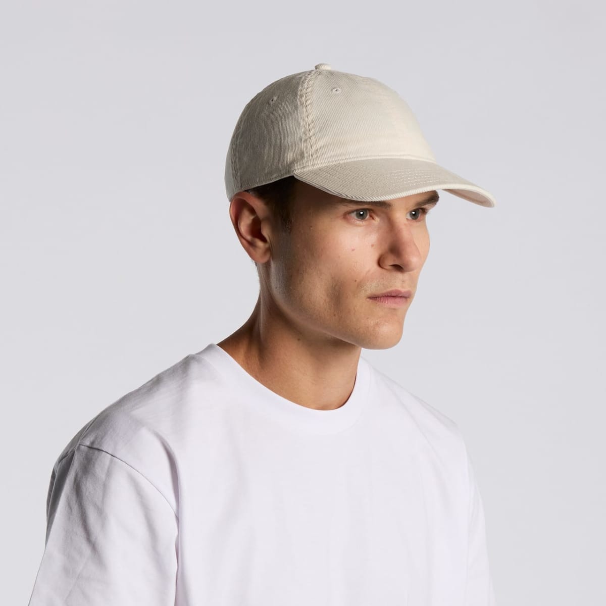
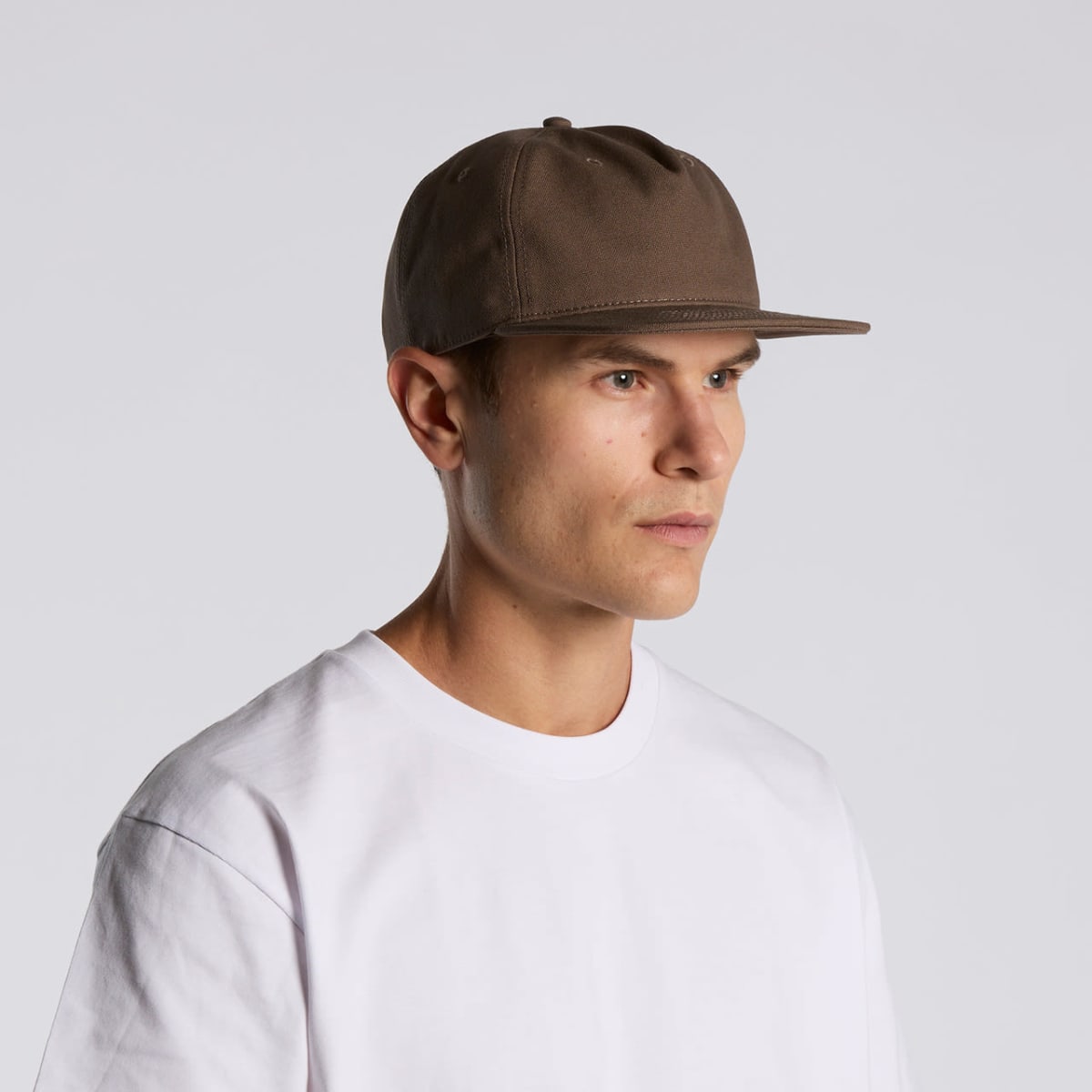
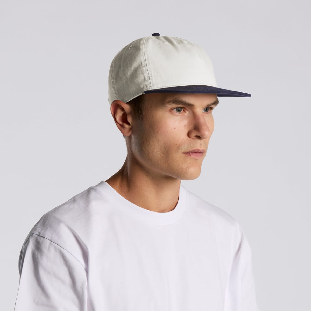
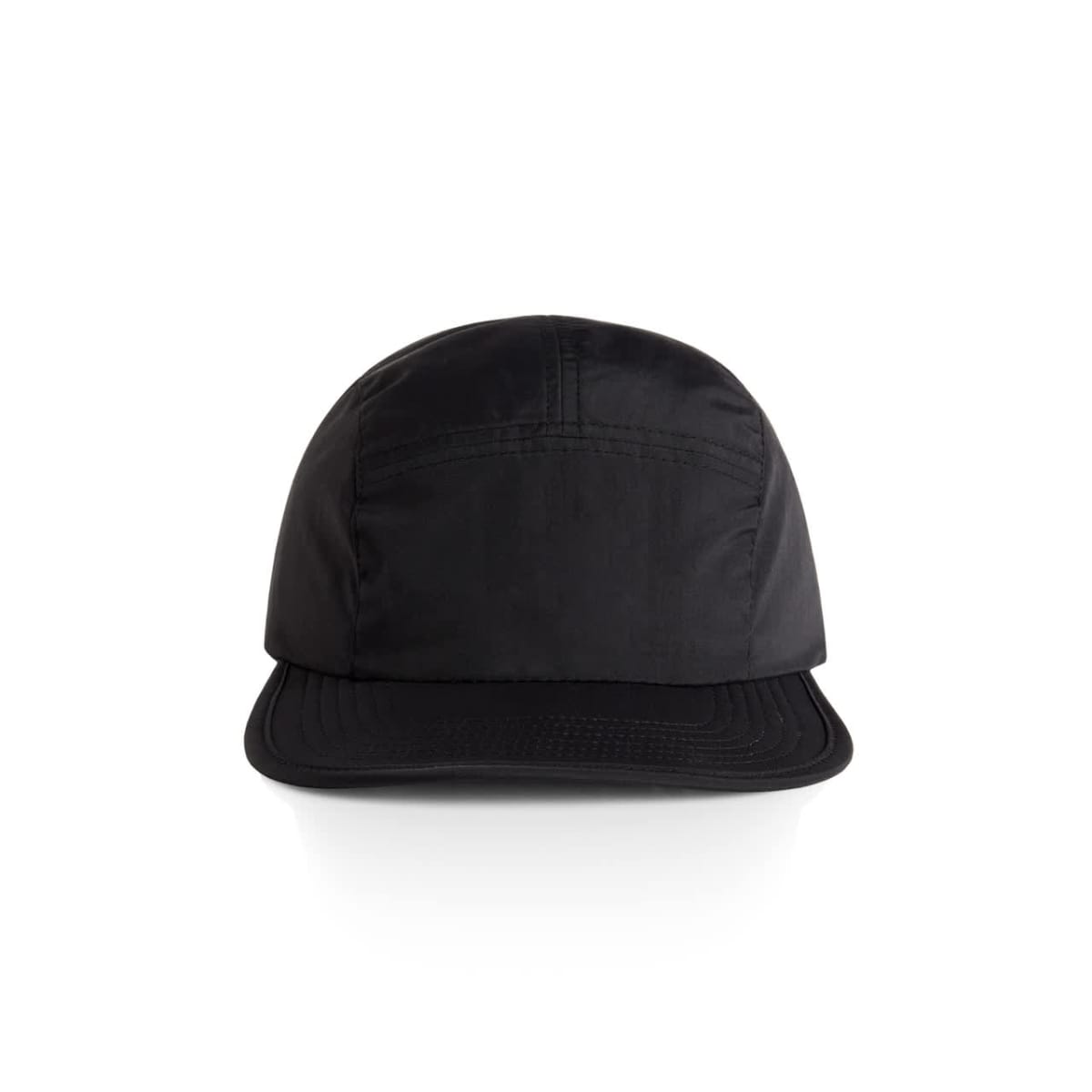
Access Canvas Caps
Prices From $18.24 -
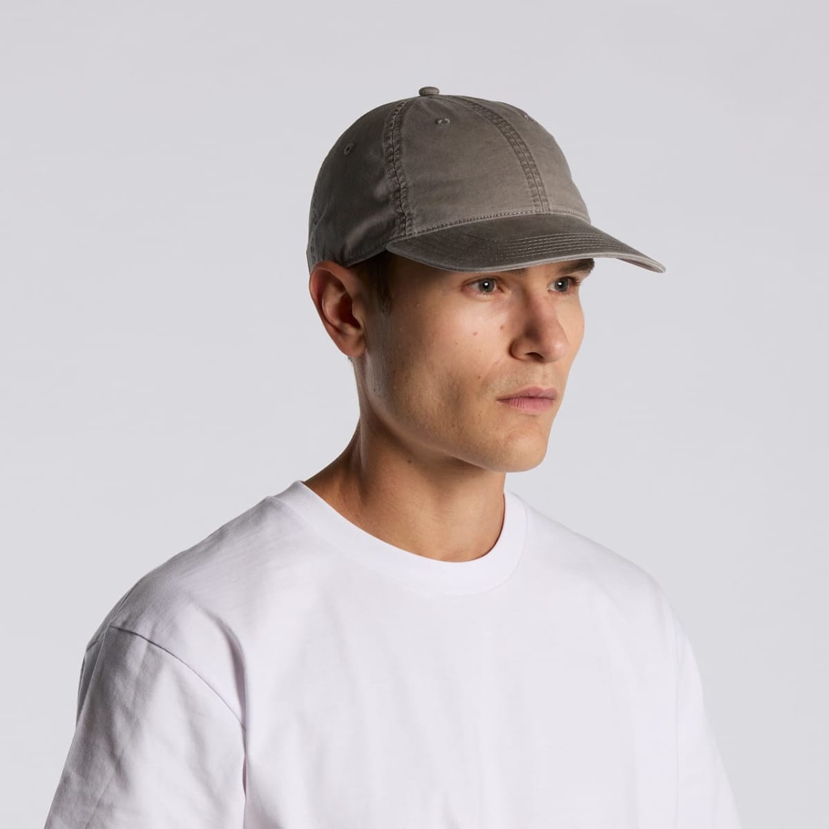
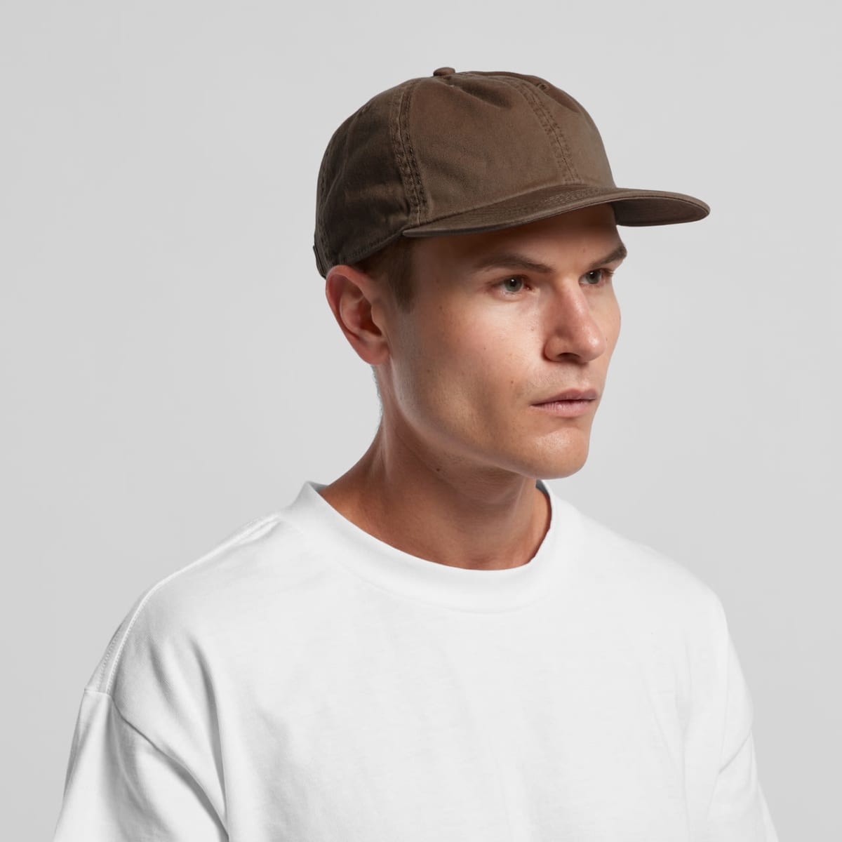
Access Caps
Prices From $18.24 -
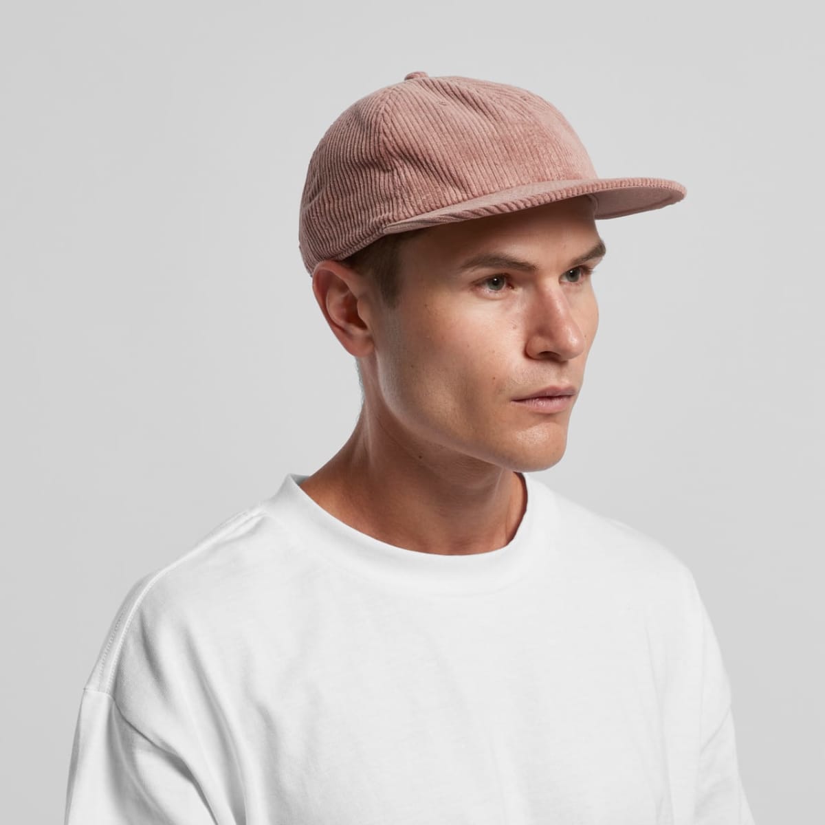
Access Cord Caps
Prices From $18.68 -
Access Faded Caps
Prices From $13.55 -
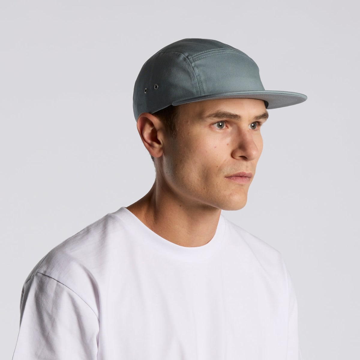
Access Five Panel Caps
Prices From $18.24 -
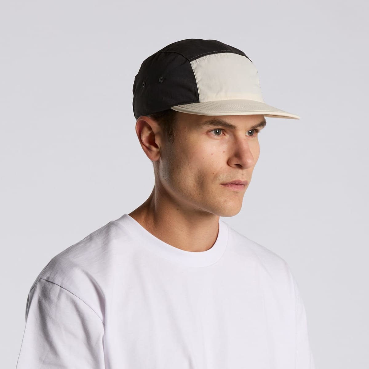
Active Finn Caps
Prices From $18.68 -
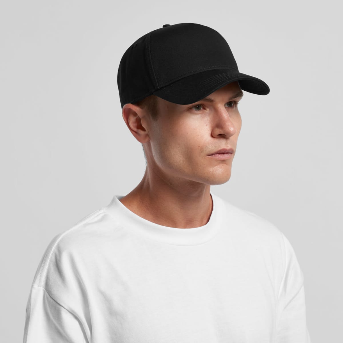
Billy Caps
Prices From $17.95 -
Class Canvas Caps
Prices From $18.68 -
Class Caps
Prices From $18.68 -
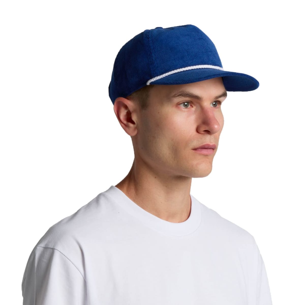
Class Cord Caps
Prices From $19.04 -
Class Cord Rope Caps
Prices From $19.70 -
Class Cord Trucker Caps
Prices From $18.68 -
Class Cord Two-Tone Caps
Prices From $19.04 -
Class Five Panel Caps
Prices From $18.24 -
Class Linen Caps
Prices From $19.41 -
Class Performance Caps
Prices From $18.68 -
Class Two-Tone Caps
Prices From $18.68 -
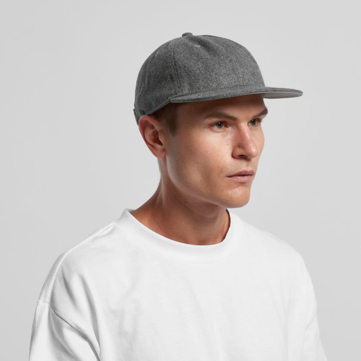
Class Wool Caps
Prices From $19.04 -
Davie Six Panel Caps
Prices From $17.95 -
Finn Five Panel Caps
Prices From $18.24 -
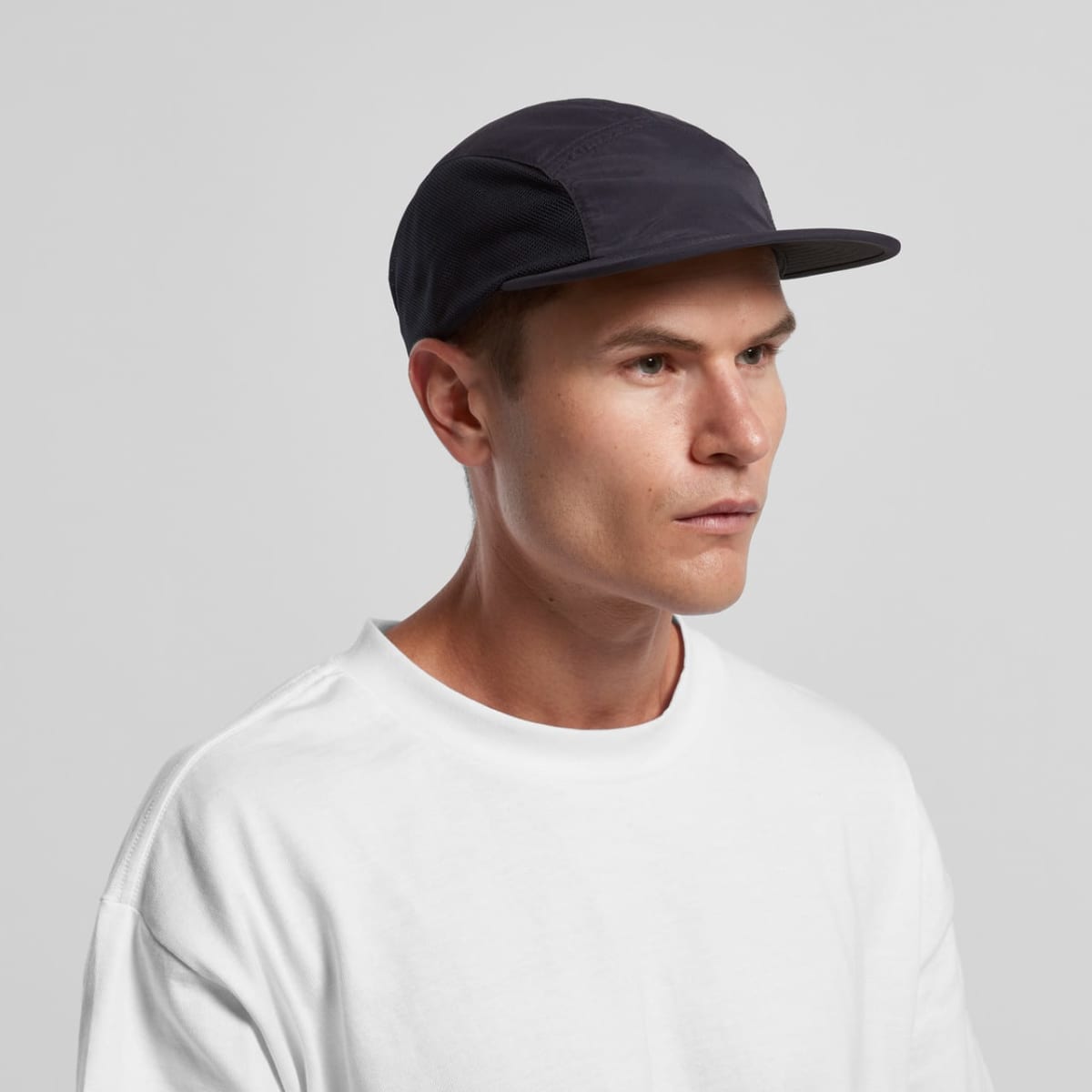
Finn Nylon Caps
Prices From $18.68 -
Finn Two-Tone Nylon Caps
Prices From $18.68 -
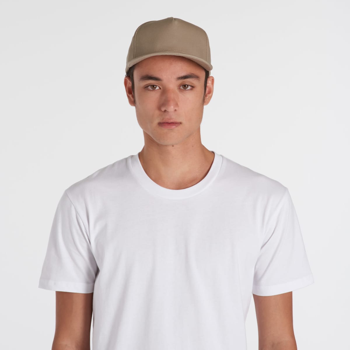
Frame Caps
Prices From $18.24 -
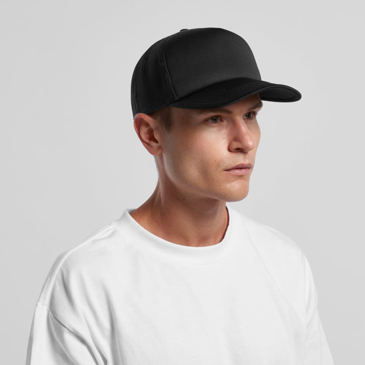
Frame Foam Trucker Caps
Prices From $17.95

Premium AS Colour Caps at Wholesale Prices
AS Colour caps offer the same top-notch quality you’d expect from premium retail brands but at a fraction of the cost. They have durable construction, superior stitching, and a contemporary style. These caps are designed to last through regular wear and washing. The brand stocks an array of colours. These colours allow you to seamlessly match your brand’s identity, making them an ideal choice for any promotional campaign or corporate initiative.
Wholesale pricing ensures businesses across Australia can get the most out of their promotional budget. From large-scale corporate events to employee recognition programs, our AS Colour caps are a cost-effective way to elevate your brand without compromising quality.
Custom Embroidery for a Lasting Impact
What sets our promotional caps apart is our expert custom embroidery. Done in-house, our embroidery provides a professional, long-lasting branding solution. Printed designs can fade or peel over time, which is why we suggest embroidery. With precise thread quality, perfect colour matching, and durable finishes, your brand’s logo will stand out with a raised, textured look that stays sharp even after extensive use.
Embroidery elevates your brand’s presence and communicates quality and attention to detail. It’s a wise, investment-worthy choice that will keep your branding looking fresh and impactful over time.
Versatile Promotional Use All Year Round
Where to use AS Caps? Easy. If you are organising for:
- outdoor events,
- trade shows,
- sporting activities
- corporate events,
Then, you likely will need sun protection and a polished, professional look. They also serve as excellent gifts for employees and clients, helping to foster team unity and brand loyalty. Their practical benefits make them a go-to item for every season, ensuring your brand stays visible regardless of weather or business occasion.
Ideal for Multiple Industries
Whether in construction, professional services, sports, education, or healthcare. These caps can help you build brand recognition, enhance team spirit, and leave a lasting impression. They’re a great fit for everything from executive gifts to large-scale marketing campaigns, offering functionality and style.
Ready to Elevate Your Brand with AS Colour Caps?
Boost your brand visibility with premium AS Colour caps at wholesale prices. At Cubic Promote, we combine high-quality products, fast turnaround times, and expert custom embroidery to deliver top-tier promotional caps that get your brand noticed.
Contact us today at 1300 858 288 or submit an enquiry online to discover how we can elevate your brand with custom embr