Last Updated: 14 April 2026
Key Points
- A strong logo should be simple, recognisable, and work across different sizes and formats, from digital screens to physical products.
- Avoid complex designs and too many colours, as simple logos reproduce better on items like pens, apparel, and bags.
- Our account managers recommend testing logos on real products early to ensure clarity, flexibility, and consistent branding everywhere.
A logo is more than artwork on your website or business card. It’s the visual shortcut to your brand—what people see in a split second and instantly connect with your company, your values, and their experience of you.
In our 19+ years of branding and merchandise work at Cubic Promote, our experts have witnessed the impact of thoughtfully designed logos… and the consequences of not having one. Good logos scale, last, and work everywhere—from your website header to a tiny print on a promotional pen or a large print on a conference bag.
This guide consolidates practical logo tips into one place, allowing you to stress-test your own logo—or brief a designer with confidence.
What Should a Strong Corporate Logo Achieve?
A good logo doesn’t have to literally show what you sell. It does need to:
- Be easy to recognise at a glance
- Work in lots of different formats and sizes
- Stay relevant for years, not months
- Feel aligned with your industry and audience
- Reproduce cleanly on digital, print, and promotional products
Think of it like a flag for your organisation: simple, distinct, and loaded with meaning over time.
Why Simplicity Beats Complexity
Overly detailed logos might look clever in a large mock-up, but they quickly break down in real life—especially on smaller items, or when printed in one colour.
Simple logos:
- It is easier to remember
- Survive resizing better
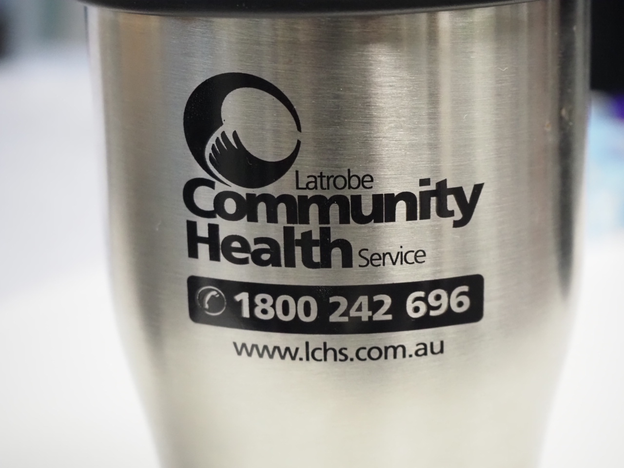
- Reproduce cleanly on everything from email signatures to branded umbrellas
Iconic marks like the Nike swoosh or the McDonald’s arches all lean on simplicity. You don’t need to copy that style, but you do want that level of clarity.
Ask yourself: If I remove the colour and shrink it down, can someone still recognise it?
How to Make Your Logo Memorable
Memorability isn’t about being loud; it’s about being clear and distinct. Ways to build memorability:
- Use a strong, simple shape or symbol
- Limit your colour palette (two or three key colours)
- Avoid generic clip-art icons and overused motifs
- Make sure your mark looks noticeably different to competitors
A memorable logo means even people who aren’t your customers can identify your brand when they see it on a bag, screen, or billboard.
Designing for Longevity, Not Just Trends
A logo redesign every few years is expensive and confusing for your audience. While small refinements over time are normal, a solid core design should last.
To keep your logo timeless:
- Avoid hyper-trendy effects (overdone gradients, gimmicky 3D, filters)
- Focus on clear forms and good proportion
- Use classic, well-structured typography
- Test how it would look 10 years from now in a simpler form
Brands like Coca-Cola and McDonald’s have refreshed details over the decades, but their core shapes and wordmarks have stayed remarkably consistent for a reason.
Why Flexibility Matters Across Media
One of the biggest practical issues we see at Cubic Promote is logos that only work in one very specific format—like a full-colour, horizontal illustration that falls apart on a small promotional item.
Your logo needs to adapt to:
- Websites and apps
- Business cards and letterheads
- Email signatures and presentations
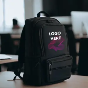
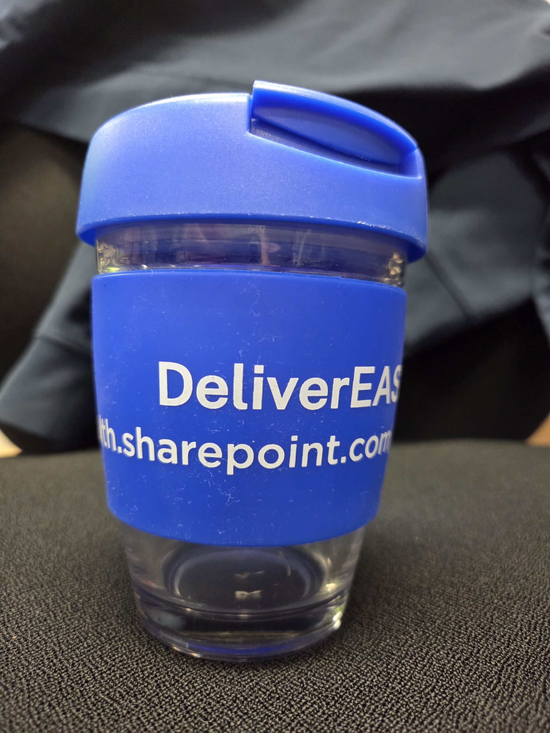
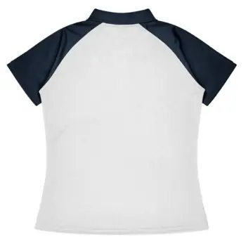
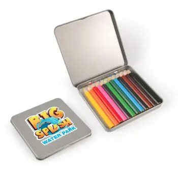
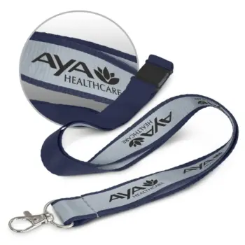
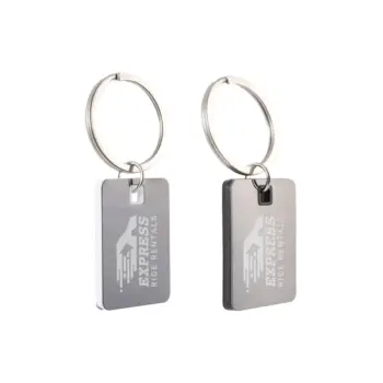
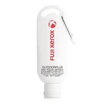
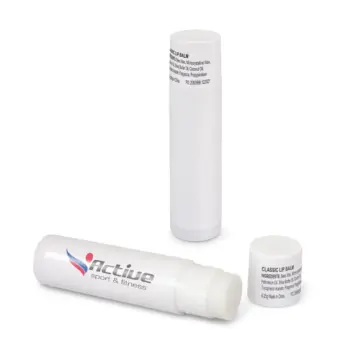
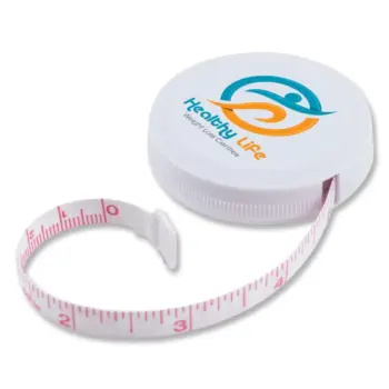
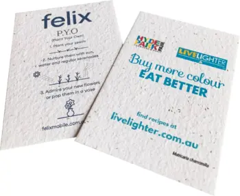
- Promotional products (pens, compendiums, bags, apparel, umbrellas)
- Banners, flags, signage, vehicle graphics
Each of these has different shape constraints, colour limitations, and viewing distances. A flexible logo system gives you options without losing recognisability.
A Quick Logo Flexibility Checklist
Use this table as a fast health check:
| Flexibility Element | What to Have | Why It Matters |
|---|---|---|
| Colour Versions | Full-colour, 1-colour, black, white | Keeps logo usable in any print or digital situation |
| Orientation | Horizontal + stacked/vertical version | Fits narrow headers and tall spaces |
| Scale | Simplified small-size version if needed | Preserves clarity on pens, favicons, tiny prints |
| File Type | Vector master files (AI, EPS, SVG) | Allows clean scaling to any size without quality loss |
| Backgrounds | Approved use on light, dark, and photo backgrounds | Prevents visibility issues in real-world layouts |
Typography: Getting the Text Part Right
Even the most sophisticated symbol can be let down by poor typography. Typography is one of the strongest signals of your brand personality.
Key considerations:
Serif vs Sans Serif
- Serif fonts (with little “feet”) often feel traditional, formal, or established. Great for legal, finance, premium, or heritage brands.
- Sans-serif fonts are clean and modern. Often ideal for tech, startups, education, or contemporary service brands.
Legibility First
- Avoid overly decorative fonts in your main logo text.
- Check readability at small sizes and at a distance.
- Make sure letterforms don’t merge or become ambiguous when scaled down.
Custom or Modified Type
- A custom type treatment can make your logo more distinctive.
- Small tweaks (unique ligatures, modified letters) can be enough.
- Whatever you do, it must remain readable—pretty but illegible is a fail.
Typography should feel like a natural extension of your brand voice: confident, approachable, premium, playful—whatever fits your positioning.
Testing Your Logo in Real-World Scenarios
A logo that looks great on a white slide deck might fall apart on a navy jacket or a textured tote bag. Before you lock anything in, test it:
- On a website header and mobile view
- On a white and a dark background
- On a business card mock-up
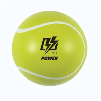
- On a small promo item (like a stress ball or pen)
- On a larger item (like a conference bag or jacket)
At Cubic Promote, our team regularly spots issues at this stage—fine lines disappearing on embroidery, colours clashing on fabric, or taglines too small to read on compact items. Catching that early lets you adjust the design or set specific usage rules.
Common Logo Mistakes to Avoid
Based on years of handling client artwork for thousands of products, our experts see the same issues come up again and again:
- Too much detail: Tiny lines, shadows, or gradients that don’t print well.
- No single-colour option: Making it impossible to brand cost-effectively on some items.
- Low-contrast colours: Logo disappears on certain backgrounds.
- Raster-only files: Sending JPG/PNG only, with no vector master.
- Unclear small-size use: Logos that become blobs on pens, badges, or favicons.
- No guidelines: Different departments/vendors use different colours and placements.
A clear logo system, along with a simple one–to two-page brand guide, will save you money and headaches over time.
How Cubic Promote Can Support Your Logo in the Real World
Because we specialise in branded merchandise, we see how logos behave on real objects every day—from tiny USBs to full-size outdoor banners. That perspective is very different from designing purely for screens.
Our team can:
- Review your logo for print and promo suitability
- Suggest tweaks or alternate versions for small items
- Explain which branding methods work best (embroidery vs print vs engraving)
- Provide mock-ups of real products so you can see how everything comes together
Suppose you’re still working on your logo. In that case, we can also provide you with a checklist to hand to your designer, so they can incorporate flexibility and usability from the start—rather than retrofitting it later.
Bringing It All Together
An effective corporate logo doesn’t have to be complicated—but it does have to be considered. When you:
- Keep the design simple and memorable
- Aim for timeless, not trendy
- Built in flexibility for different sizes, colours, and orientations
- Choose typography that reflects your brand and stays legible
- Test across real-world applications, especially promotional products
If you’d like a sanity check on how your current logo will perform on branded merchandise—or you’re planning a refresh and want to avoid common pitfalls—our experts at Cubic Promote are happy to help.


