
The Printing Issue Our Team Keeps Seeing on Dark-Coloured T-Shirts
Key Points
- White logos and small details often appear duller on black shirts because dark fabrics print differently than lighter apparel.
- Black shirts still dominate trade shows because they look professional, hide marks better, and suit most branding styles.
- Our team usually recommends bolder artwork, thicker fonts, and print samples before producing large dark-shirt apparel orders.
One of the most ordered colours, especially for brands looking for staff uniforms for events, is black. While others go for navy, charcoal, or dark green. It’s because dark colours look sleek and professional. However, our team often sees a main printing issue with darker shirts: logos sometimes look less sharp or vibrant after printing than clients expect. In this blog, we discuss issues we see on dark-coloured t- shirts and how we help brands avoid them.
White Logos Often Print Differently on Dark Shirts

Many buyers do not realise that white ink prints differently on black or dark-coloured shirts. On lighter shirts, logos usually show up clearly on the fabric. On darker cotton, printers often need to add an extra underbase layer under the artwork to keep the colours visible. If that layer is not strong enough, white logos might look:
- Slightly grey
- Less vibrant
- Patchy in some areas
- Softer than expected
This becomes especially noticeable with:
- Thin logo lines
- Small text
- Detailed artwork
- Fine typography
A logo that looks bright on a screen can look much duller when printed on black fabric.
Thin Details Cause Problems Fast
One issue we regularly notice is businesses using artwork designed for websites or documents rather than for apparel printing. Very fine details often struggle on dark promo shirts because the print needs a stronger contrast to stay visible.
This is even more important at trade shows, where people see shirts from several metres away under bright lights. Small details that look clear on a computer screen often disappear at real events.
Black Shirts Still Dominate Trade Shows

Even with these printing issues, black shirts are still the most popular choice for promo apparel. There are good reasons for that:
- They look more premium.
- Staff feel more comfortable wearing them.
- They hide marks better during long events.
- They match most branding styles.
- They make teams look more coordinated.
At conferences and exhibitions, black shirts often make booths look cleaner and more professional. The main challenge is making sure the print stands out on the dark fabric.
Cheap Shirts Usually Make the Problem Worse
Fabric quality affects print results more than most people think. Lower-quality promo shirts often have rougher or thinner fabric, which can affect:
- Ink coverage
- Print sharpness
- Colour consistency
- Logo visibility
On dark shirts, these issues stand out more because the contrast between the shirt and the print is stronger. That is why some dark promo shirts look crisp while others look faded, even when they are brand new.
We Often Suggest Simplifying the Artwork
Our team often recommends simplifying artwork a bit before printing on dark shirts. That may involve:
- Thickening thin lines
- Enlarging smaller text
- Increasing contrast
- Removing unnecessary detail
These changes usually make the design much easier to see on fabric. Some clients worry that simplifying weakens their branding, but it often makes the logo easier to read and improves the overall look.
Event Lighting Makes It More Noticeable
Lighting is another factor many businesses overlook. Trade show halls and conference venues often use:
- Strong overhead lighting
- Spotlights
- Mixed lighting temperatures
In these conditions, low-contrast prints on dark shirts are harder to read. That is why bold logos and simple designs usually work better for event apparel than detailed graphics.
Print Samples Help Prevent Disappointment
Digital mockups rarely show exactly how printing on dark fabric will look in real life. That is why print samples or test prints are very helpful for:
- Large apparel orders
- Staff uniforms
- Detailed logos
- Multi-colour branding
We have seen many cases where artwork looked perfect on a screen but appeared softer once printed on black cotton. Catching this before full production saves a lot of frustration later.
Dark Shirts Still Work Extremely Well

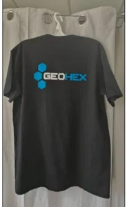
Even with these printing challenges, dark-coloured promo shirts are still one of the strongest choices for branded apparel. They work particularly well for:
- Trade shows
- Conferences
- Staff uniforms
- University events
- Brand activations
The key is understanding that darker garments require slightly different artwork preparation than white or light-coloured shirts. Once businesses properly adjust for that, the final results usually look far stronger.
Why This Issue Keeps Happening?
This problem keeps happening because many people think digital artwork will print the same on every fabric colour. But dark shirts change:
- Colour visibility
- Ink behaviour
- Print contrast
- Artwork sharpness
That is why our team takes extra time to review logos and artwork carefully before printing dark-coloured promo shirts. Usually, small adjustments early make the biggest difference once the shirts are actually printed.
Ready To Buy?
Related reading: our visual guide to t-shirt printing methods
