Fork Force
Last Updated: 10 November 2026
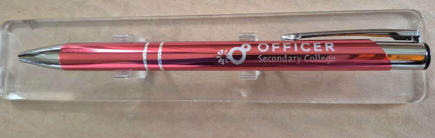
Madeline McCulloch from Fork Force worked with us on the custom pens for the business. Fork Force is an Australian company that specialises in forklift sales, hire, and servicing, so they needed pens ready for their staff to use and to hand out to their clients too. Madeline chose a striking metallic red pen, but the company’s logo was in red too, so they asked for our advice on this matter.
The Challenge: Red on Red?
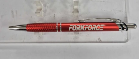
Fork Force’s original logo was in bold red and black, which looked absolutely fine on a white background. On a metallic red pen, it would have been very difficult to see the red at all. There wasn’t much room for error either, with the printing area on the barrel so narrow. We needed the company name to be readable without in any way losing the bold red of the pen.
Shealeigh’s Clever Fix
Our account manager, Shealeigh Keeney, helped coordinate a simple artwork adjustment. Instead of printing the original red-and-black design, the finished pens featured the FORKFORCE lettering in white. That one change gave the logo enough contrast to be clearly visible against the metallic red barrel. Sometimes, the simplest fix is exactly what a product needs!
A Closer Look at the Finished Pens
The final design looked sharp, with the white lettering sitting neatly along the pen’s side. The product itself also had several details that worked well with Fork Force’s branding. Here’s what we liked about the finished result:
- The metallic red barrel reflected Fork Force’s brand colours.
- The textured red grip provided a comfortable hold.
- The silver tip, clip and click button complemented the design.
- The white lettering made the company name easy to recognise.
These pens were used in the Fork Force office. During client meetings, they also handed out these pens to clients, which clients were happy to take home with them.
Ready To Buy?