Pop! Training
Last Updated: 12 October 2026
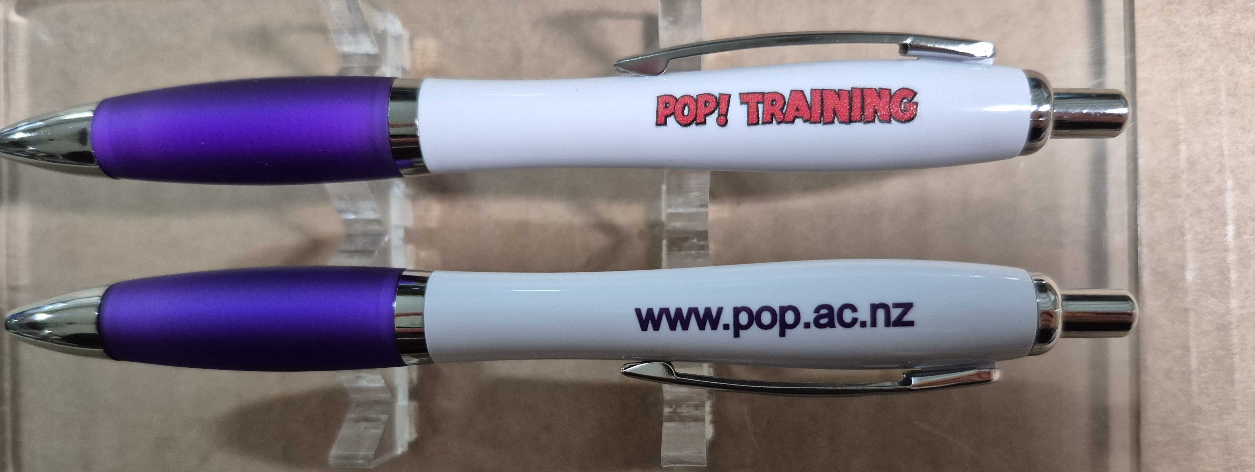
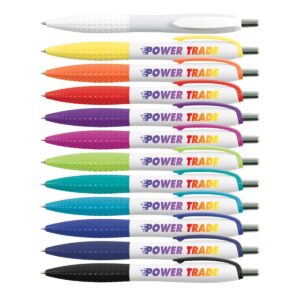
Pop! Training ordered white barrel pens with its logo on one side and its website on the other. These give learners something handy during class and something they could take with them afterwards. Mary Haycell Aguirre-Cruz, our account manager, helped get the artwork and production sorted so both sides of the pens stayed clear and easy to read.
The Challenge
From our experience, pens look simple until you try fitting a logo, website and brand colours onto one. You only have so much space, and once you squeeze in too much, the whole thing can start to look cramped. For Pop! Training, the main challenge was keeping everything readable without losing the pen’s clean look. The white barrel and purple grip gave us a solid starting point. From there, we focused on getting the sizing and placement spot on.
Giving Each Side Its Own Job
Rather than squeezing everything into one print area, Mary and our artwork team split the branding across both sides of the pen. The logo took one side, while the website had its own space on the other. That gave Pop! Training:
- A logo that was easy to recognise
- A website people could actually read
- A cleaner overall look
- Brand colours that tied everything together
- Two clear brand touchpoints without making the pen look busy
It was a small adjustment, but it made a big difference to how polished the pens looked once printed.
What They Said
Once the pens arrived, their feedback could not have been much clearer:
“Yup, just perfect.”
The client also confirmed everything had arrived safely for Cubic Promote, which wrapped the job up nicely. The branding came through clearly, the pens landed without any issues, and Pop! Training got exactly what they were hoping for.
Ready To Buy?