Happy Client: ZANEROBE
Last Updated: 12 October 2026
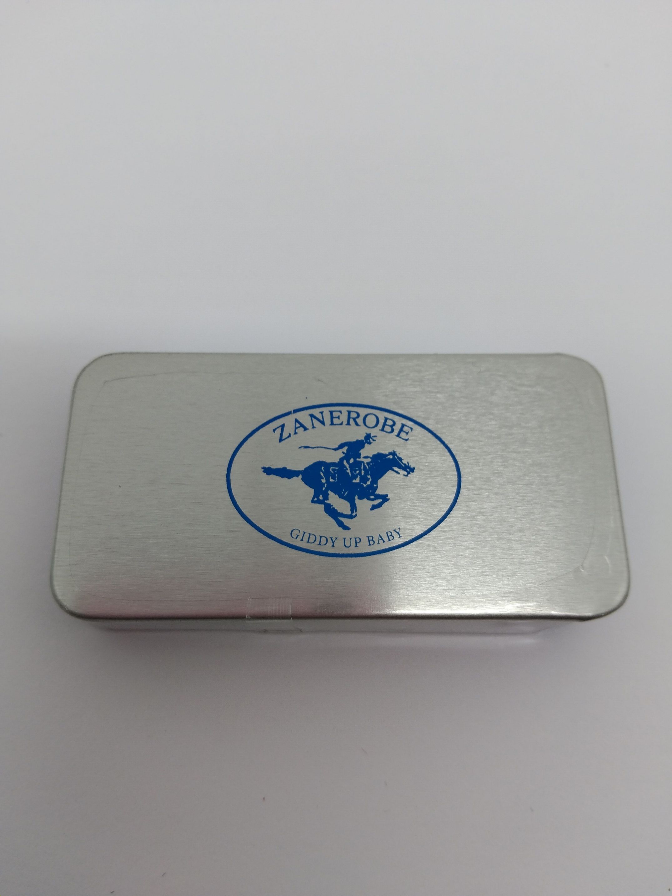
Fashion brands tend to notice the little things, so even something as small as a mint tin still has to feel right. ZANEROBE is an Australian menswear label known for its clean, understated streetwear style, and the team ordered custom mint tins carrying the ZANEROBE branding.
Why We Suggested Mints
The logo has to be clear, balanced and easy to recognise without making the whole thing feel crowded. The silver finish gave us a nice clean base, so we kept the artwork simple and let the ZANEROBE branding speak for itself. We focused on:
- Keeping the logo crisp at a smaller size
- Giving the artwork enough breathing room
- Making the branding easy to recognise straight away
- Keeping the overall look clean and understated
Keeping an Urgent Order Calm
The order came through as urgent, so Hannah kept a close eye on the timing from artwork approval through to production. Rush jobs can get messy pretty quickly if no one is keeping tabs on them. Here, the artwork stayed clean, the timing stayed under control, and the tins still came through looking polished rather than rushed.
What We Liked About This One
We really liked how restrained the final piece felt. Nothing was overdone; the branding sat nicely on the lid, and the whole thing looked very ZANEROBE. There is something satisfying about getting a small product this clean. The client was happy, the urgent job landed well, and the tins looked sharp enough that we were pretty pleased with them too!
Ready To Buy?