American Apparel T-Shirts: Premium Brand
We supply original and genuine American Apparel T-shirts custom printed with your graphics and logos in bulk across Australia. Businesses, organisations, events, concerts and corporate teams need a high-quality, stylish garment. With premium cotton fabrics, modern fits, and ethical production, American Apparel tees make an ideal canvas for custom branding, screen printing, and embroidery.
These tee shirts are designed for the wearer. Comfort, durability, and a fashion-forward look make them perfect for corporate uniforms, retail merchandise, band merchandise, and giveaways. Whether you’re after classic cotton tees, soft tri-blends, or trendy fitted styles, American Apparel delivers iconic quality with every piece. Prices exclude GST.
Filter Products
Shop Our Range
Showing 1–6 of 6 results
- Sort by price: low to high
- Sort by price: high to low
- Sort by latest
-

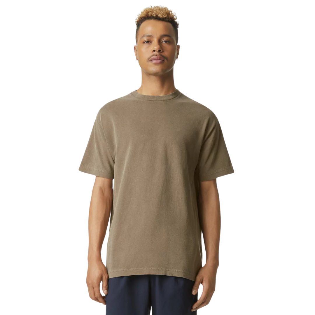
American Apparel Adult Fine Jersey T-Shirts
Prices From $58.51 -
American Apparel Adult Long Sleeve T-Shirts
Prices From $61.91 -
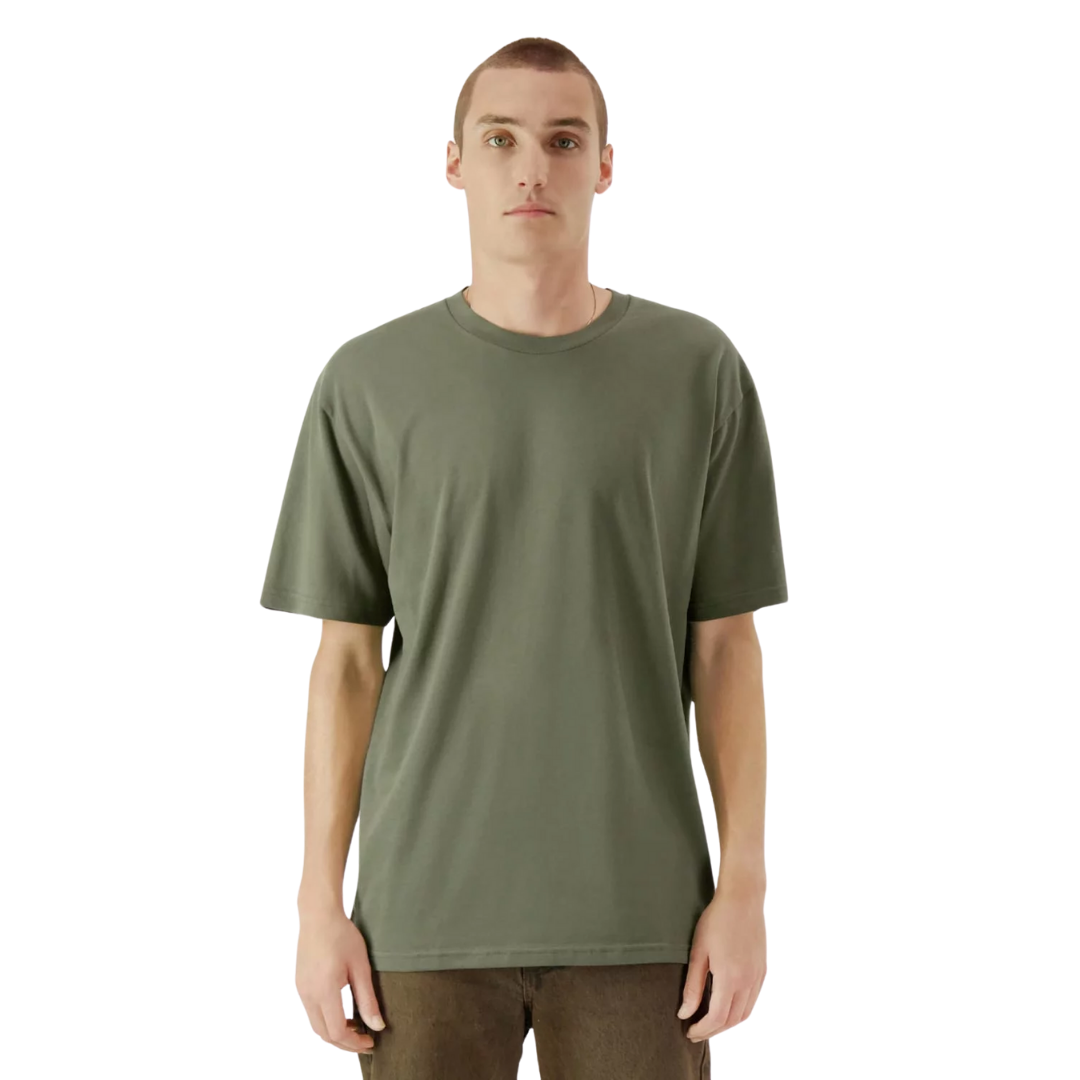
American Apparel Adult Polycotton T-Shirts
Prices From $25.26 -
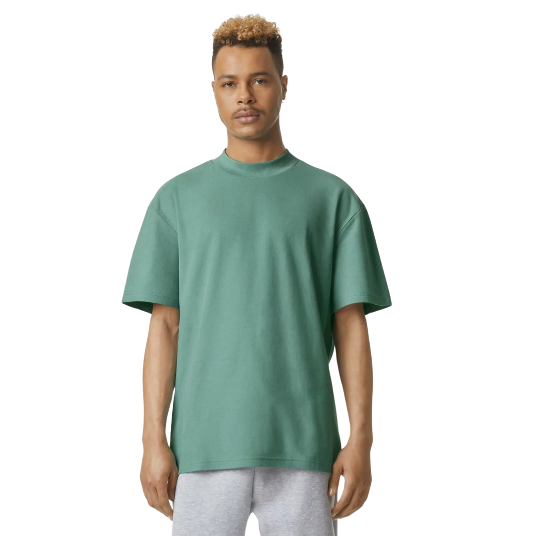
American Apparel Adult Relaxed Fit Jersey T-Shirts
Prices From $90.91 -
American Apparel Ladies’ Fine Jersey T-Shirts
Prices From $20.46 -

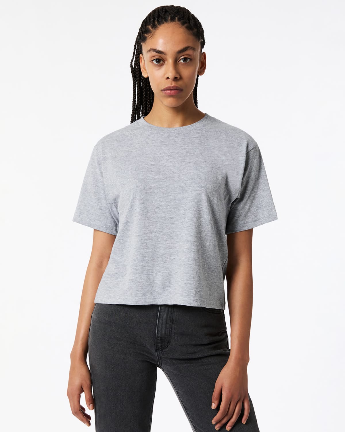
American Apparel Women’s Boxy Cropped Tees
Prices From $21.25


A Brief History of American Apparel
Founded in Los Angeles in 1989, American Apparel quickly became a recognised name in fashion basics. The brand is built on a commitment to ethically made, high-quality apparel. Minimalist designs, soft fabrics, and vibrant colour ranges make them a perfect canvas to brand your graphics. American Apparel tees gained popularity in music, streetwear, and promotional branding industries.
Today, the brand continues to deliver premium cotton T-shirts with a focus on sustainability, using organic and responsibly sourced materials in many of its products. Their reputation for superior fabric, flattering cuts, and long-lasting quality makes American Apparel a standout choice for businesses.
Why Choose These for Custom Branding?
Not all T-shirts are created equal, and American Apparel stands out for its craftsmanship, soft-touch fabric, and style. These tees provide:
- High-Quality Cotton & Tri-Blend Fabrics – Ensuring a soft, breathable feel that gets better with every wash.
- Retail-Ready Fashion Cuts – More than just basic tees, these shirts offer sleek, modern silhouettes.
- Excellent Printability – The smooth, tight-knit fabric makes these shirts ideal for screen printing, embroidery, and direct-to-garment (DTG) printing.
- Long-Lasting Wear – With reinforced stitching and premium dyes, these shirts maintain their look wash after wash.
If you’re looking for branded apparel that people actually want to wear, American Apparel T-shirts provide a perfect blend of comfort, quality, and style.
Who We Recommend To
For companies needing promotional tee shirts and require something higher in quality.
- Corporate & Tech Companies: Great for startup culture, trade shows, and stylish company uniforms.
- Music, Arts & Entertainment: A favourite for band merch, music festivals, and creative industry promotions.
- Charity & Awareness Campaigns: High-quality T-shirts encourage more wear and greater message visibility.
- Cafés, Bars & Hospitality Businesses: A modern, comfortable uniform option for front-of-house teams.
- Sports & Fitness Brands: Soft, breathable fabrics make these tees a great alternative to standard workout shirts.
Because American Apparel is a recognised, trusted brand, custom-printed tees add value and appeal to any promotional campaign.
Case Study: Sydney Design Agency
A creative agency in Sydney created premium branded merchandise for both employees and clients supplied by Cubic Promote. Rather than using basic cotton T-shirts, they opted for American Apparel’s soft-touch fitted tees, featuring:
- A clean, minimalist logo on the front reflects their modern aesthetic.
- A premium, ultra-soft cotton blend, ensuring long-lasting comfort.
- Employees loved wearing inside and outside the office.
The Outcome
Everyone loved the tee shirts. We have been told they wear them even on weekends. The branding exposure is epic.
Print and Branding Options
We print onto American Apparel tee shirts including:
- Screen Printing
- Direct-to-Garment (DTG) Printing
- Embroidery
- Heat Transfer Vinyl (HTV)
Our in-house design team can assist in creating a branding concept that aligns with your vision. Design services start at $35 an hour.
Best-Selling Styles & Colours
American Apparel has many different shirt options. The best selling options include:
- Classic Crew Neck T-Shirts
- V-Neck T-Shirts
- Tri-Blend Tees
- Long-Sleeve Tees
Colour wise:
- Bright & Bold Colours – Red, yellow, and royal blue options.
- Muted & Earthy Tones – Ideal for minimalist, high-end branding in greys, blacks, and neutrals.
Companies can mix and match colours and sizes for bulk orders, creating a cohesive yet diverse branded collection.
Two Creative Ways to Use Them Promotions
- High-End Employee Merchandise – Provide stylish, comfortable branded tees for staff, ensuring a modern company image.
- Retail-Ready Branded Apparel – Sell these premium T-shirts as official merchandise for bands, designers, or influencers, together with custom water bottles.
Order Custom American Apparel T-Shirts
A branded American Apparel T-shirt is more than just clothing—it’s a premium statement piece that reinforces your brand’s quality and style. Whether for fashion brands, corporate teams, or event promotions, these tees provide lasting impact with a touch of sophistication.
Contact us today for the best bulk pricing on custom American Apparel T-shirts. We supply Australia-wide.