


What Is In Our Range
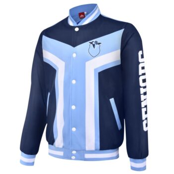
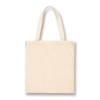
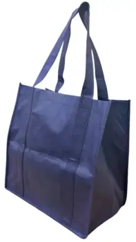
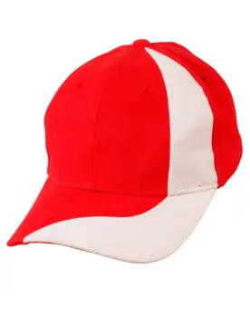
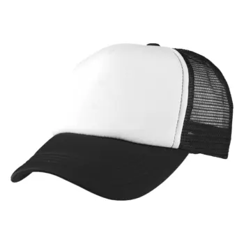
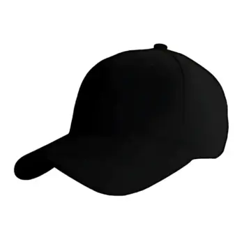
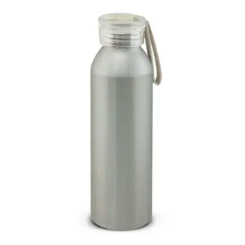
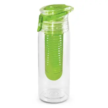
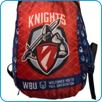
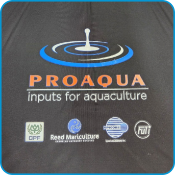
This category consists of promotional items branded with a candidate’s name, slogan, or political party logo. These products create visibility, foster voter engagement, and establish a cohesive campaign identity. From eye-catching banners to practical giveaways like reusable bags or water bottles. We transforms simple items into powerful tools for spreading your message.
The quality of printing plays a key role in making these items campaign-ready. With our printing and branding expertise, your merchandise will feature sharp designs and vibrant colours that leave a lasting impression on Aussie voters.
Experience and Pedigree
We’ve partnered with election campaign managers nationwide to supply merchandise for
- local elections
- state elections
- federal elections
Our team understands the unique requirements of each race.
Why Campaign Managers Trust Us
- We work with all political affiliations, including Independents, Labour, Liberal, Greens, Nationals
- Our neutral stance ensures fair and professional service for every campaign.
- Decades of experience working alongside campaign managers across all levels of government.
- Reliable, fast turnaround times to meet the tight schedules of election periods.
Tip on Planning
Plan your merchandise early in the campaign. Ordering in advance ensures that all items are ready for key events and helps secure the best production timelines.
How We Custom-Brand Them
We offer a variety of branding methods to ensure your message stands out:
- Screen Printing
- Digital Printing
- Embroidery
- Custom Stickers: Affordable and effective for mass distribution. (bumper stickers are always popular)
Partner with us to create merch that voters will remember. Let’s help your campaign shine! We supply Australia-wide.