Last Updated: 13 April 2026
Key Points:
- Logos need multiple versions to work across merchandise, uniforms, and print, not just one file.
- A complete logo system includes horizontal, stacked, mono, and icon versions for different sizes and uses.
- Businesses should use flexible logo files to prevent print issues, cut costs, and keep branding consistent.
Some logos look great on a website header but don’t work at all on a pen, polo shirt, or tote bag. If your organisation uses branded merchandise, uniforms, event materials, or print, your logo is more than just a nice design. It’s a tool that needs to work across many types of media and sizes. This guide will show you which logo types work best on custom merchandise, how to plan for different versions, and what small businesses can learn from Australia’s top brands.
Your Logo Needs a System, not a Single File
The days of using one JPEG logo everywhere are long gone. Today, even small brands need a logo system that includes:
- A horizontal (landscape) version
- A stacked (portrait) or square version
- A mono (single-colour) version
- An icon-only mark for tiny spaces
Having these options means your logo will work on everything from letterheads to billboards. For your brand, this approach helps your logo fit on:
- Websites and social icons
- Business cards and stationery
- Corporate uniforms and hi-vis gear
- Promo items like bottles, pens, bags, and tech
Design for Orientation: Landscape, Portrait, and Tiny
Most promo items aren’t shaped like a website header. Some are tall and narrow, like pens. Others are wide, like banners, or tiny, like lapel pins. You need logo versions that fit these shapes without being stretched or squashed.
Configurations to plan for
- Horizontal logos: Best for: websites, email signatures, banners, notebook covers, pull-up banners.
- Stacked / portrait logo: Best for: social media avatars, square label areas, and small front print positions on tees.
- Icon-only mark: Best for: pens, zipper pulls, small badges, tiny embroidery.
If your current logo only works in one shape, you’ll almost certainly struggle on:
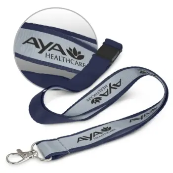
- Narrow items like lanyards, pens
- Tiny branding areas like USBs, power banks
- Circular or square spaces, like stickers and badges
Action step:
Ask your designer for at least two lock-ups (horizontal + stacked) and an icon version. Ensure each is supplied as a vector file (AI, EPS, SVG) so they scale cleanly at any size.
Colour Flexibility: Full Colour, Mono, and Reverse
Full-colour logos look great on screens and large prints. But on small or low-cost items, they don’t always work as well.
Why do you need multiple colour variations?
- Many promotional decoration methods cannot brand in full colour with gradients. Examples include pad printing, screen printing, embroidery, and laser engraving.
- Some materials, such as metal, jute, felt, or certain plastics, don’t show subtle gradients or fine colour changes very well.
- Dark products like black hoodies, navy caps, or charcoal notebooks need a light or white version of your logo so it stays easy to read.
That’s why professional brands have:
- Full-colour logo – for digital, premium print, and large format.
- Mono dark logo – solid black or dark version for light backgrounds.
- Mono light/reverse logo – solid white version for dark backgrounds.
Minimum set of colour variations to request
Ask your designer for:
- Full-colour version (CMYK + RGB)
- Solid black version
- Solid white version (on transparent background)
This gives you more ways to decorate your merchandise and can often lower your branding costs.
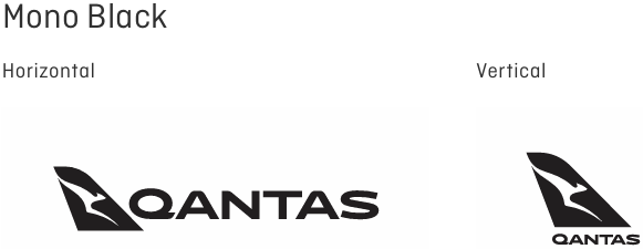
Example with the Qantas Logo:
Full Colour Version
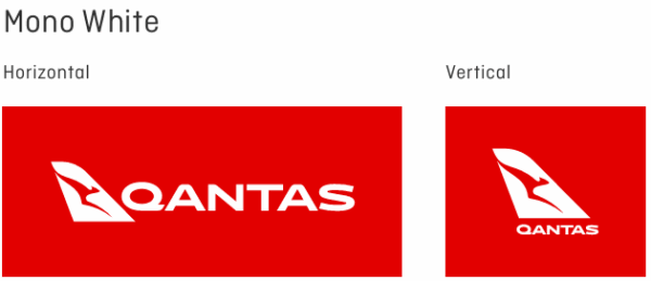
Mono Colour White
Mono Colour Black
How Can We Help
Sometimes brands come to us with very specific colour requirements that don’t work well on real products. Gradients, multiple shades, or exact colour matches can look great on screen but fall apart on fabric, metal, or plastic.
For example, one client wanted a full-colour gradient logo on black caps. It looked great digitally, but when we tested it, the details got lost, and the logo was hard to read. We switched it to a clean white version, and it came up sharp and clear.
At Cubic Promote, we help you choose the right logo version for each product. That might mean simplifying colours, improving contrast, or selecting a better print method. If you don’t have those versions ready, we’ll point you in the right direction.
Think Across Media: Where Will Your Logo Actually Live?
If you design your logo just for your website, it probably won’t look good everywhere else.
Here’s a quick planning grid:
| Medium / Use | Key Considerations for Your Logo |
|---|---|
| Website & digital | Works well in horizontal layout; legible on mobile; icon version for favicon. |
| Social media | Square/stacked version for profile image; simple enough to recognise at small sizes. |
| Business cards & stationery | Clear mono version for black & white printing; scales cleanly to small sizes. |
| Magazines, newspapers, brochures | Needs CMYK full-colour and mono options; avoid ultra-thin lines. |
| Billboards & posters | Bold, simple shapes; strong contrast; avoid tiny taglines. |
| Uniforms & tees | Embroidery-friendly (no hairline strokes); stacked option for left chest; horizontal for back. |
| Promo items (pens, bottles, keyrings, tech etc.) | Icon-only version essential for small print areas; solid shapes that reproduce well. |
| Watermarks & overlays | Mono, semi-transparent variants that don’t overpower content. |
When you design or update a logo, try it out on different mockups—like a shirt, pen, tote bag, business card, and website header. If it only looks good on one or two, it’s not ready yet.
What the Best Brands Do (and You Can Too)
Large organisations and government agencies in Australia often publish brand guidelines that include:
- Horizontal and stacked logo versions
- Mono and reversed options
- Rules for minimum sizes and clear space
- Guidance for using the logo on different backgrounds
You don’t need a 40-page brand manual, but you should aim for the same principles:
- Your logo is legible and recognisable at different sizes.
- It has multiple lock-ups for different spaces.
- It has various colour treatments for different materials.
With tools like Canva, Figma, Affinity, and Adobe Express, you don’t need to be a big company to have a flexible, well-documented logo. Small businesses can now get the same polished look for much less.
Practical Tips: Creating Logo Variations for Merchandise
If you already have a logo, here’s how to get it “merch-ready” without starting from scratch.
a) Build a Simple “Logo Kit”
Ask your designer (or update it yourself if you have the files) to create:
- Horizontal logo – full colour, mono dark, mono light
- Stacked logo – full colour, mono dark, mono light
- Icon-only mark – mono dark + Mono light
Save these as:
- Vector: AI / EPS / SVG (for printing & scaling)
- Raster: PNG (transparent background) for quick use in documents and digital.
b) Simplify for Small Sizes
Tiny print areas don’t like detail.
- Remove taglines for small applications.
- Avoid ultra-thin lines, intricate shading, or small text.
- Test your logo at 16–24px and again at 2–3cm wide — if you can’t read it, simplify.
c) Make a One-Page Brand Cheat Sheet
You don’t need a complete brand book. A simple one-page PDF can include:
- Which logo to use on light vs dark backgrounds
- When to use horizontal vs stacked
- Example mockups on a shirt, pen, and web header
- A note for suppliers: “Use these files only. Do not stretch, recolour, or redraw.”
Share this with your promo supplier, printer, web designer, and your team. It will save you a lot of back-and-forth emails.
How This Helps When You Order Merchandise
When your logo system is sorted, ordering custom merch gets much easier:
- You don’t have to redesign your logo for every product.
- Your supplier (like us at Cubic Promote) can quickly tell you:
- “This version will embroider best.”
- “Use the mono version on this material.”
- “The stacked logo will look better in this print area.”
- You avoid last-minute compromises like: “We had to drop the colour” or “We couldn’t fit the tagline.”
In short, you’ll get better-looking merchandise, fewer headaches, and a more consistent brand.
Where to Start (Even if Your Logo Isn’t Perfect)
If your logo is older, fussy, or only exists as a tiny JPEG, you don’t need to panic — start with small steps:
- Get it redrawn as a vector (a designer can recreate it in Illustrator).
- Create at least three versions:
- Full-colour horizontal
- Mono stacked
- Icon-only
- Test those versions on a few likely items:
- A polo shirt
- A pen
- A notebook
- A social media avatar
If it still feels clunky or hard to read, that’s a sign it may be time for a logo refresh—not necessarily a complete rebrand, just a cleaner, more flexible version of what you already have.
What’s Next?
The good news is that if you were to begin creating different logo layouts and colours, there have never been more tools and resources available for you. Use tools like Canva or other online or app-based drawing tools. The traditional route of contacting your designer or marketing agency is another option. We also have graphic designers here at Cubic Promote that you can call upon to assist as well. We recommend always being prepared and having your logos ready.
Ready To Shop?
Do you have your logo ready? If so, you can start shopping for uniforms and merchandise for your organisation. Here are some of our best sellers:
Shop Branded Polo Shirts here
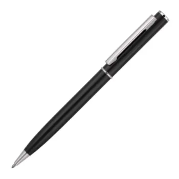
Shop Promotional Pens here
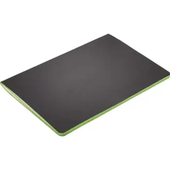
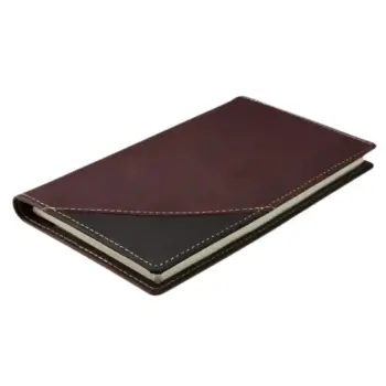
Shop Regular Notebooks here
Shop Promotional Power Banks here
Shop Branded Metal Bottles here


