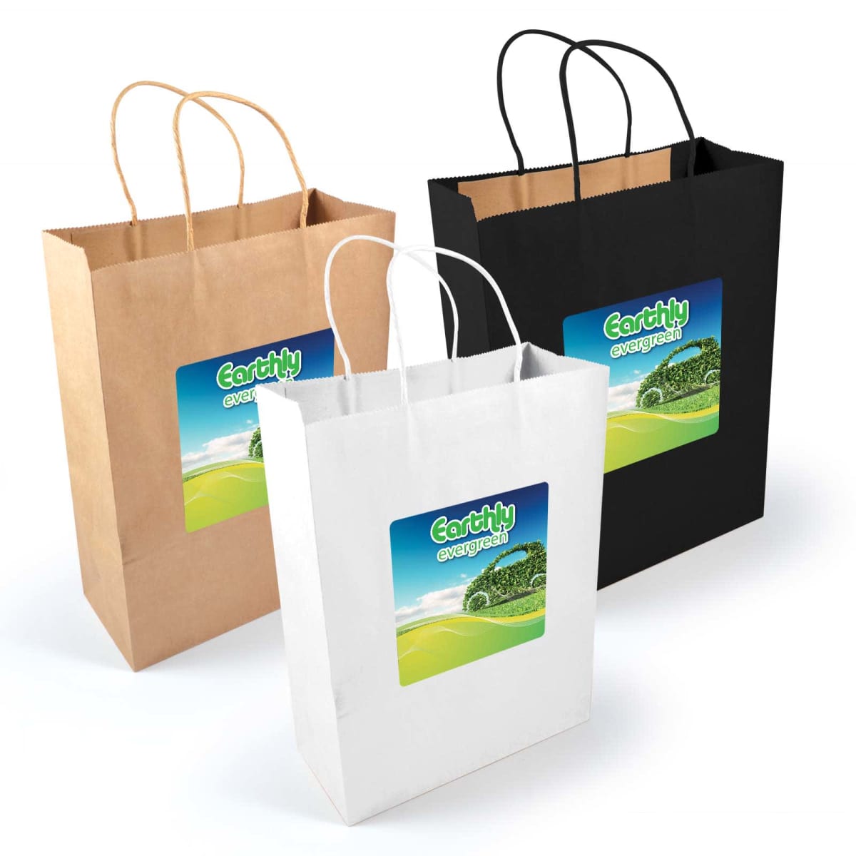
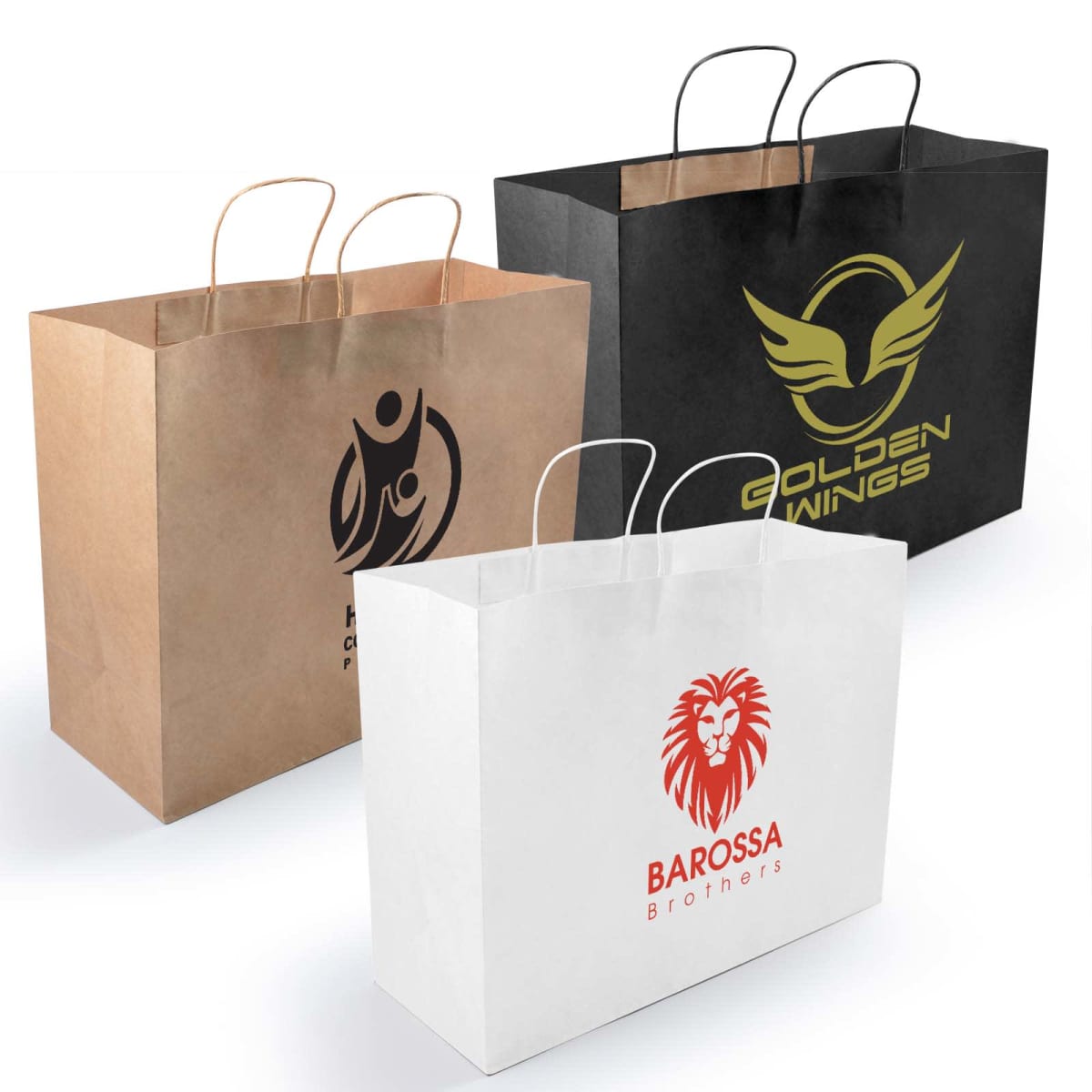
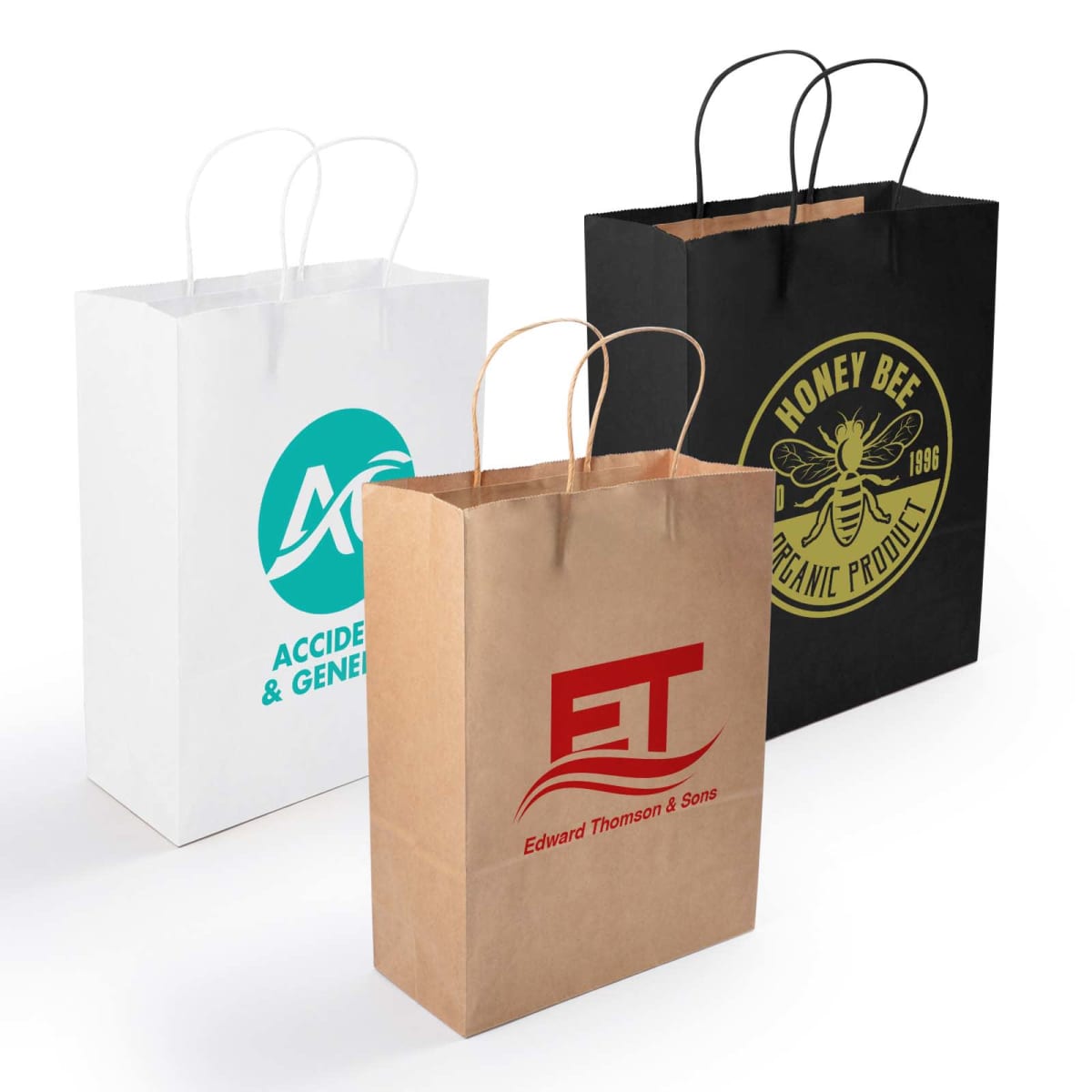
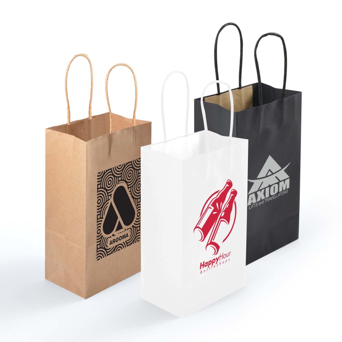
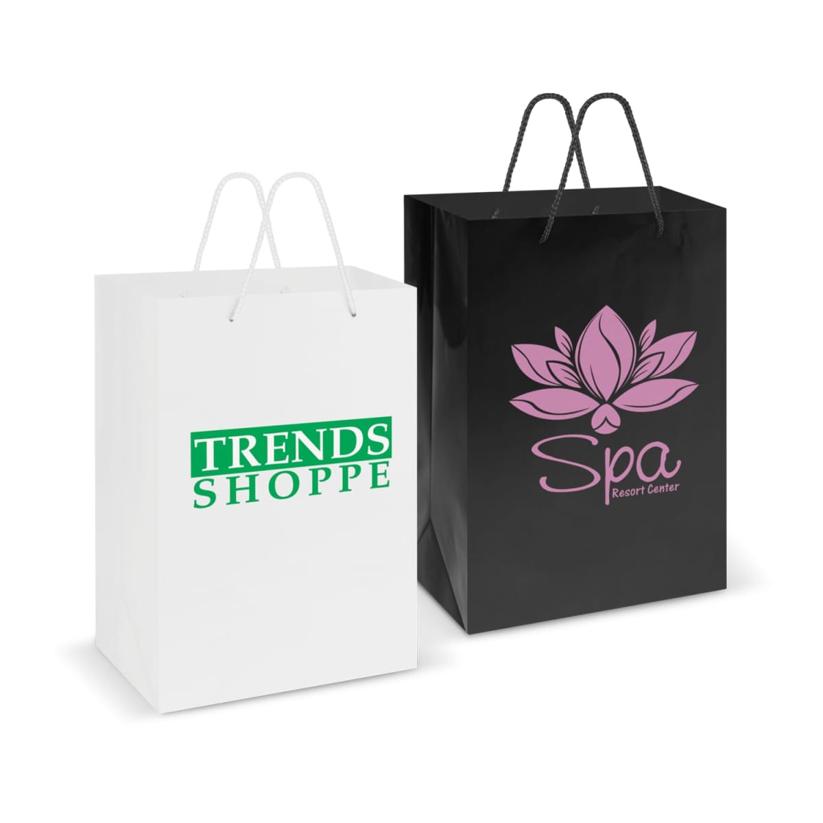
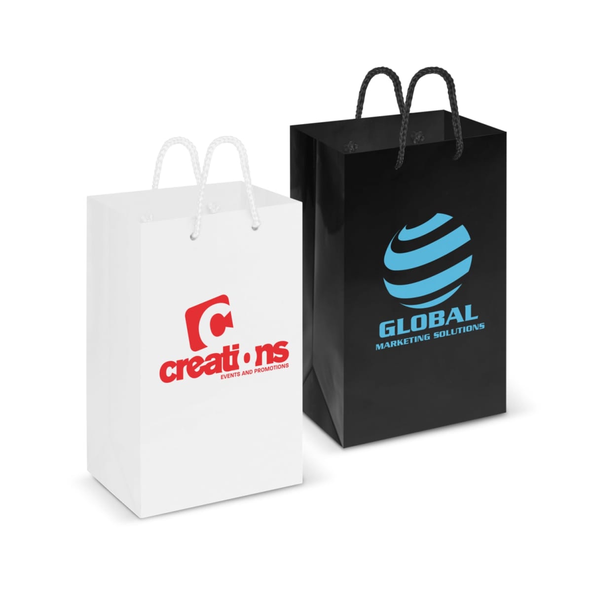
Custom Branded Paper Bags
A high-quality paper bag is more than just packaging—it’s a statement about your brand’s professionalism, style, and commitment to sustainability. This is the category for you if your company runs a retail stores, hosts events, or are looking for a premium packaging alternative. Custom-branded paper bags ensure your logo is seen everywhere your customers go. We are a leading paper bag supplier in Australia, at Cubic Promote, we stock a range of promotional paper bags. We supply luxurious glossy paper bags, eco-friendly kraft bags, and flat-handle carry paper bags for retailers or events; fully custom-printed bags tailored for your business. Whether you are seeking elegant or natural and earthy. We can deliver to you with screen printing, foil stamping, full-colour digital prints, and embossed finishes to ensure your paper bags make a lasting impression. Prices exclude GST.
Filter Products
Hot Sellers
Shop Our Range
Showing 1–24 of 32 results
- Sort by price: low to high
- Sort by price: high to low
- Sort by latest
-

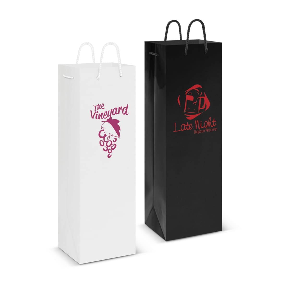
180 gsm Paper Wine Bags
Prices From $6.63 -
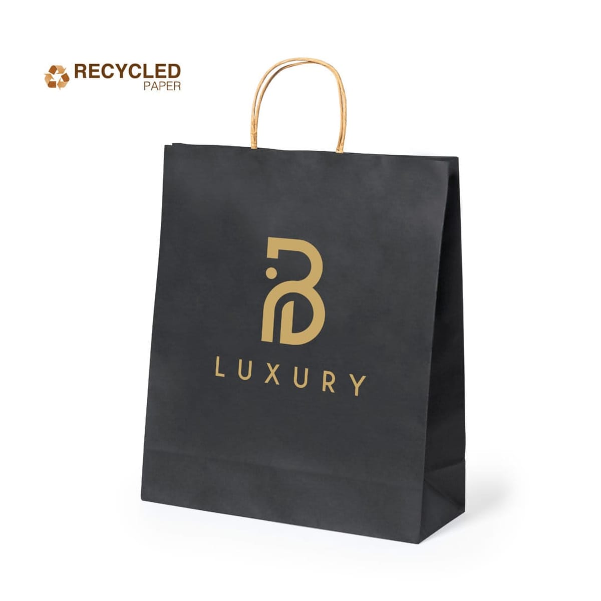
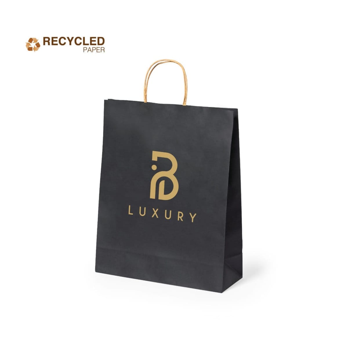
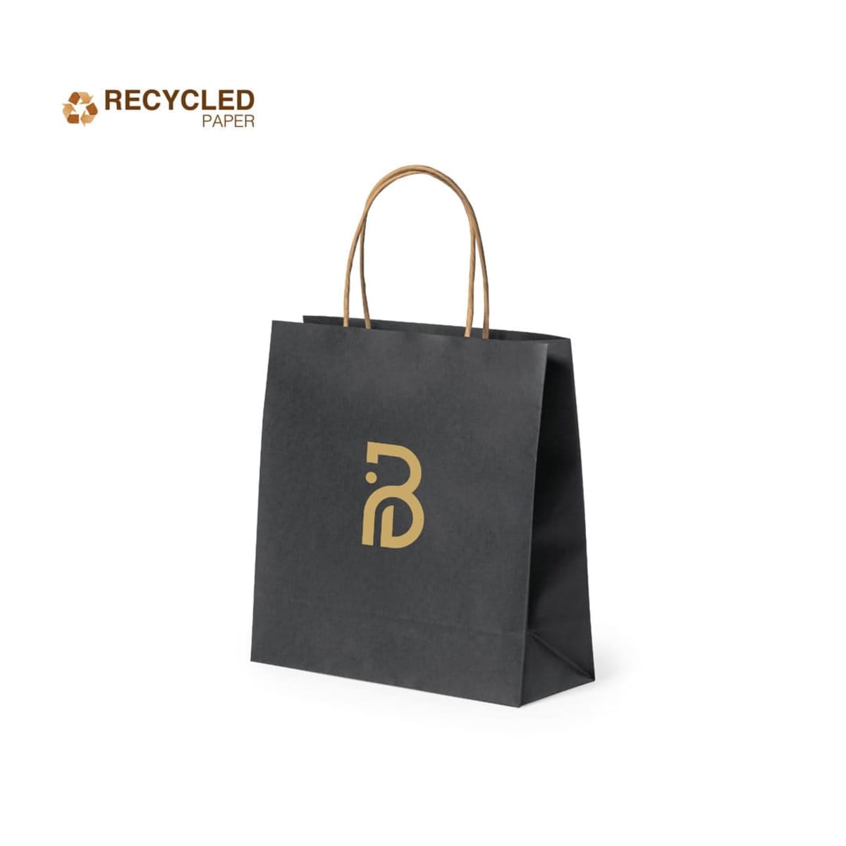
Black Recycled Paper Bags
Prices From $3.84 -
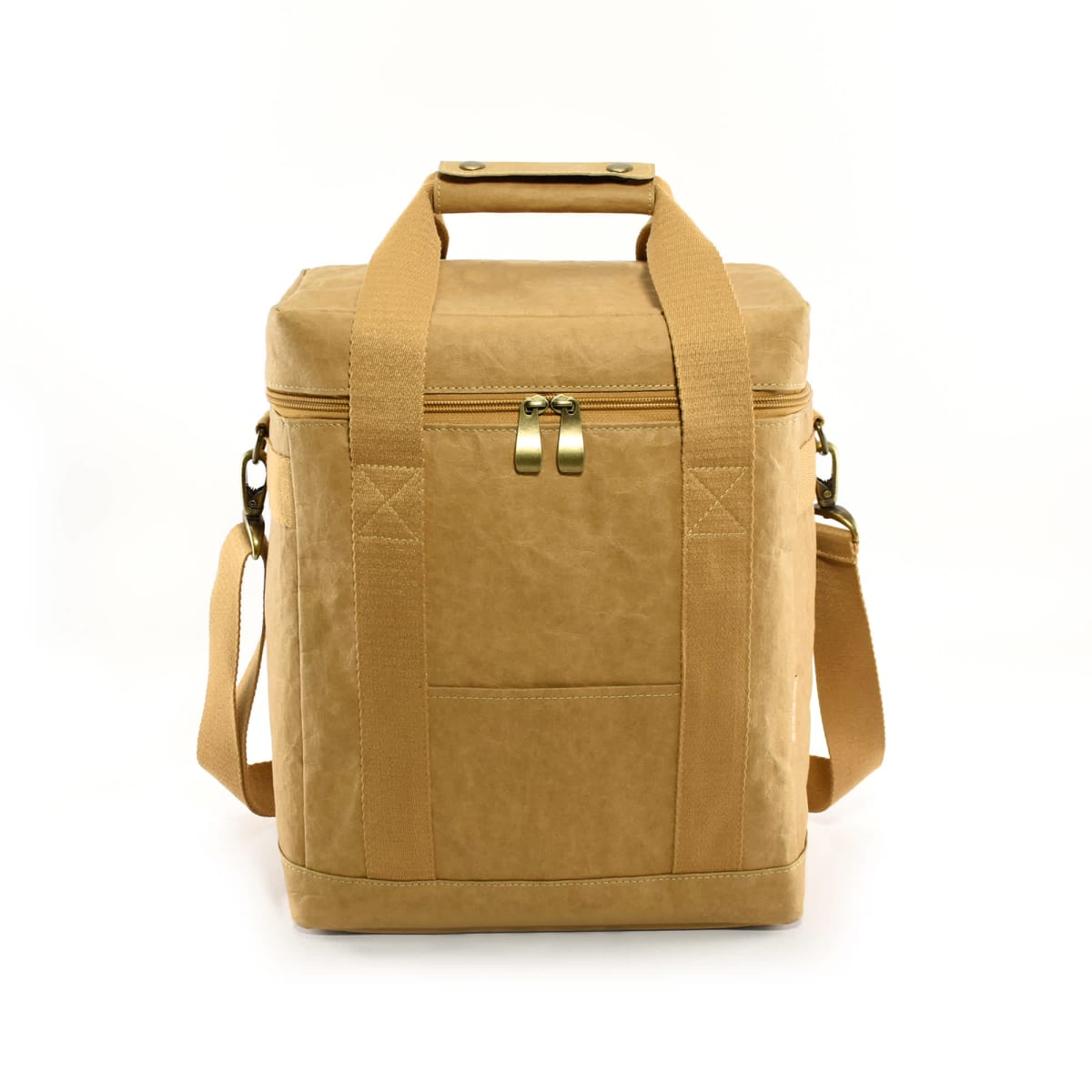
Burkeley Kraft Paper Lunch Cooler Bags
Prices From $37.58 -
Champagne Ribbon-Handled Premium Paper Bag
Prices From $6.56 -
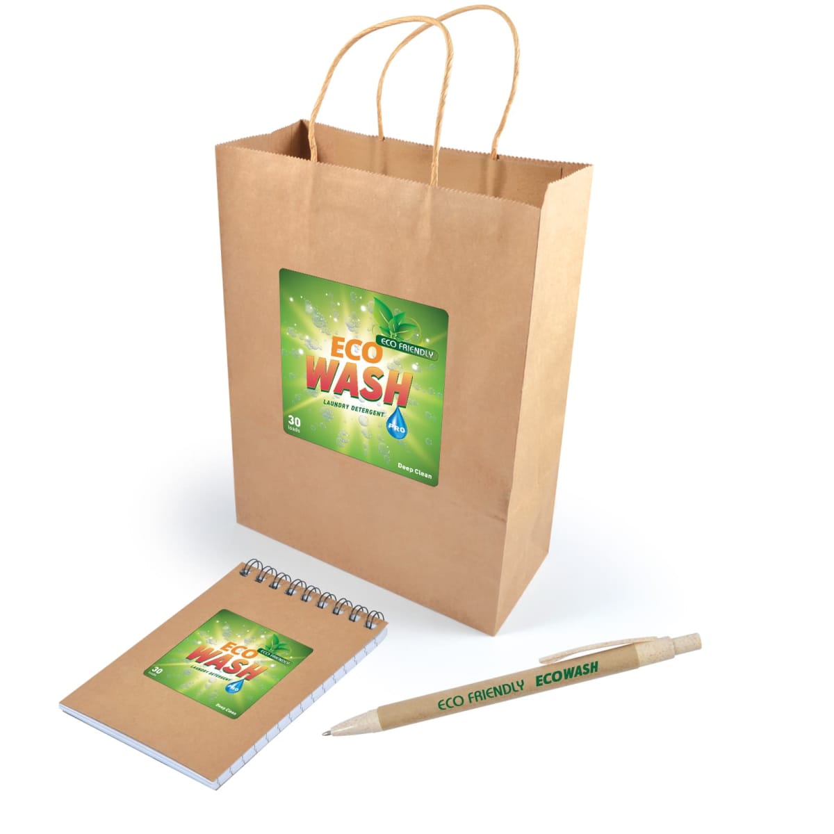
Eco Event Gift Sets
Prices From $6.15 -
Eco-Flex Paper Bags
Prices From $3.25 -
Elegant Wine Ribbon-Handled Premium Paper Bag
Prices From $6.38 -
Express Kraft Paper Bag Medium
Prices From $2.40 -
Express Kraft Paper Bag Small
Prices From $2.69 -
Express Paper Kraft Bag Large
Prices From $2.62 -
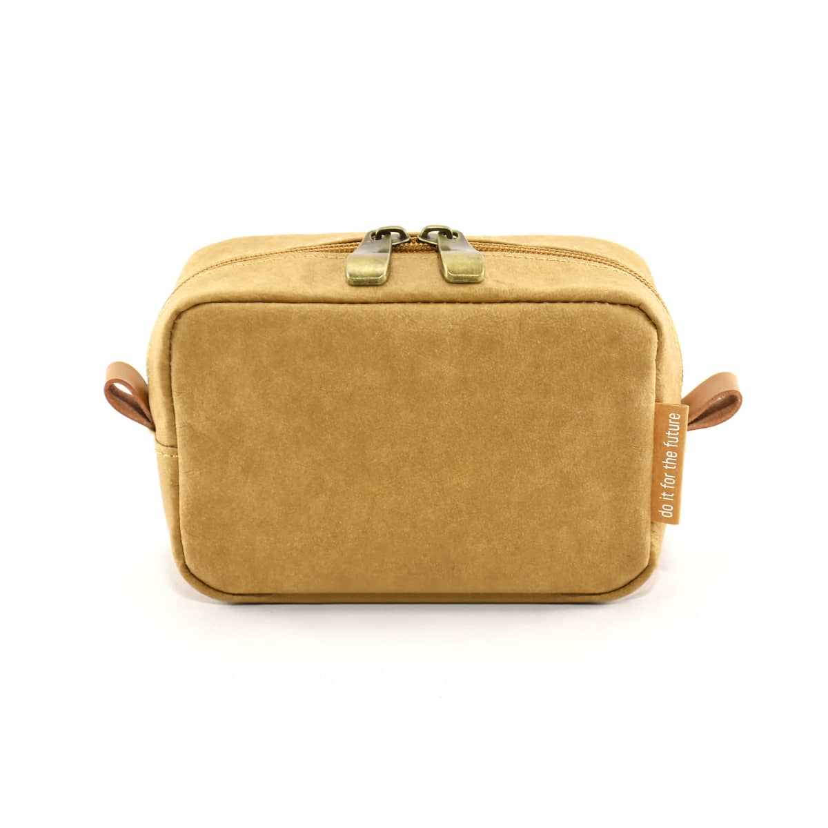
Gardner Kraft Paper Cosmetic Bags
Prices From $10.42 -
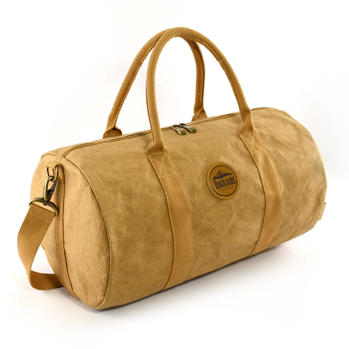
Jakobson Kraft Paper Duffle Bags
Prices From $50.03 -
Kraft Paper Bag Extra Large
Prices From $2.95 -
Large Printable Laminate Bag
Prices From $3.10 -
Mimi Kraft Paper Cosmetic Bags
Prices From $10.50 -
Paper Bag Medium
Prices From $1.24 -
Paper Bags Large
Prices From $1.50 -
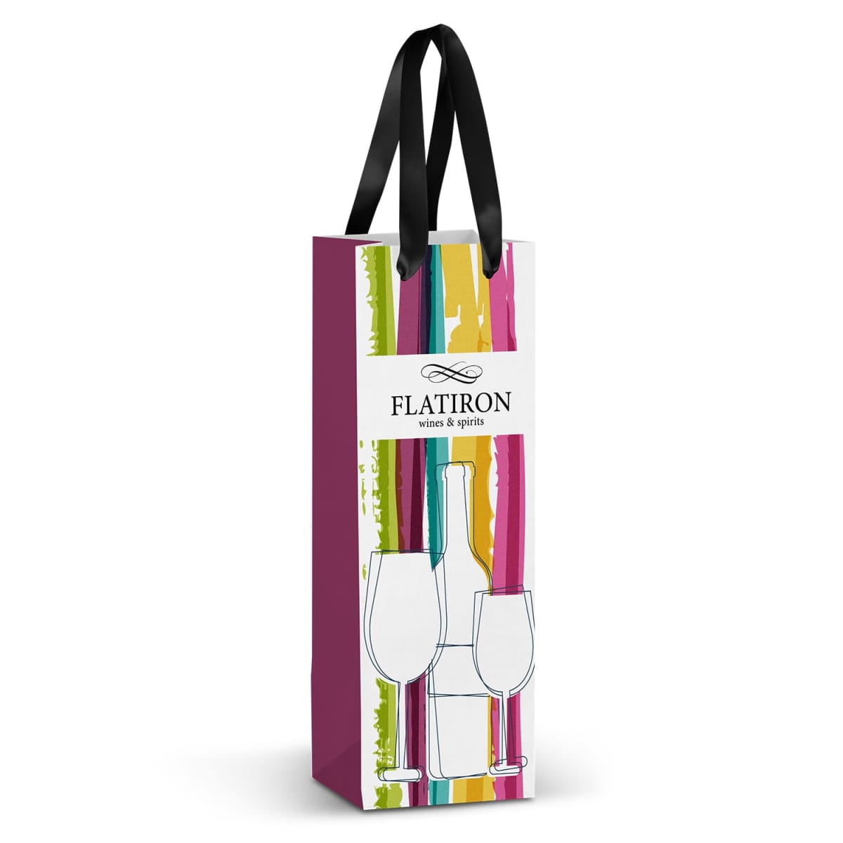
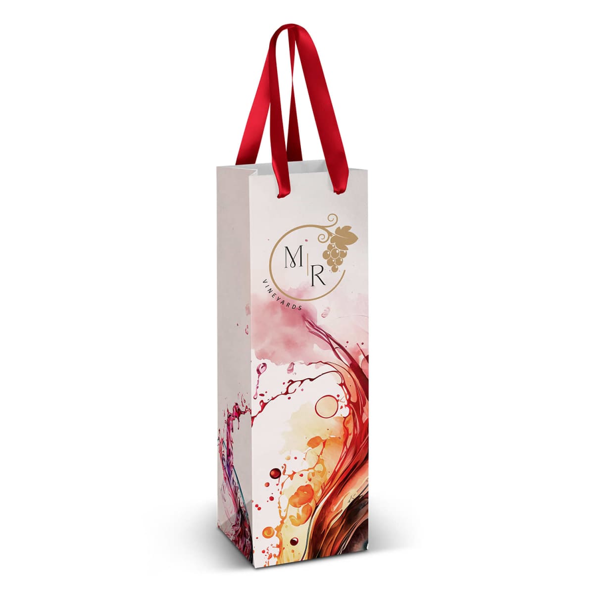
Personalised Wine Gift Bag
Prices From $2.81 -
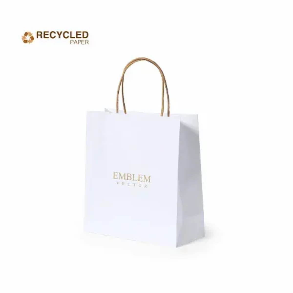
Recycled Nature-Line Paper Bags
Prices From $2.99 -
Recycled Paper Bags
Prices From $3.04 -
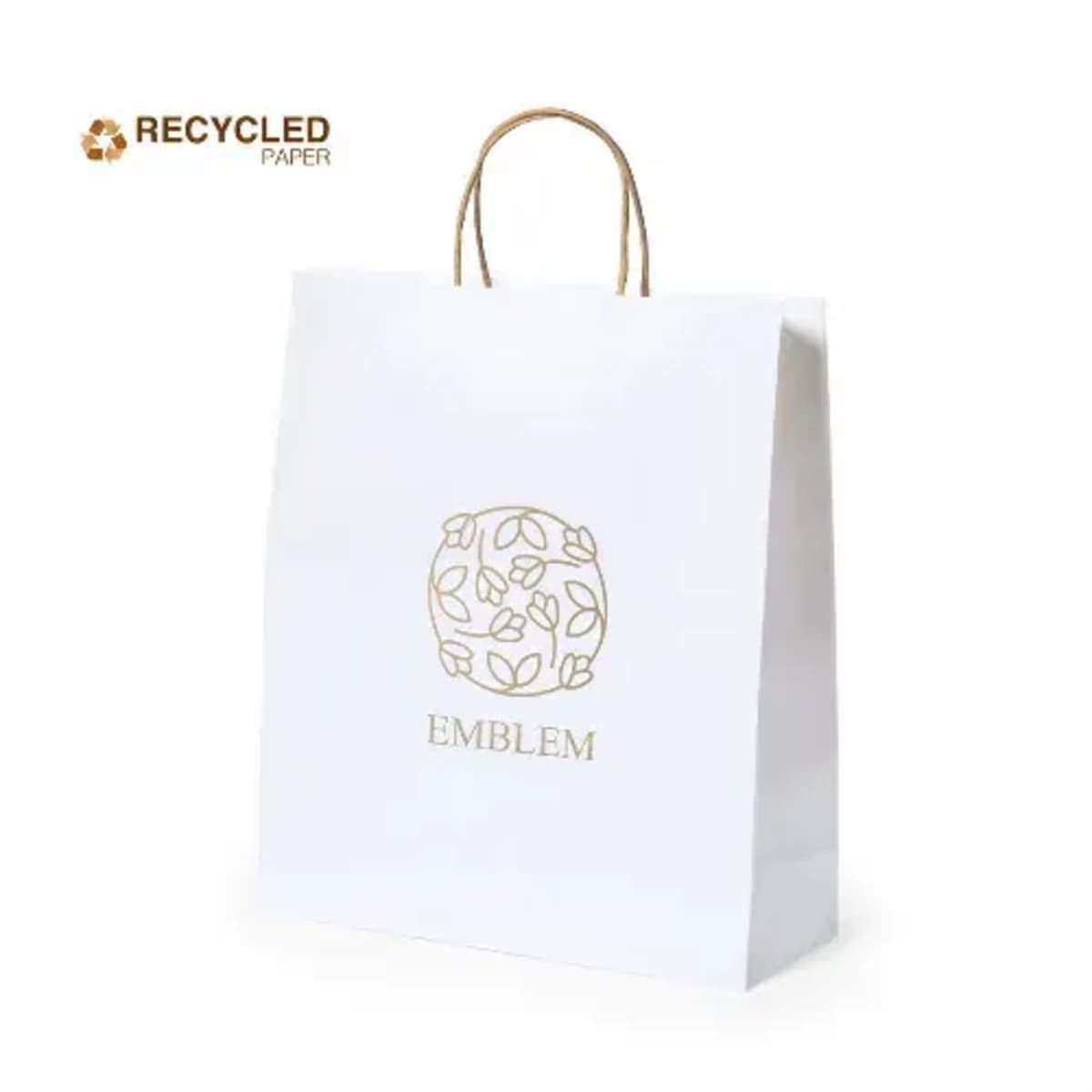
Recycled White Paper Bags
Prices From $3.81 -
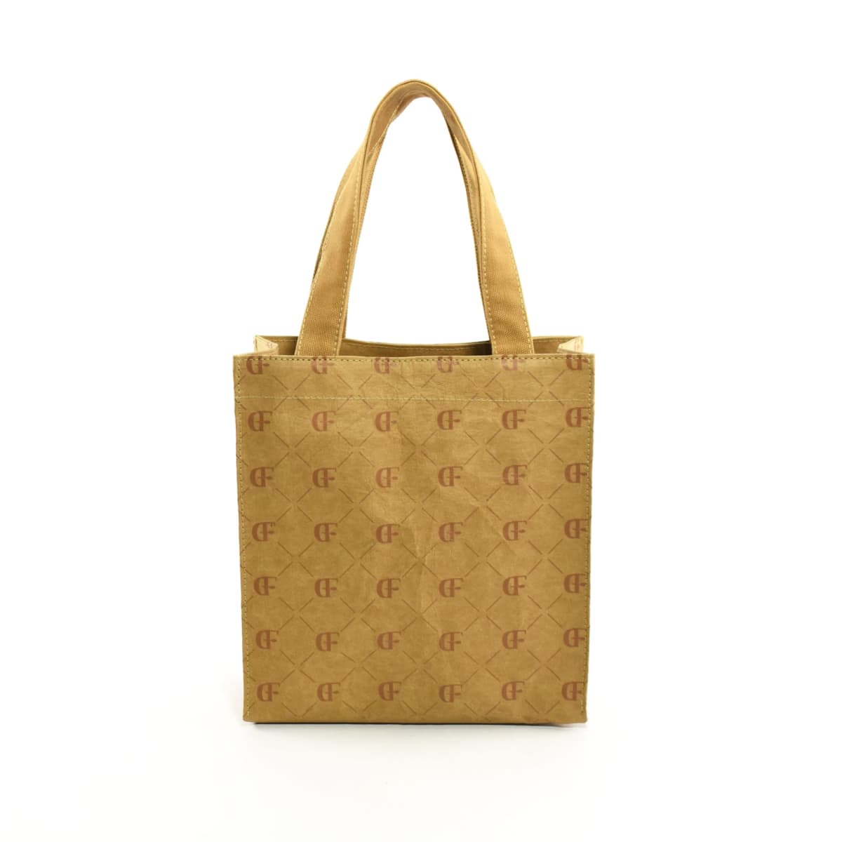
Selbah Kraft Paper Tote Bags
Prices From $17.33 -
Shantal Kraft Paper Cosmetic Bags
Prices From $17.24 -
Small Printed Paper Bags
Prices From $2.82

Why Choose Custom Paper Bags?
Paper bags are a staple across retail as well as conferences and events. These paper bags have many advantages over other custom promotional bags, including:
- Practical & Stylish: Durable, well-made, and designed to elevate your brand’s presentation
- Eco-Friendly & Recyclable: A sustainable alternative to plastic, helping businesses meet environmental commitments
- Walking Brand Exposure: Carried everywhere, ensuring your business stays in sight long after the purchase
- High-Quality Finishes Available: From premium matte and glossy textures to custom foil embossing
- Low in cost for bulk orders: Cost-effective for retail stores, events, corporate gifting, and takeaways
Who Do We Supply These To
Organisations who use custom paper bags include:
Retail & Fashion Brands
- A high-end alternative to plastic bags for clothing boutiques, department stores, and gift shops
- Custom branding ensures a polished and cohesive in-store experience
Corporate Events & Trade Shows
- Ideal for gift packs, promotional merchandise, and branded giveaways
- Reinforces brand professionalism with stylish, high-quality packaging
Cafés, Bakeries & Takeaway Businesses
- A food-safe, sturdy solution for carrying takeaway meals, baked goods, and beverages
- Customised with logos, seasonal branding, or eco-friendly messaging
Luxury & Boutique Brands
- Premium glossy and embossed bags for exclusive product launches, beauty brands, and upscale gifting
- Adds an extra layer of elegance to high-end packaging
Environmental & Sustainable Brands
- Kraft and recyclable paper bags align with eco-conscious branding
- Custom messaging can reinforce a company’s sustainability efforts
Branding Methods
What Makes Our Products Stand Out?
At Cubic Promote, we don’t just print a logo on a bag—we create packaging that enhances your brand image and delivers a strong message. We ensure our products are ethically and sustainably sourced, working with SEDEX-audited suppliers who meet global standards for fair wages, safe working conditions, and responsible production. As a carbon-neutral supplier, we provide eco-friendly alternatives, including fully recyclable and biodegradable paper bags.
Case Study: Lockeroom Gym
One of our loyal clients, Lockeroom Gym, is a thriving fitness centre in Queensland, wanted a meaningful way to engage new members during sign-up. See the full Lockeroom Gym case study to learn how welcome kits lifted sign-ups and improved retention.
Key Benefits
- Sleek, Professional Presentation: Adds a polished look to any retail or event setting
- Reusable & Eco-Friendly: Encourages customers to reuse, reinforcing brand visibility
- Cost-Effective for Businesses: Available in affordable Bulk pricing tiers
- Customisable for Every Brand: Choose from rustic kraft, high-end glossy, or fully printed styles
Tips
- Use paper bags by including promotional messages or QR codes as a marketing tool. This can lead customers to your website or social media pages.
- Consider opting for a branded flat-handle paper bag with eco-friendly messaging for hospitality or takeaway industries. This will reinforce your commitment to sustainability while promoting your business.
Place Your Order Today
Cubic Promote offers expert branding, bulk discounts, and free delivery. Request a quote today and make every purchase an opportunity to showcase your business. We supply Australia-wide.
FAQs: Everything You Need to Know 🤓
Do you ship outside Australia?
What is your returns policy?
Returns are only accepted for defective or incorrectly produced items. You can cancel or modify an order only before production begins. Change‑of‑mind returns aren’t accepted after artwork approval. For full terms and conditions, please view our Returns Policy.
How long does production and delivery take?
Our standard production time for products with custom branding is 7-10 business days after artwork approval has been received. Please allow additional time for delivery.
- For metro areas in NSW, VIC, QLD, and ACT, delivery takes 1 business day after dispatch.
- For other Australian cities and regional centres, delivery may take up to 6 business days.
Do you offer urgent or same-day branding services?
Yes, we offer an express dispatch service for custom-branded products, with dispatch within 24 hours. Please allow additional time for delivery.
- For metro areas in NSW, VIC, QLD, and ACT, delivery takes 1 business day after dispatch.
- For other Australian cities and regional centres, delivery may take up to 6 business days.
What is the minimum order quantity (MOQ)?
Do you offer product samples?
Yes, we offer product samples upon request. To see product samples, you can choose:
- Unbranded Samples (free, we only charge the cost of freight)
- Branded Samples (cost: $75). This $75 cost will be refunded via a deduction from your total invoice should you proceed with a wholesale purchase order.
What artwork file formats do you accept, and can you match Pantone colours?
- Foil Stamping & Embossing: We accept files in the following formats: AI, EPS, PDF, JPEG, and PNG.
- Screen Printing: Artwork must be supplied as AI/EPS/PDF with vectorised outlines.
- Full-Colour Digital Printing: We accept high-resolution JPEGs, Adobe Illustrator, and Adobe Photoshop files.
Pantone colours can be matched when you provide the Pantone code.