


Entire AFL Team Uniforms Kits
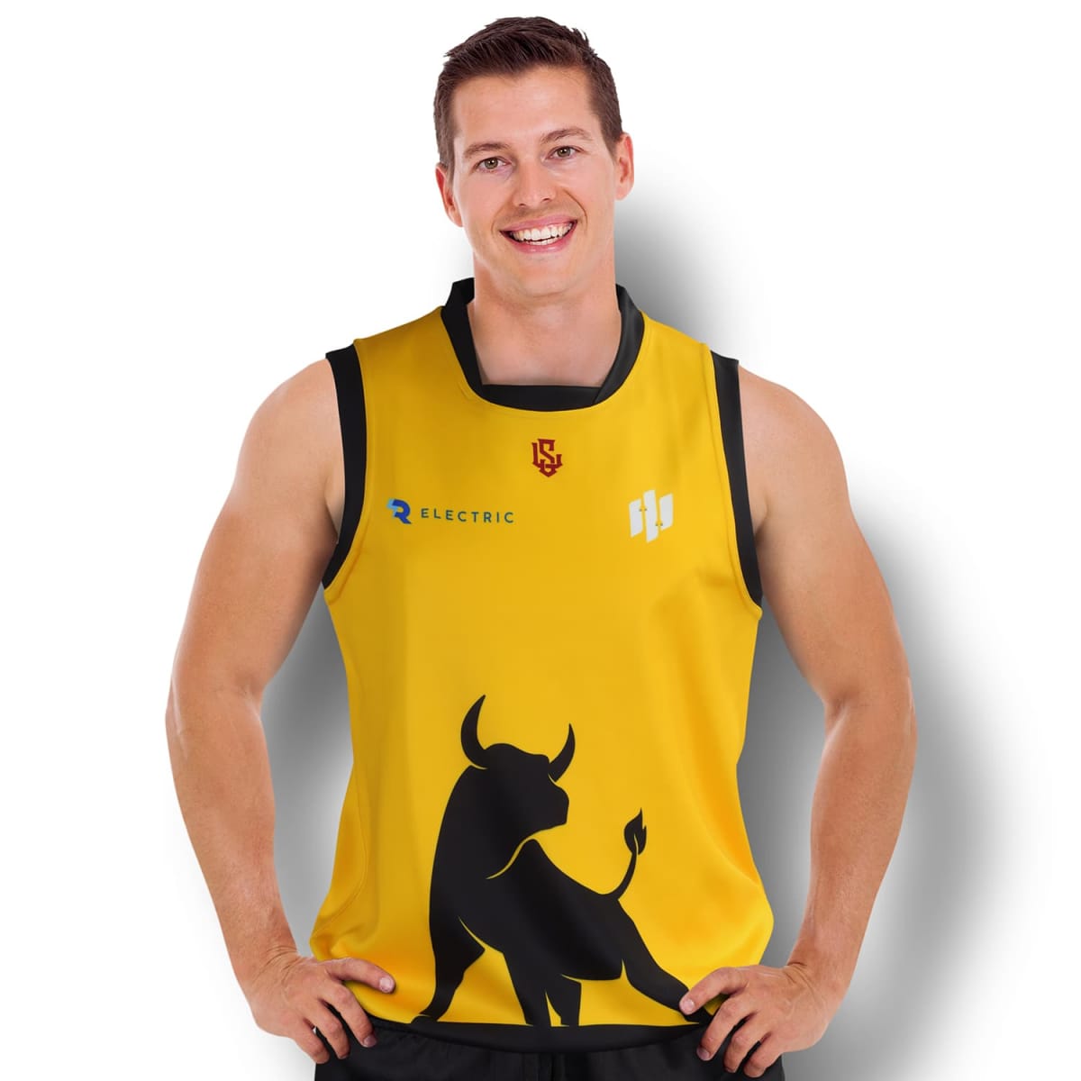
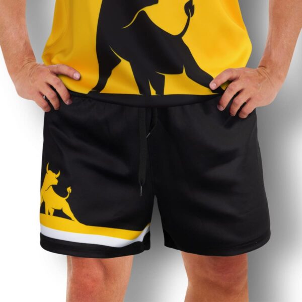
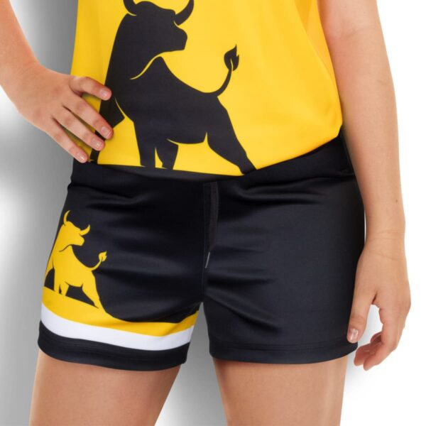
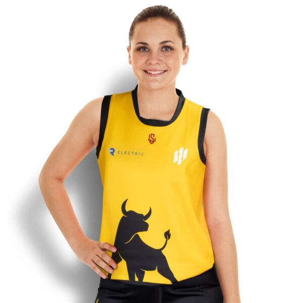
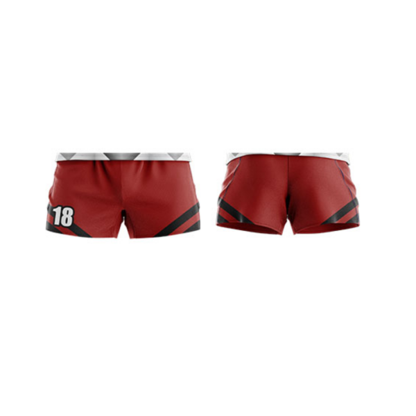
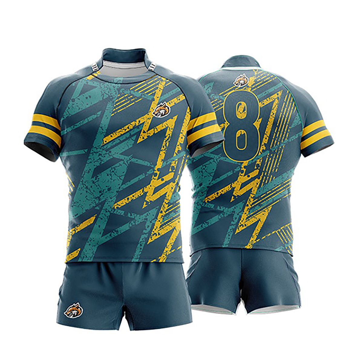
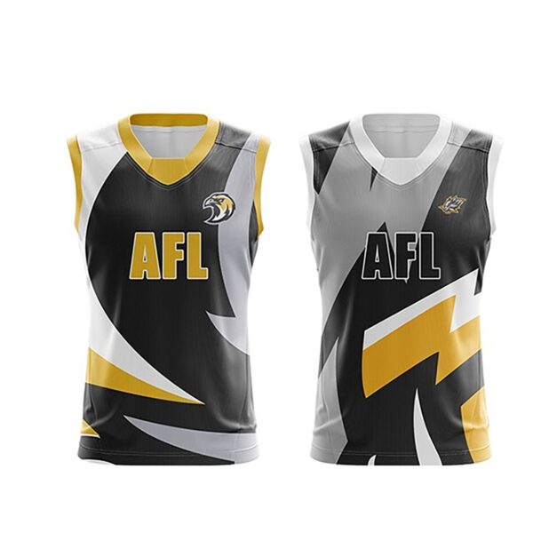
AFL stands for Australian Rules Football. It is a game popular in Australia. We supply the entire players kit for you icluding jerseys, shorts, and socks tailored for maximum comfort and mobility during play. All kits come with custom printed (or sublimated) with your teams identity, sponsors, and logo in a professional and eye-catching way. Kick your branding into gear with Custom AFL Uniforms. Make sure to browse our selection of Custom Basketball Uniforms Jersey Kits too.
Who We Supply Sports Kits To
We supply AFL uniform kits to local sports teams and Aussie companies including.
- Local Clubs: Provide players with high-quality, customized uniforms to boost team spirit and enhance performance.
- Corporate Teams: Design branded kits for workplace competitions or team-building events.
- School Teams: Supply students with professional-grade uniforms for school sports programs.
- Community Sports Leagues: Equip teams with durable, customized uniforms for weekly matches.
As well we supply Event Organizers who want to engage in an AFL themed marketing campaign.
Branding Techniques We Use
We offer a range of customisation methods to ensure your AFL uniforms meet your team’s unique needs:
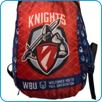
- Sublimation Print: High-quality, full-colour designs integrated directly into the fabric.
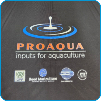
- Screen Printing: Perfect for bold, vibrant logos and numbers.
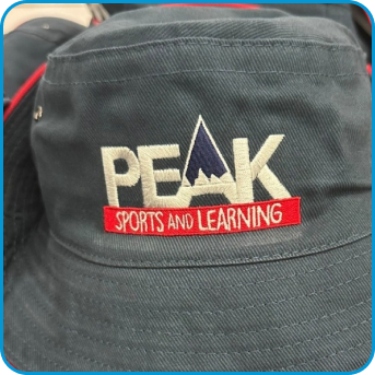
- Embroidery: Adds a premium touch to logos or sponsor names.
Some of the best jerseys we have created for clubs, include 2 different types of decoration for an incredibly brilliant looking kit.
Frequently Asked Questions
How do I order Custom AFL Uniforms?
- Enquiry: Submit your details using our online form.
- Quote: Receive a detailed quote within one hour during business hours.
- Mock-Up: Share your logo and design ideas, and we’ll create a preview for approval.
- Approval: Confirm the design, and we’ll issue an invoice for payment.
- Production & Delivery: Your customised uniforms will be produced and delivered promptly.
Do you offer uniforms for all sizes?
Yes, we provide a full range of sizes to suit players of all ages and builds.
What’s the production time?
Uniforms are typically completed within 2-3 weeks after design approval, with faster options for urgent orders. We supply Australia-wide.