How We Check Print Colour Accuracy?
Last Updated: 11 May 2026
Key Points
- Colour accuracy matters in branded merchandise because even small colour differences can affect brand consistency, approvals, and how professional products look.
- Different branding methods like screen printing, embroidery, pad printing, and digital printing all affect colour differently, so each method needs separate colour checks.
- Physical samples, indoor lighting tests, and natural sunlight checks help catch colour issues before large bulk orders go into full production.
If you’ve ever approved artwork and still thought, “That blue looks different in real life”, you’re not alone. Colour accuracy is one of the most important and most misunderstood parts of branded merchandise. At Cubic Promote, we don’t rely on screens, guesses, or settling for ‘close enough.’
We follow a step-by-step process to make sure your brand colours look right on the product, under different lighting, and when your audience sees them. Here’s exactly how we do it and why it matters for Australian B2B buyers who order in bulk.
Why Colour Accuracy Is Non-Negotiable for B2B Brands?
Your logo colour isn’t decoration. It’s recognition, trust, and consistency. When colour is off, even slightly:
- Brands look less established.
- Marketing teams get internal pushback.
- Procurement loses confidence
- Events feel less polished.
And once thousands of units are printed? There’s no undo button. That’s why colour checking at Cubic Promote happens before, during, and after production.
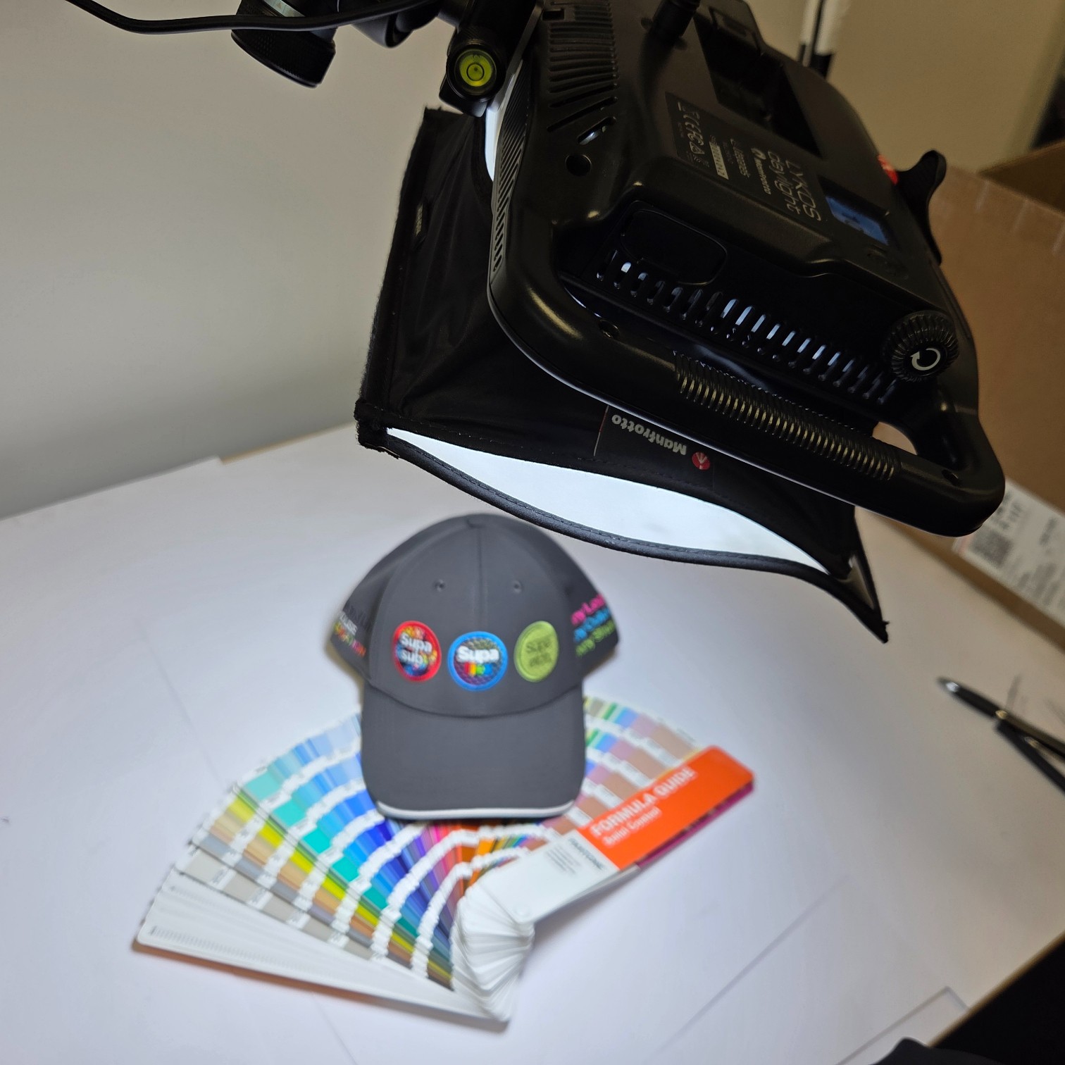
Step 1: We Start with the Right Colour Reference (Always)
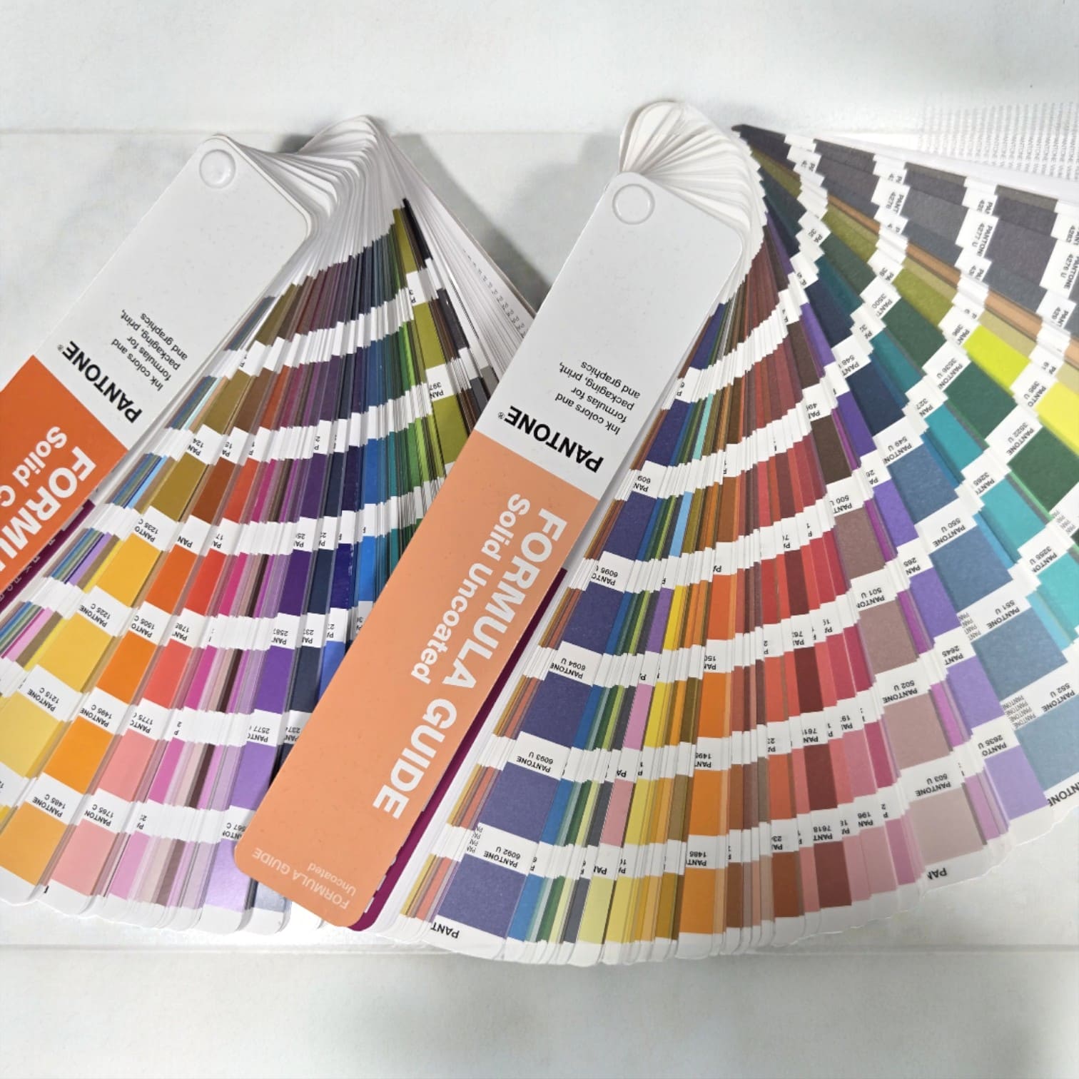
Everything begins with clarity. Pantone references are especially important because screens can be misleading. Monitors, brightness, and colour profiles all vary. PMS gives us a physical, standard colour reference instead of relying on guesswork.
We ask for:
- PMS (Pantone) colour codes were available
- Vector artwork (AI, EPS, or high-res PDF)
- Clear brand guidelines, if you have them
Step 2: We Match Colour to the Decoration Method
This is a step that many suppliers overlook: Colour behaves differently depending on how it’s applied. We treat each branding method differently.
Pad Printing
With methods like pad printing on promotional items, colour is mixed as ink and transferred via a silicone pad. Pad printing is precise, but small changes in pressure or surface can shift the colour slightly. We plan for that from the start.
We check:
- Ink formulation vs PMS reference
- Ink density on curved or textured surfaces
- How the substrate (plastic, metal, rubber) affects tone
Screen Printing
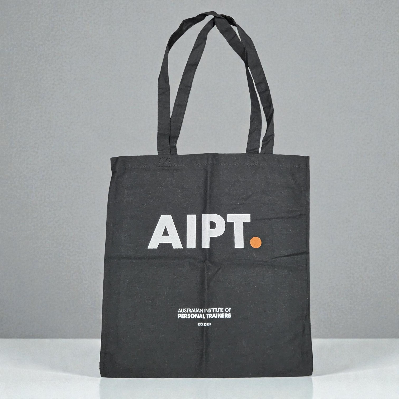
For larger print areas, especially on apparel and bags, screen printing is the go-to for promotional items. A navy colour printed on cotton will not look the same as it does on polyester. We test for that before approving production runs.

Here we assess:
- Ink opacity (especially on dark fabrics)
- Underbase requirements
- Fabric absorption
Digitally Printed Labels
With digitally printed labels, colour accuracy depends heavily on calibration. Digital printing is flexible, but only if the machines are properly calibrated. Ours are.

We check:
- Printer profiles
- CMYK to PMS conversions
- Gloss vs matte finishes (they change how colour is perceived)
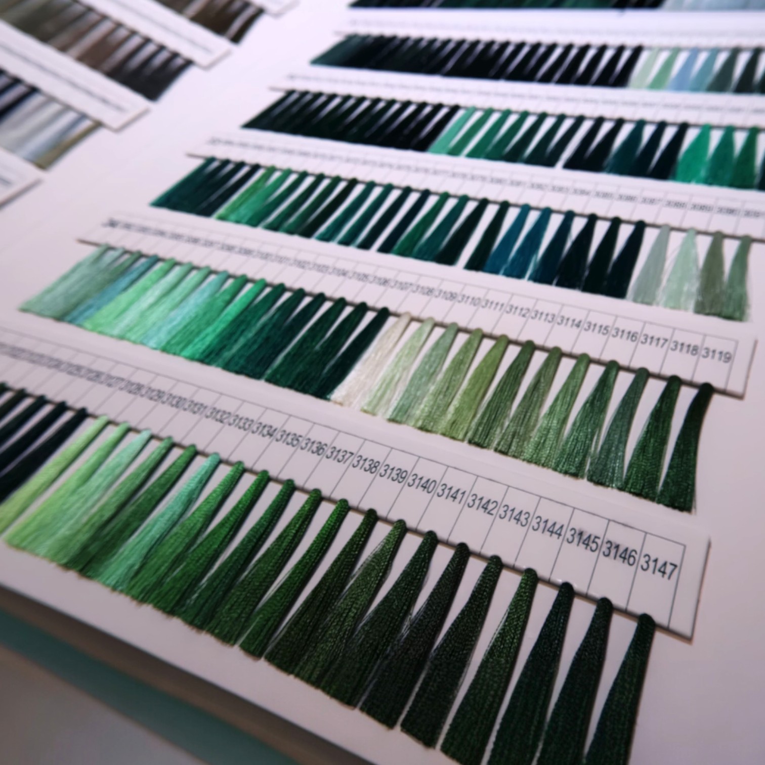
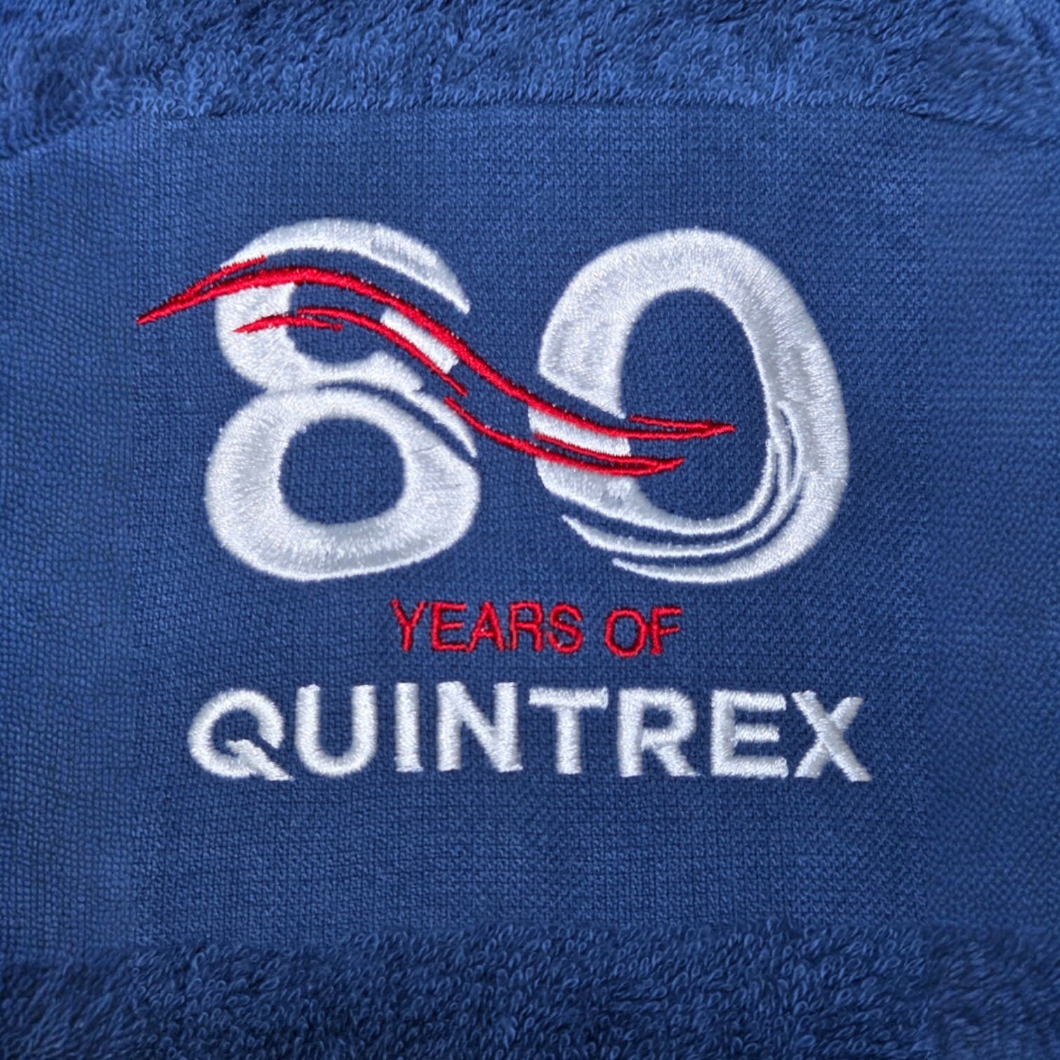
Embroidery
Embroidery on promotional items is a completely different process. Thread isn’t ink. Some colours do not translate perfectly into thread. When this happens, we let you know early and suggest the closest and best-looking alternative.

We evaluate:
- Thread colour libraries vs PMS
- Stitch density (dense stitching deepens colour)
- Direction of stitch, since it affects how the colour reflects light
Step 3: Physical Sampling, Not Just Digital Proofs
Digital proofs are useful. They are not the final word. This is where theory meets reality. Ink on a screen is not the same as ink on a product. We only sign off when we’re happy with what’s physically in front of us.
For colour-critical jobs, we review:
- Pre-production samples
- Strike-offs
- Production samples from the actual batch
Step 4: The Indoor Light Check (Office Reality Test)
Most branded merchandise lives indoors. Some colours skew cooler or warmer under artificial light. If we see it, we catch it here.
We check colour under:
- Office lighting
- Fluorescent lights
- Warm indoor LEDs
This shows how your logo will look:
- On desks
- In meeting rooms
- At conferences
- In onboarding kits
Step 5: The Natural Sunlight Check (Real-World Test)
This is a step many suppliers skip, but we do not. We take the finished product outside. If a colour only looks good inside a warehouse, that is not good enough.
Natural sunlight reveals:
- Undertones you won’t see indoors.
- Saturation shifts
- Contrast issues on certain materials

Why this matters:
- Events happen outdoors
- Staff use merch on the go.
- Logos are photographed in daylight.
- Social content lives under natural light.
Step 6: Side-by-Side Brand Consistency Review
We often line up:
- New production samples
- Previous orders
- Existing brand assets
This ensures:
- Repeat orders stay consistent.
- Multi-item kits look cohesive.
- Different products don’t clash visually.
This step is especially important for:
- Large corporates
- Government departments
- Ongoing uniform or merch programs
Consistency builds trust, and we make sure to protect it.
Common Colour Challenges (And How We Handle Them)
No surprises. No last-minute panic.
Why This Process Matters for Bulk Orders?
When you’re ordering hundreds or thousands of units:
- Small colour errors multiply fast.
- Reprints cost time and money.
- Stakeholders notice
Our colour accuracy checks protect:
- Your brand reputation
- Your internal approvals
- Your project timelines
And, honestly, your peace of mind.
The Cubic Promote Difference
We don’t just print logos. We safeguard brands. Colour accuracy isn’t one step. It’s a system. From receiving your artwork to the final sunlight checks, we treat your branding as if it were our own, because once it is out there, it represents you.
If you’re planning a colour-critical project and want confidence before you commit, talk to our team early. We will guide you through the best decoration method, material choice, and colour approach before anything goes to print. That’s how we keep Australian brands looking sharp.
