


Why Buy Custom Activewear?
Activewear is more than just apparel— with your brand on it, it becomes a walking advertisement. People wear branded fitness clothing in gyms, parks, outdoor events, and everyday life, ensuring long-lasting exposure for your brand.
We recommend this product because:
-With breathable fabrics, sweat-wicking technology, and ergonomic designs, our custom activewear is ideal for high-energy environments.
-Whether you’re organising a fundraising run, a workplace fitness challenge, or a school sports day, branded apparel adds a professional and unified look to any event.
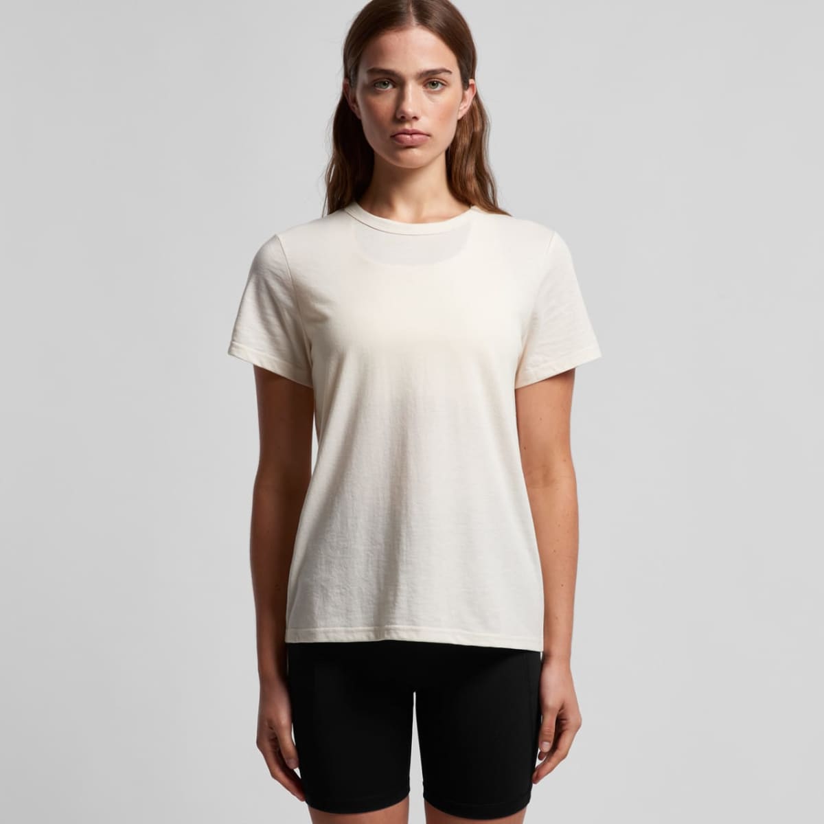
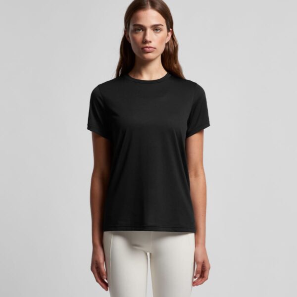
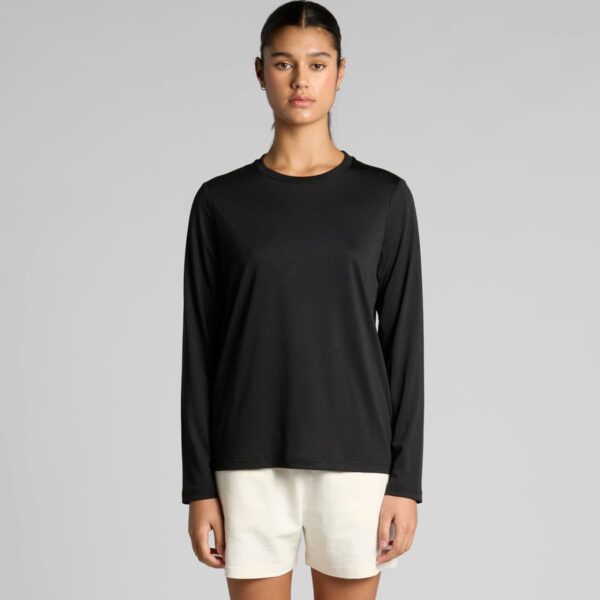
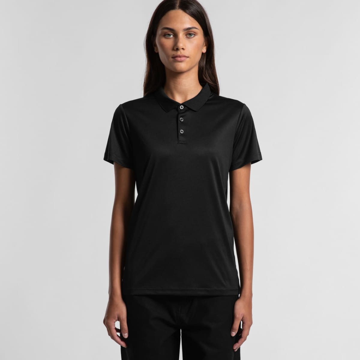
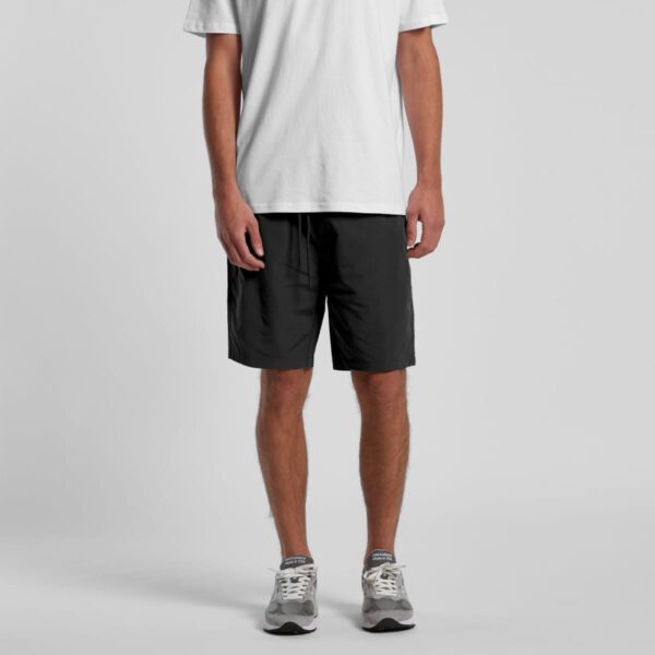
What Is Promotional Activewear?
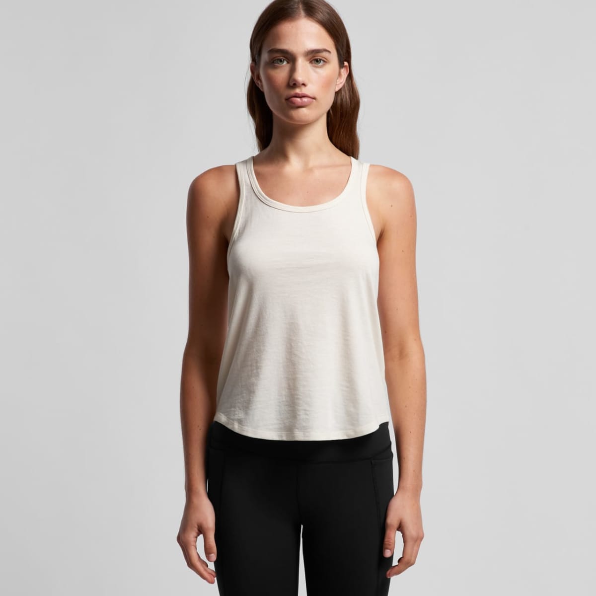
Activewear is clothing designed for sports, exercise, and outdoor activities. It offers maximum comfort and movement and is made from lightweight, flexible, and sweat-resistant fabrics.
They include:
- Performance T-Shirts & Singlets
- Running Shorts & Leggings
- Polo Shirts & Training Tops
Customising the product with your logo or design, you can turn them into “Promotional Activewear” that showcases your brand for everyday activities.
Who Uses Custom Activewear?
Custom-branded activewear is widely used across various industries and events, including:
- Sports Teams & Fitness Groups
- Charity & Fun Runs
- Corporate Events & Workplace Initiatives
- Outdoor Brands & Adventure Companies
Case Study: A Community Fun Run’s Branded Activewear Success
A Charity Run initiated by Brisbane City needed cost-effective yet high-quality activewear for its annual fundraising event. They wanted a product that participants would wear again, ensuring continued brand visibility beyond race day.
Cubic Promote supplied 800 moisture-wicking performance t-shirts, each printed with the event logo and key sponsors’ branding. The shirts were distributed as part of the race registration pack, creating a unified, professional look for all runners. Post-event feedback was overwhelmingly positive.
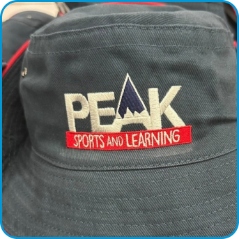
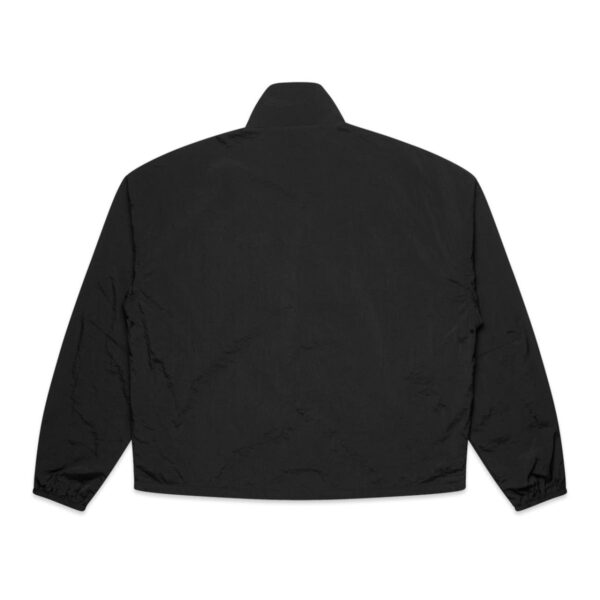
Printing & Branding Methods: Activewear
We offer multiple branding techniques to ensure your logo stands out:
- Embroidery
- Screen Printing
- Sublimation Printing
- Digital Transfer Prints
- Heat Press Vinyl
Who Buys Custom Branded Athletic Wear?
Organisations that choose to buy activewear include:
- Sports Teams & Clubs
- Corporate & Charity Events
- Gym Promotions
- School & University Programs
Free Australia-Wide Delivery
We supply Australia-wide.
📦 Fast turnaround ensures your activewear arrives on time for events and promotions!
How to Order Custom Activewear
Learn in detail about our ordering process now!
1️⃣ Choose Your Apparel – Select from t-shirts, singlets, or custom uniforms.
2️⃣ Upload Your Design – Send us your logo or request design assistance.
3️⃣ Approve Your Digital Proof – We’ll send a mock-up before production begins.
4️⃣ Receive Your Order – Shipped free Australia-wide within 1-2 weeks.
✔ Bulk discounts apply
✔ Price match guarantee available
✔ All prices exclude GST
Frequently Asked Questions
1️⃣ What can I use promotional activewear for?
It is ideal for sports teams, fitness promotions, and outdoor events.
2️⃣ What materials are available?
We offer moisture-wicking polyester, cotton blends, and breathable fabrics.
3️⃣ How long does production take?
Standard turnaround is 1-2 weeks after artwork approval.
4️⃣ Can I order multiple colours in one bulk order?
Yes! You can mix and match colours to suit your brand.
5️⃣ Do you price match?
Yes! We offer a price match guarantee to ensure you get the best deal.
Order Custom Activewear Today!
📢 Place your bulk order today—FREE Australia-wide delivery and price match guarantee available!