


Why Businesses Choose Custom Specialty Apparel
- Practical & Industry-Specific – Designed to fit the needs of different industries
- Durable for Daily Use – Apparel that withstands demanding work environments
- Large Branding Space – Ensures logos and messages stand out.
- Bulk orders attract significant discounts – This is why we are the favourite wholesale supplier amongst thousands of Australian businesses.
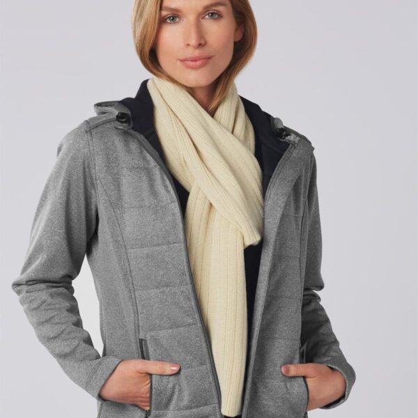
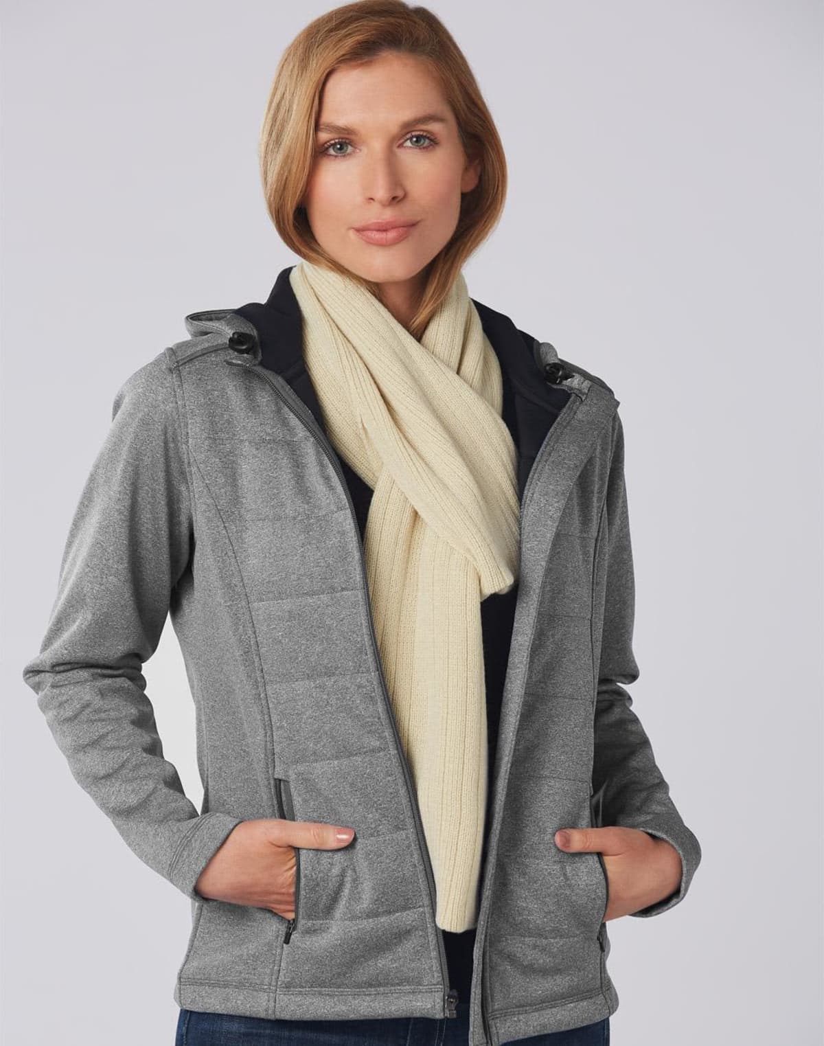
All our clothing is sustainably sourced and manufactured. We are SEDEX members and have strict procurement policies to ensure fair trade, fair pay and safe working conditions.
Who We Supply To:
Cubic Promote has supplied thousands of organisations, including charities, schools, retailers, government departments, small businesses, large multi-national businesses and organisations with custom-branded apparel accessories. Some of the places include:
- Restaurants, Cafés & Bars – Branded aprons, chef jackets, and bar uniforms
- Construction & Industrial Companies
- Retail & Customer Service Teams – Staff uniforms and custom aprons for store assistants
- Event Organisers & Festival Teams – Ponchos, bandanas, and rainwear for large outdoor events
- Merchandise for Resale with retail brands and food and beverage brands
- Tourism & Hospitality Businesses – Branded sarongs, resort uniforms, and front-of-house accessories
Printing & Branding Methods: Clothing Accessories
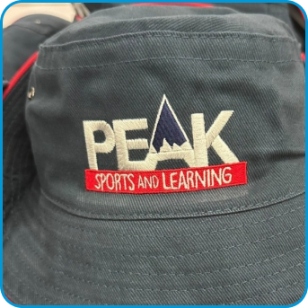
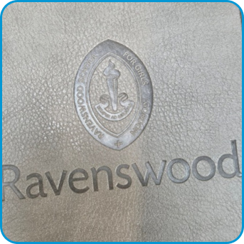
- Embroidery – Stitched logos for long-lasting, professional branding
- Screen Printing
- Heat Transfer Printing – Ideal for complex, multi-colour graphics
- Sublimation Printing – A premium method for all-over prints on select apparel
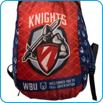
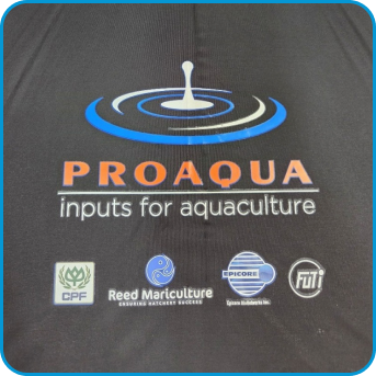
- Direct digital printing – Full-colour graphics and logos
What Our Team Thinks About this Category
From pyjamas to belts to everything in between. We stock the tiny little items which are essential for daily use. We think this category complements the daily lifestyles of Aussies, whether you’re at school, at work, at home or at play. If you’re an organisation, your clients, guests, students, constituents, and staff will appreciate what this category has to offer.
FAQ
Q: What is the minimum order quantity for apparel accessories?
A: Most items start at 25–50 units, with discounts available for bulk orders.
Q: How long does production take?
A: Standard production is 1–2 weeks after artwork approval, with express options available.
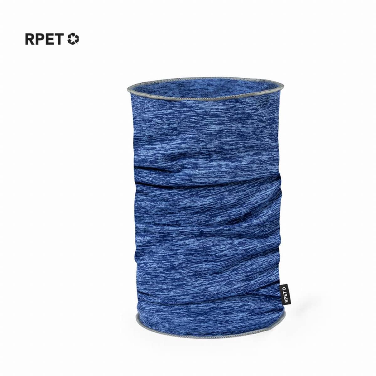
Q: Are sustainable apparel options available?
A: Yes! We offer organic cotton, recycled fabrics, and biodegradable ponchos.
Q: Can I mix different apparel types in one order?
A: Absolutely! You can combine aprons, safety vests, rain jackets, and more in a single bulk order.
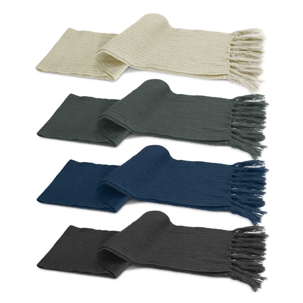
Bulk Order Pricing – More Apparel, Greater Savings
Speciality apparel is best ordered in bulk, whether for staff uniforms, promotional campaigns, or safety gear. Our tiered pricing structure ensures that the cost per unit decreases at 25, 50, 100, 250, 500, and 1000 units, allowing businesses to maximise their budget while ensuring consistent branding.
Key Benefits
- Tailored for Industry-Specific Needs – Custom workwear, hospitality uniforms, and event apparel that fits the job
- Highly Visible Branding – Ensures staff, teams, and event attendees stand out
- Designed for Durability & Comfort – Made for tough work environments, outdoor wear, and long shifts
- Sustainable Options Available – Recycled and eco-conscious materials available upon request
Buying Tip #1
Investing in matching branded aprons, shirts, and headwear for hospitality and retail businesses creates a polished and cohesive team appearance, reinforcing brand professionalism.
Buying Tip #2
Businesses running outdoor events or worksite promotions should consider high-vis safety apparel, waterproof ponchos, and weather-resistant jackets to ensure staff and event attendees stay comfortable in any conditions.
Order Custom Specialty Apparel Today
Need industry-specific branded apparel for your business, team, or event? Cubic Promote offers expert embroidery, bulk discounts, and fast turnaround. Request a quote today and dress your team for success. We supply Australia-wide.