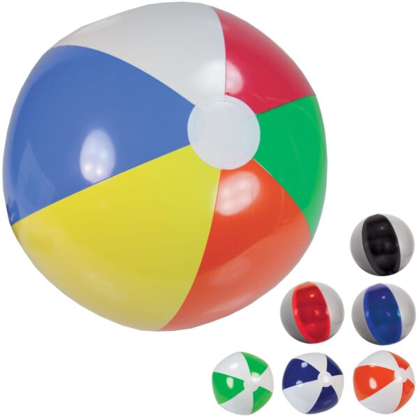


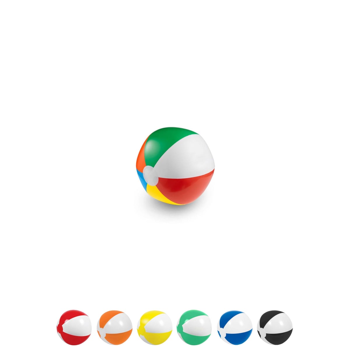

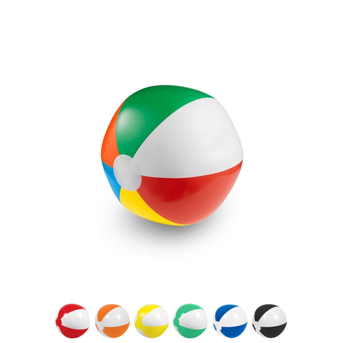
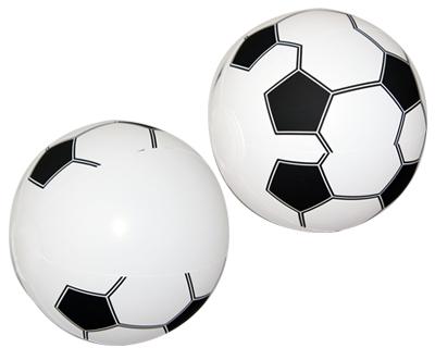


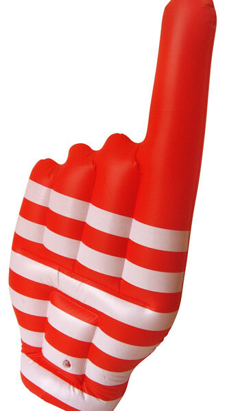

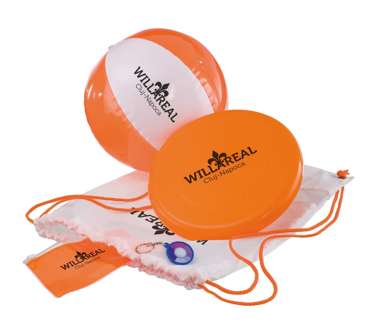
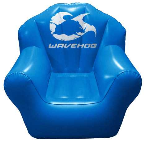

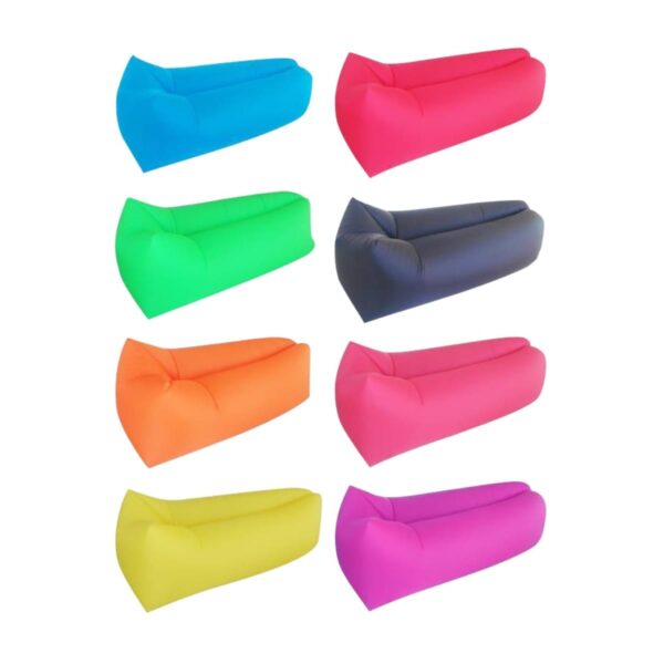

What Are “Beach Balls & Inflatables”?
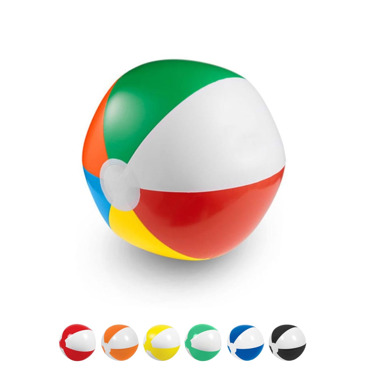
Beach Balls & Inflatables are lightweight, air-filled items used for recreational fun at the beach or in a swimming pool. Branding your logo onto them turns them into promotional items that capture attention and engage audiences. Inflation is easy with these products and they flat pack incredibly well. This makes them easy to transport to events. Inflation can easily be done by blowing into the rubber nozzles. They’re perfect for creating an interactive, fun atmosphere at any event. From bouncing around outdoor festivals to floating at poolside parties, these products ensure your brand stays seen.
Organisations we Recommend These To
Are you hosting a sports day, running a charity fundraiser, or managing a resort? Beach Balls & Inflatables are necessary for leisure centres, schools, tourism operators, and community organisations. These playful products unite people while showcasing your brand in an energetic, eye-catching way.
They are perfect for event organisers looking to leave a lasting impression. These inflatables don’t just entertain—they’re a marketing powerhouse. Bright, bold, and interactive ensure a broad audience sees your logo. Whether flying through the air at an event or dotting the shoreline, they enhance your brand’s visibility.
Case Study: Massey University Boosts Social Media Presence by 10%
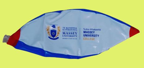
Massey University, a leading public research university in New Zealand with campuses in Auckland, Palmerston North, and Wellington, turned to Cubic Promote to supply 1,500 custom-branded beach balls. The university, known for its innovative approach to education across various disciplines, wanted a fun and eye-catching way to engage both current and prospective students. These vibrant beach balls, featuring Massey’s logo in blue, white, and red, were handed out during orientation days, open houses, and campus social events, becoming the highlight of many campus activities.
Key Metrics (Feedback from staff):
- 10% growth in social media mentions within 2 weeks, with students sharing posts featuring the beach balls and tagging the university
- Saved 120 AUD on their promotional budget for that school year
By choosing a fun and functional item like the beach ball, Massey University successfully increased engagement and visibility, reinforcing its reputation for creativity and innovation while keeping the campus atmosphere light and fun.
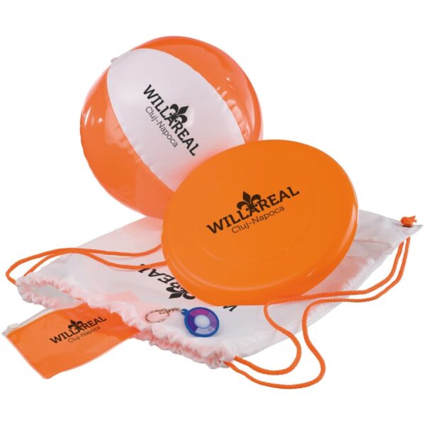
Custom Brand and Print Your Logo on Inflatables
Take your branding to the next level with our customisation options:
- Full-Colour Direct Digital Printing: For intricate logos that may have a variety of different shades of colour.
- Screen Printing: For simple bold print colours
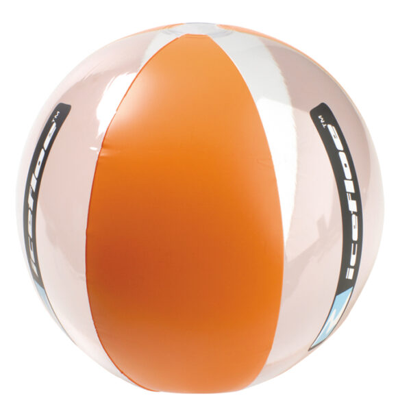
You may also order these promotional beach balls with custom colour panels of your choice:
- Custom Colour Combinations: Matches your brand’s or event theme colours.
Make your next campaign unforgettable with our Beach Balls & Inflatables. Fun, engaging, and impactful, they’re the perfect way to get your brand bouncing. We supply Australia-wide. These beach balls go hand in hand with our range of Promotional Beach Towels – browse today!