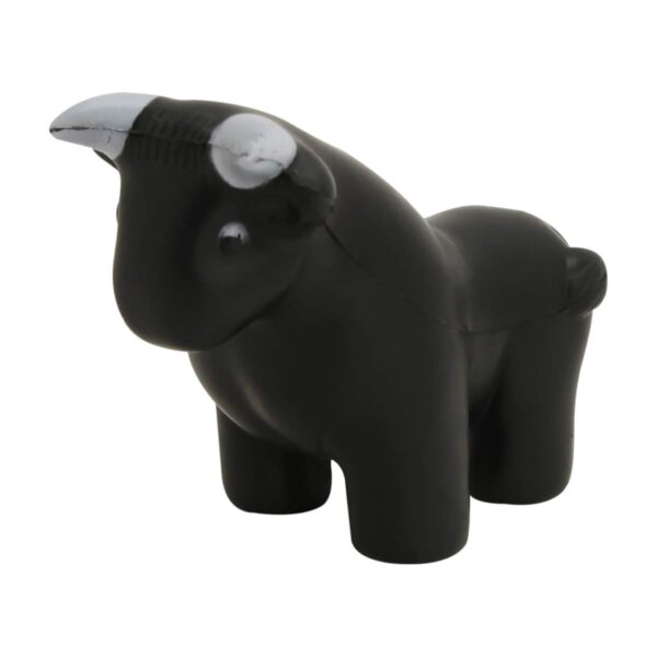
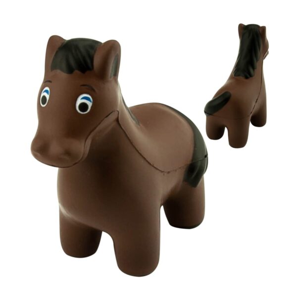
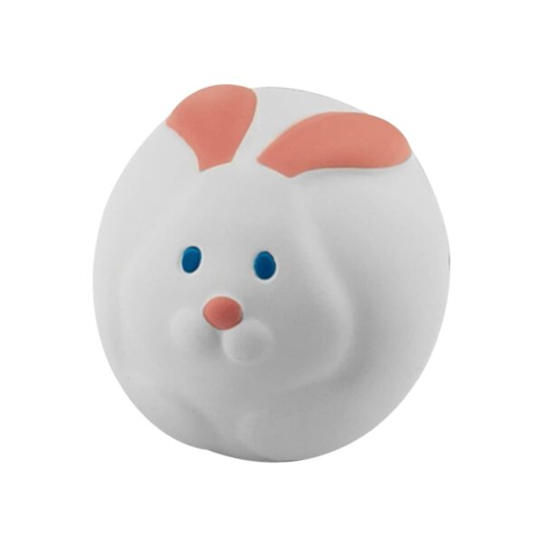


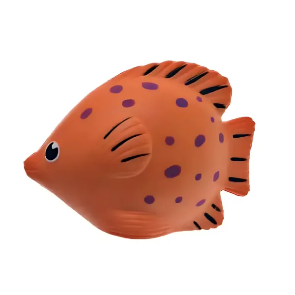


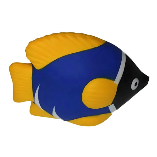
What Are Animal Stress Balls?
Similar to round-shaped stress balls, but in the shape of Animals. Stress balls are made from PU foam and moulded into the shapes of different animals. Their designs range from realistic depictions of pets like dogs and cats to comical farm animals like pigs and cows. These custom Animal shaped promotional stressballs are made from high-quality, soft materials that are satisfying to squeeze. It is ideal for both practical and decorative purposes. Their delightful shapes and bright colours make them stand out, ensuring they won’t be forgotten after your event or campaign.
Clients We Supply To
Cubic Promote has supplied these stress shapes to schools and multinational businesses. Businesses targeting families, such as childcare centres or schools, can use animal stress balls to connect with younger audiences in a fun, tactile way. Even corporate brands can embrace them to add a touch of personality to their campaigns, especially when tied to themes of creativity, nature, or playfulness.
Why Choose These as Merch?
When a regular stress ball is too generic or a pen too dull, consider this category. Animal stress balls’ unique shapes and designs create an emotional connection with recipients. A cheerful monkey or an adorable koala? We know these items spark joy and bring a smile, making them highly engaging. They are suitable for everything from trade show giveaways to employee wellness programs. Their association with animals naturally ties in with care, compassion, and friendliness themes.
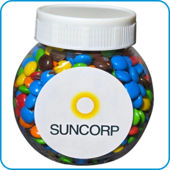
Should you be looking for stress balls, don’t miss our collection of Food & Drink Shaped Novelty Promotional Stress Balls.
How We Custom Brand Them
Animal stress balls offer a fantastic canvas for customisation, ensuring your logo takes centre stage. Whether it’s printed on the belly of a cow stress ball or along the side of a dolphin, your branding will shine. With various animal shapes and colours available, you can tailor your promotional item to align with your company’s theme or message. For example, a dog stress ball is ideal for a pet care business, while a kangaroo could represent Australian pride.
At Cubic Promote, we specialise in custom branding and offer:
- Pad Printing (perfect for prints up to two colours)
- Digital Transfer Printing (ideal for full-colour designs)
Add charm and creativity to your next campaign with animal stress balls. Whether you’re spreading awareness, fostering connections, or simply adding a touch of fun, these quirky items will surely make your branding unforgettable. Contact us today to create your custom animal stress balls! We supply Australia-wide.