2026 Custom Printed Corporate Calendars
#1 Supplier of Calendars
Purchase Promotional 2026 Calendars for your organisation. We are Australia’s leading calendar supplier for corporates around Australia. Buy wholesale at cheap prices. Have your logo or your company imagery personalised onto each of the calendars. Suitable for your staff, guests or clients.
Filter Products
Hot Sellers
Shop Our Range
Showing 1–16 of 16 results
- Sort by price: low to high
- Sort by price: high to low
- Sort by latest
-

12 Page Desk Calendars
Prices From $6.36 -

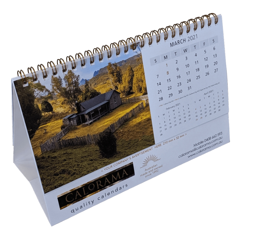
6 Leaf Wall Calendars
Prices From $8.33 -

Bamboo Desk Calendars
Prices From $9.66 -

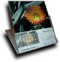
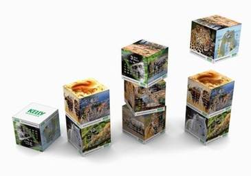
Cd Box Calendars
Prices From $3.99 -
Desk Calendars
Prices From $1.71 -
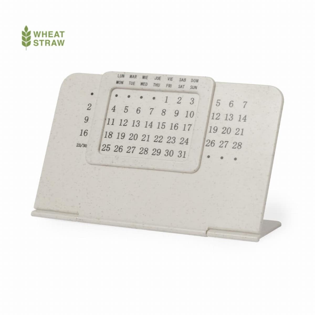
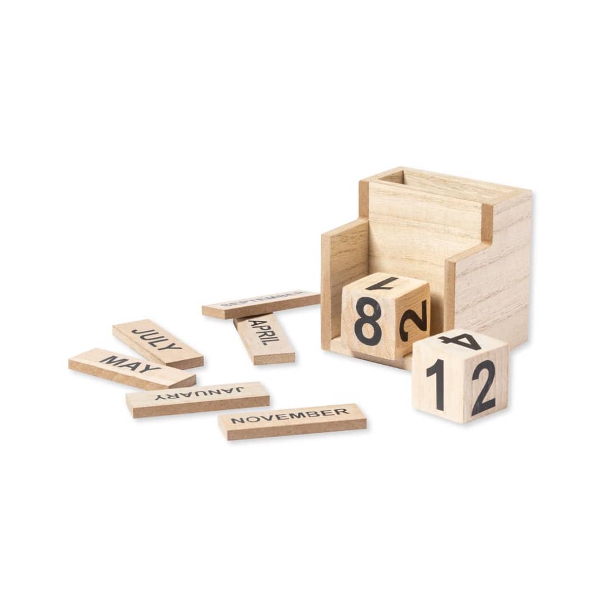
Everlasting Calendars With Foldable Stands
Prices From $4.25 -
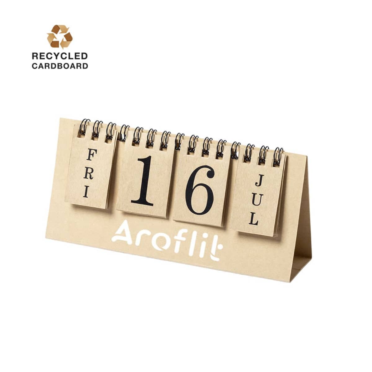
Everlasting Flip Calendar
Prices From $2.78 -

Horizon Desktop Calendars
Prices From $17.53 -

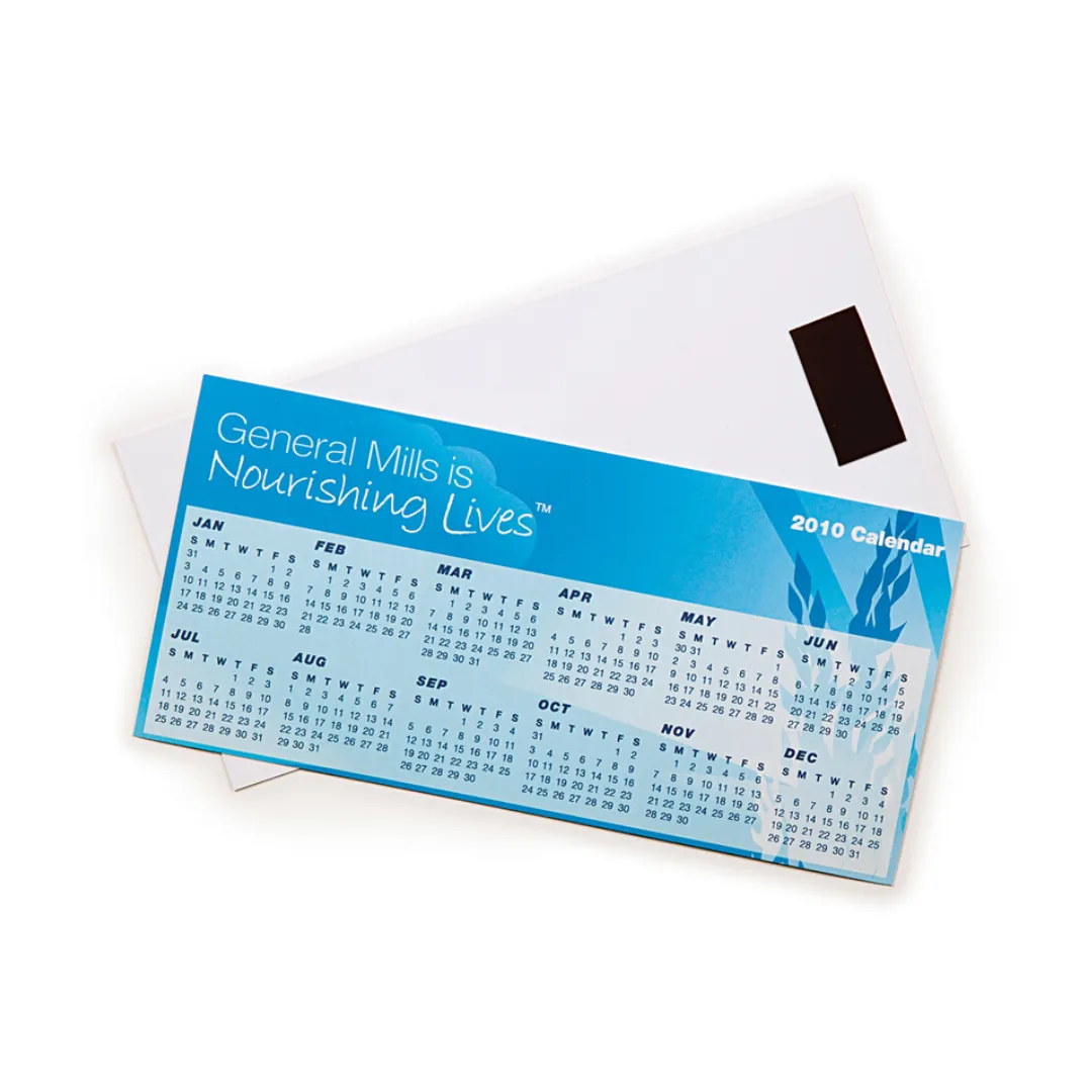
Magnetic Printed Calendars
Prices From $11.67 -
Magnetic Tab Calendars
Prices From $1.70 -
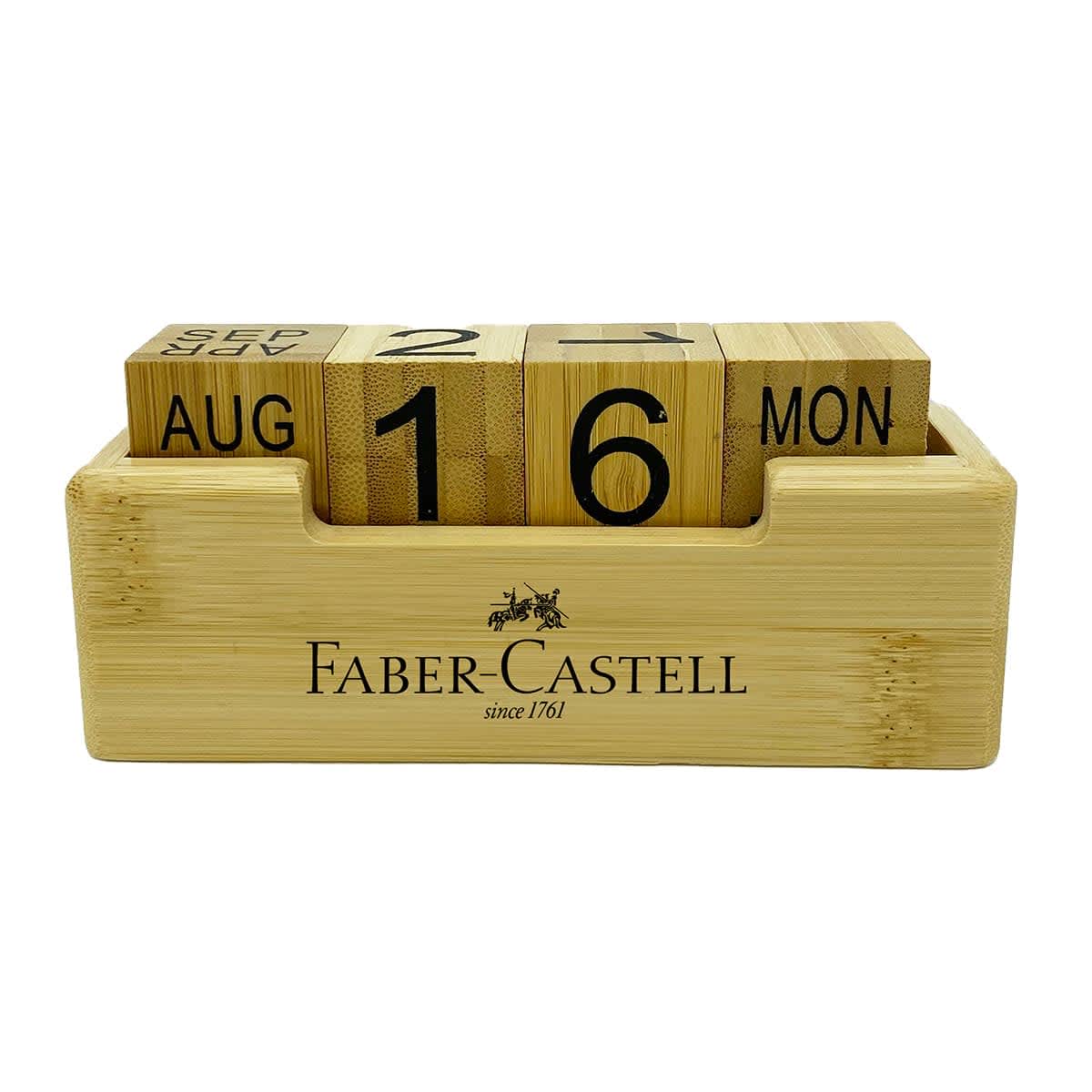
Perpetual Bamboo Calendars
Prices From $9.57 -
Perpetual Calendar Notepads
Prices From $23.70 -
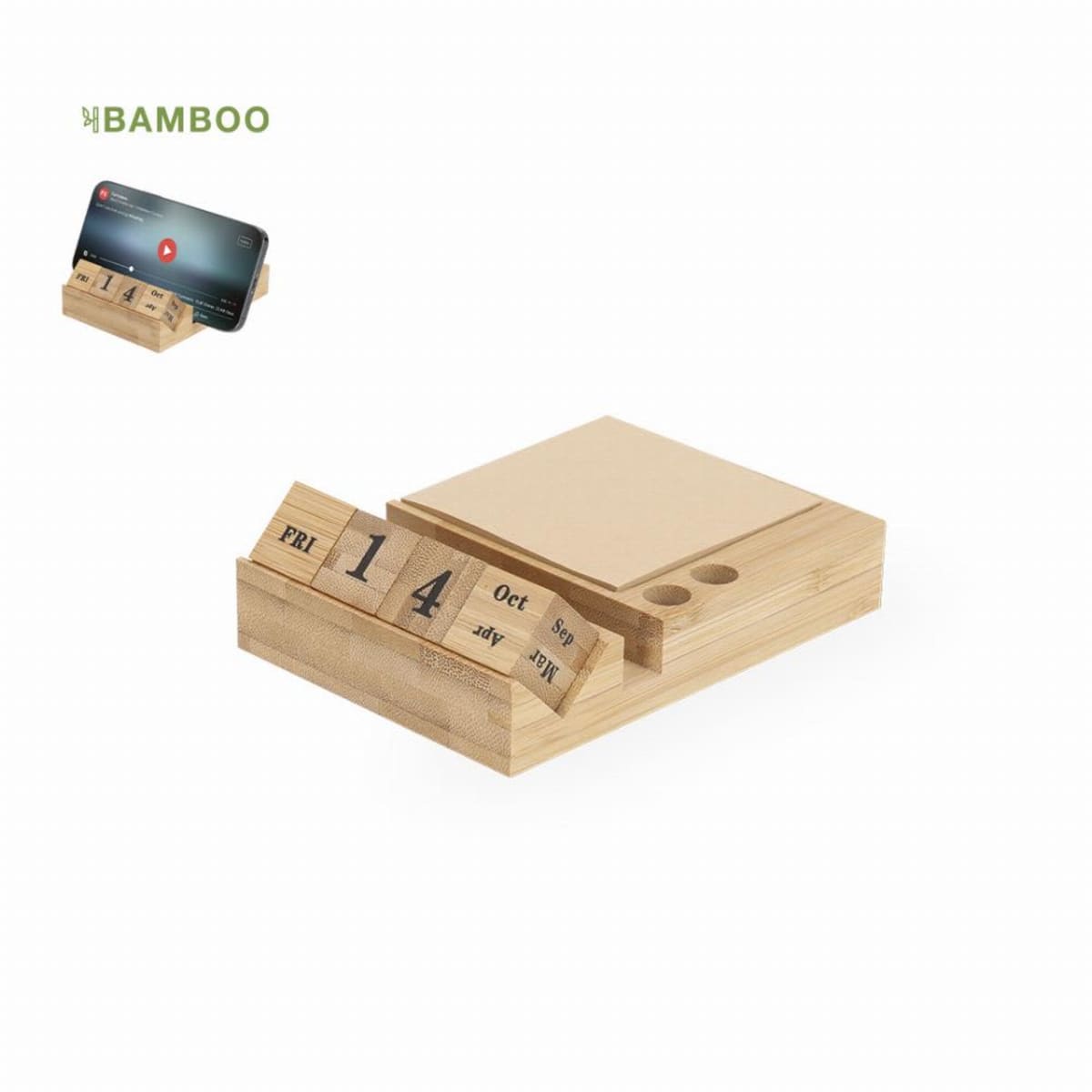
Perpetual Desk Calendar And Pen Stands
Prices From $23.42 -

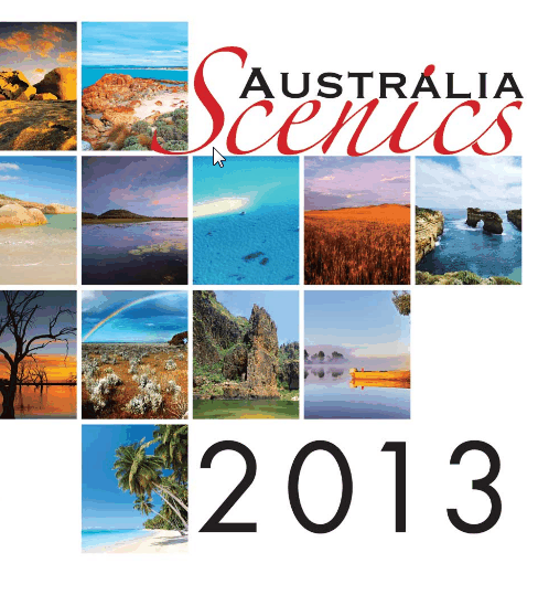
Personalised Australia Scenics Wall Calendars
Prices From $13.77 -

Vista Desktop Calendars
Prices From $9.09 -
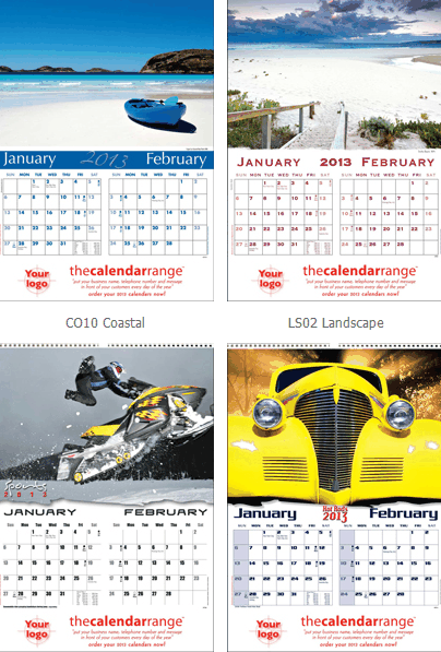
Wall CalendarsAustralia
Prices From $12.70


What Are Promotional 2026 Calendars?
Promotional 2026 calendars are customised date-planning tools designed to promote your business daily. They are available in multiple formats, such as wall-mounted styles for maximum impact, compact desk options for easy reference, and portable pocket calendars. Calendars printed with your logo and business details are the perfect corporate gift. These products blend functionality with brand exposure, making them valuable to your marketing strategy.
Who & What Type of Organisation Is It For?
Promotional calendars are ideal for professionals who want a cost-effective way to strengthen brand visibility. Typical buyers include:
- Event organisers seeking memorable giveaways
- Marketing managers aiming to maintain client engagement
- Office managers providing valuable items for staff
- Procurement teams ensure budget-friendly branded items
- Brand managers looking to reinforce their visual identity
These calendars are perfect for real estate, finance, education, hospitality, and corporate sectors.
Benefits of This Category for You
- Year-Round Visibility: With your branding displayed daily, promotional calendars offer continuous exposure.
- Customisation Options: Choose layouts and formats and even supply your images.
- Cost-Effective Advertising: Bulk purchasing makes these calendars a budget-friendly marketing tool.
- Australian Talent Highlighted: Showcase stunning photography from renowned local artists, enhancing aesthetic appeal.
Ways We Use to Brand
We can layout your calendar anyway you like. When it comes to printing your logo, we brand using the following techniques:
- Full-Colour Printing: For vivid logos and images
- Embossing and Foiling: To add premium touches
FAQs: Everything You Need to Know 🤓
How Do I Order Promotional 2026 Calendars?
Learn in detail about our ordering process now!
Enquiry: Submit your details via our online form.
Quote: Receive a detailed quote within one hour during Australian business hours.
Mock-Up: Provide your logo, and we’ll create a visual mock-up for approval.
Approval: Once you approve the design, an invoice will be issued.
Can I use my company photos and images?
Do you ship calendars outside Australia?
What is your returns policy for your range?
Returns are only accepted for defective or incorrectly produced items. You can cancel or modify an order only before production begins. Change‑of‑mind returns aren't accepted after artwork approval. For full terms and conditions, please view our Returns Policy.
What’s the Minimum Order Quantity?
How long do you take to print and delivery my calendars?
What artwork file formats do you accept?
- Calendars custom-branded with Pad Printing. Artwork must be supplied as AI/EPS/PDF with vectorised outlines.
- Calendars custom-branded with digital full-colour printing (including transfer printing): We accept high-resolution JPEGs, PNG, PDF, Adobe Illustrator, and Adobe Photoshop files.
- Colour Reproduction: Full CMYK + Pantone spot colours available. Resolution: 300 DPI minimum for optimal print quality
- File Formats: PDF, AI, EPS, high-resolution JPEG accepted. Bleed Requirements: 3mm bleed on all sides for full-bleed designs
Can I print my company logo onto these Calendars?
How good is the quality of your calendars?
Our comprehensive quality control process ensures every corporate calendar meets Australian printing industry standards and exceeds client expectations. Each production run undergoes multiple inspection points, including:
•Pre-press colour proofing and client approval
•Mid-production quality sampling and adjustment
•Final inspection before packaging and shipment
•Post-delivery satisfaction verification and support