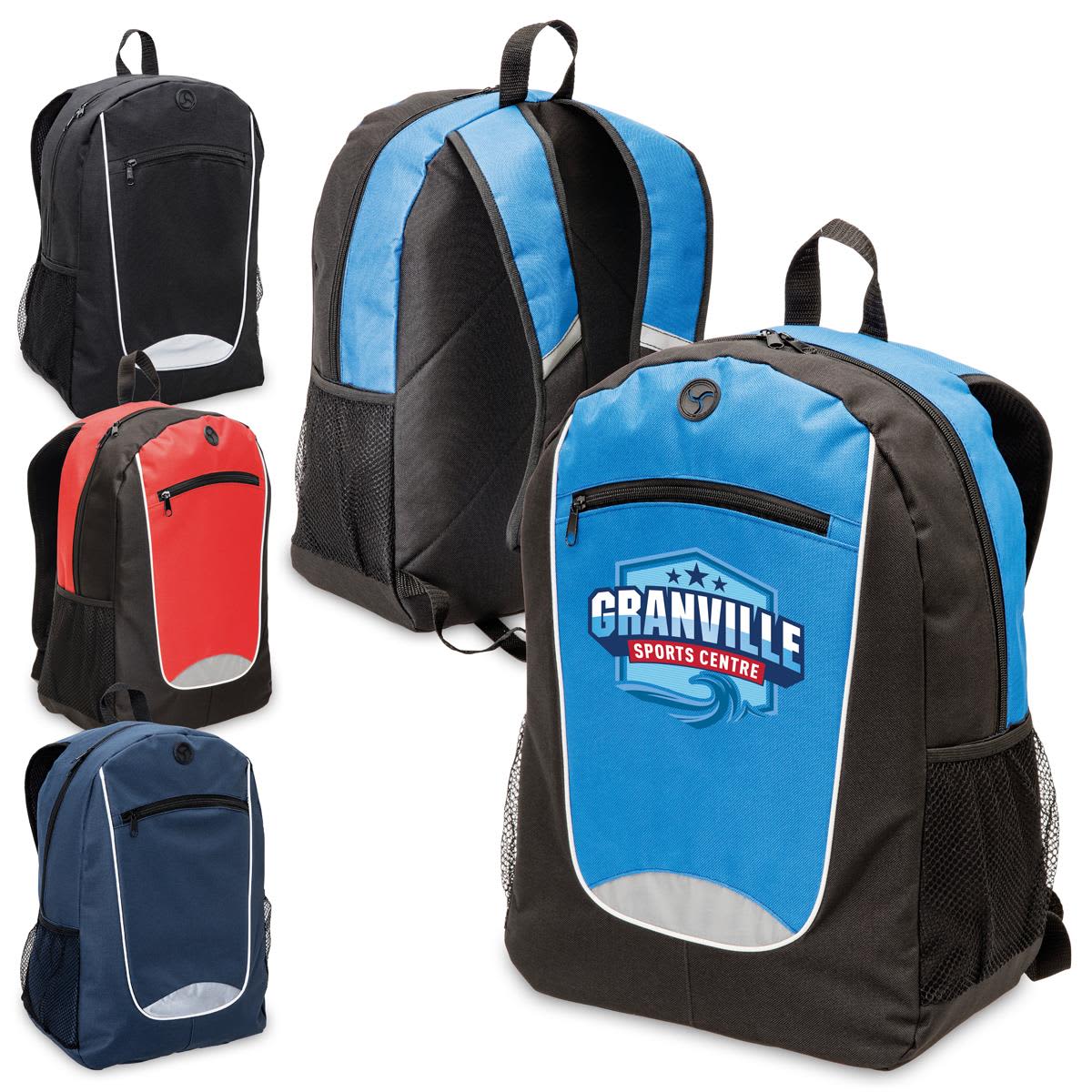
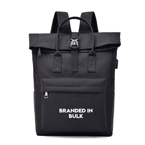
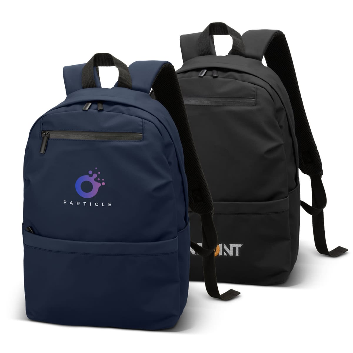
Customised Backpacks
We supply Promotional backpacks custom branded with your logo. Buy both the bag and your logo or graphic emblazoned onto the item. Backpack bags aren’t just a promotional item; they’re a practical, high-visibility branding tool that travels everywhere. Designed for businesses, schools, organisations, trade events, and marketing campaigns. Our backpacks ensure your logo is seen on the move. We take corporate responsibility seriously. As a carbon-neutral supplier, we offset emissions from our operations. Our factories undergo independent audits to ensure fair wages and safe working conditions. As a SEDEX member, we prioritise ethical sourcing. Prices shown exclude GST.
Filter Products
Hot Sellers

Shop Our Range
Showing 1–24 of 138 results
- Sort by price: low to high
- Sort by price: high to low
- Sort by latest
-

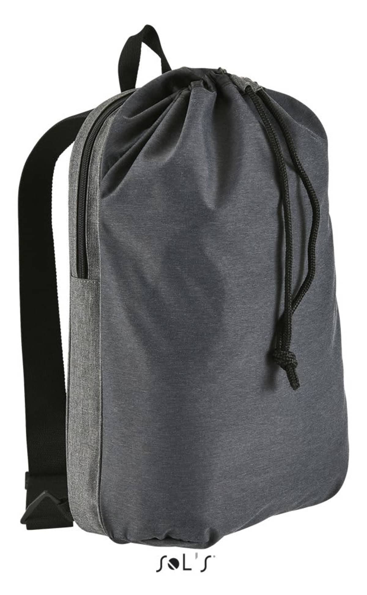
600D Rpet Backpacks
Prices From $68.95 -

Academia Backpacks
Prices From $16.56 -
Activelife Rucksacks
Prices From $11.83 -
Adventure Outdoor Travel Backbacks
Prices From $25.18 -
Alumni Pro Backpacks
Prices From $26.39 -

Amadora Compu Backpacks
Prices From $51.30 -
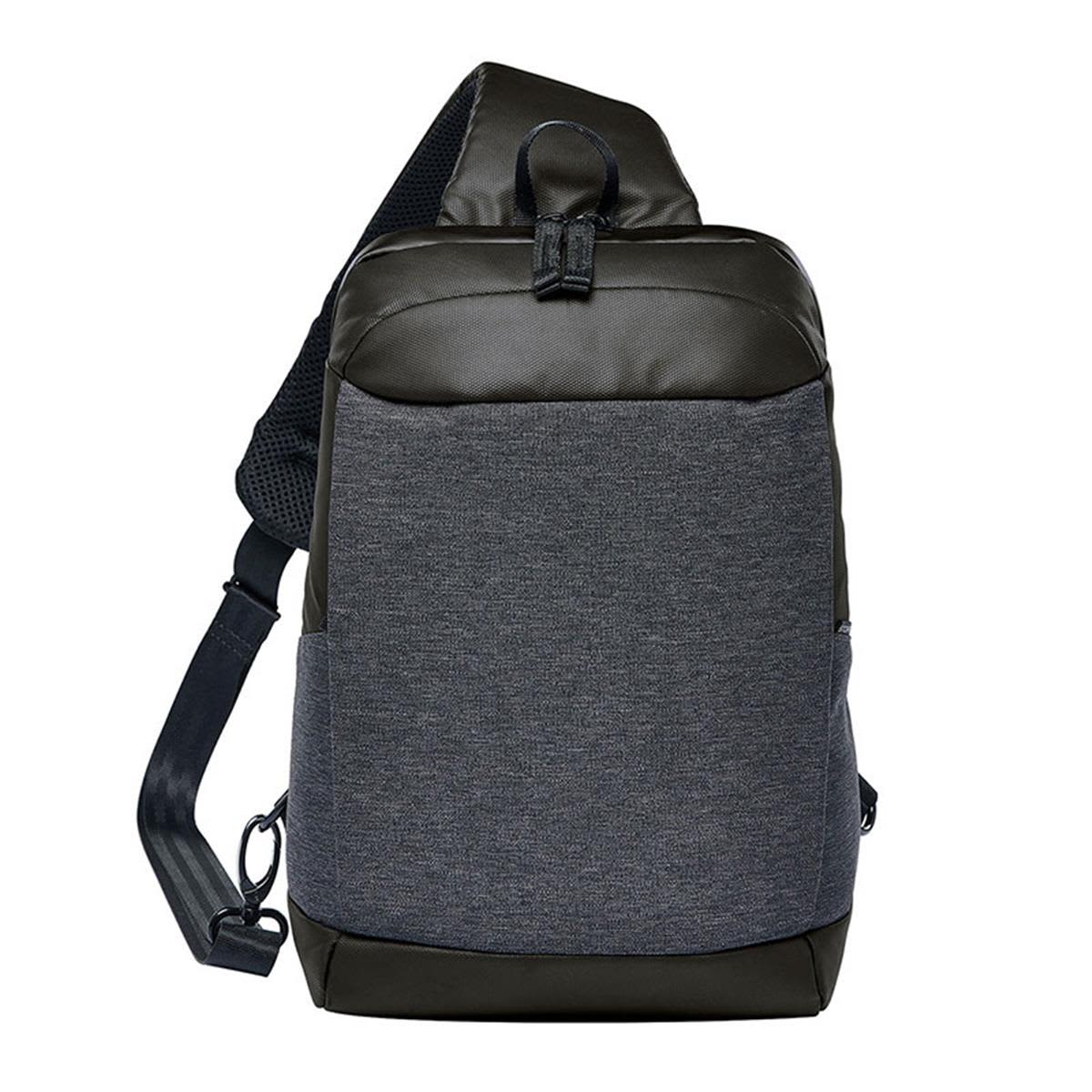
Andes Sling Backpacks
Prices From $78.12 -
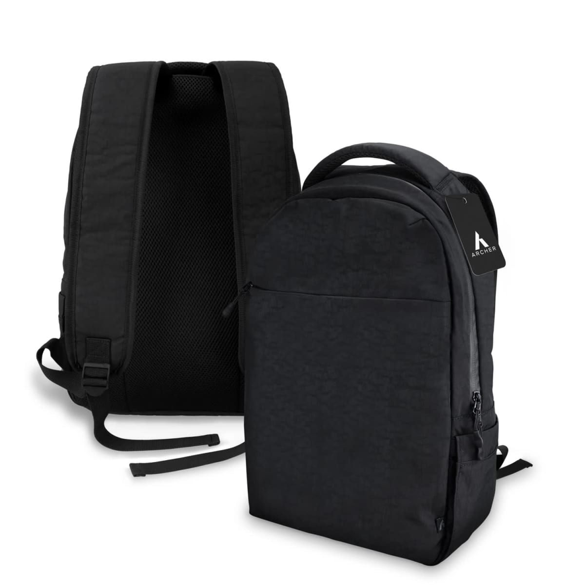
Archer Daily Backpacks
Prices From $48.60 -
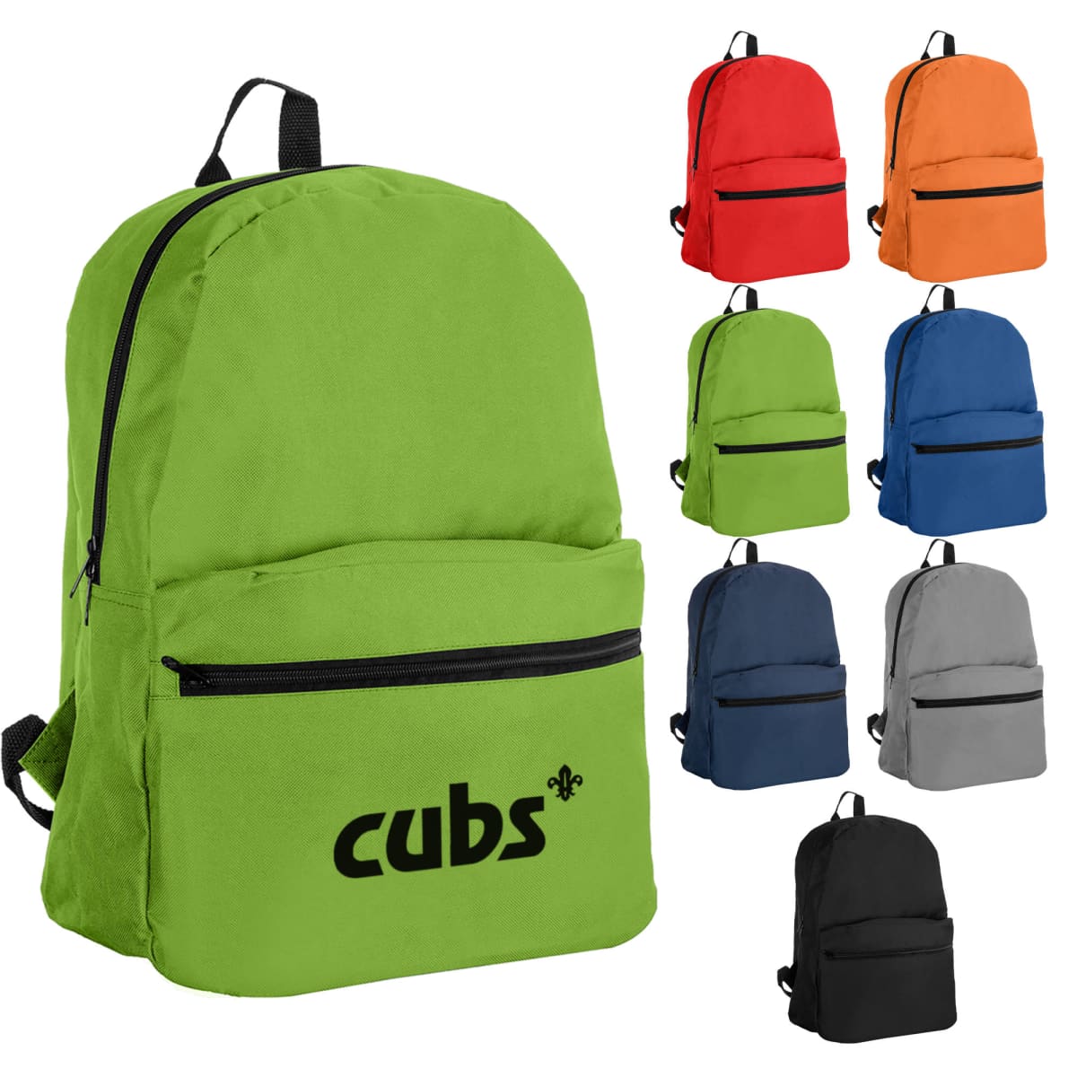
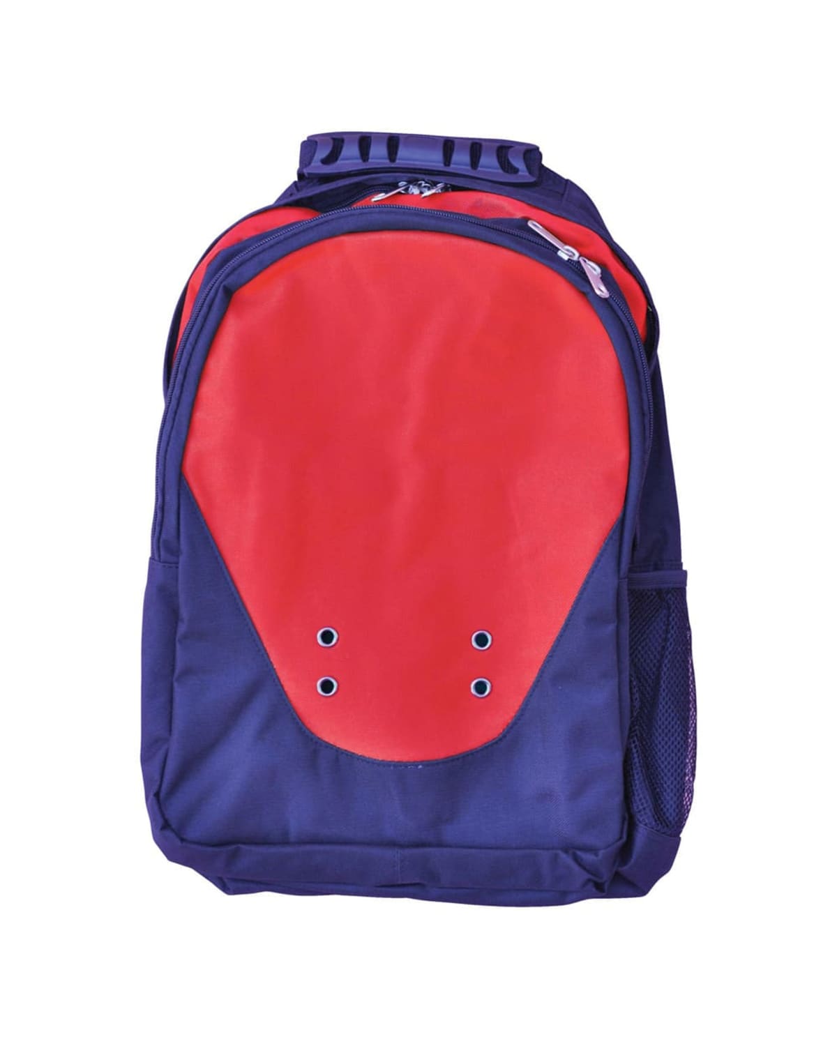
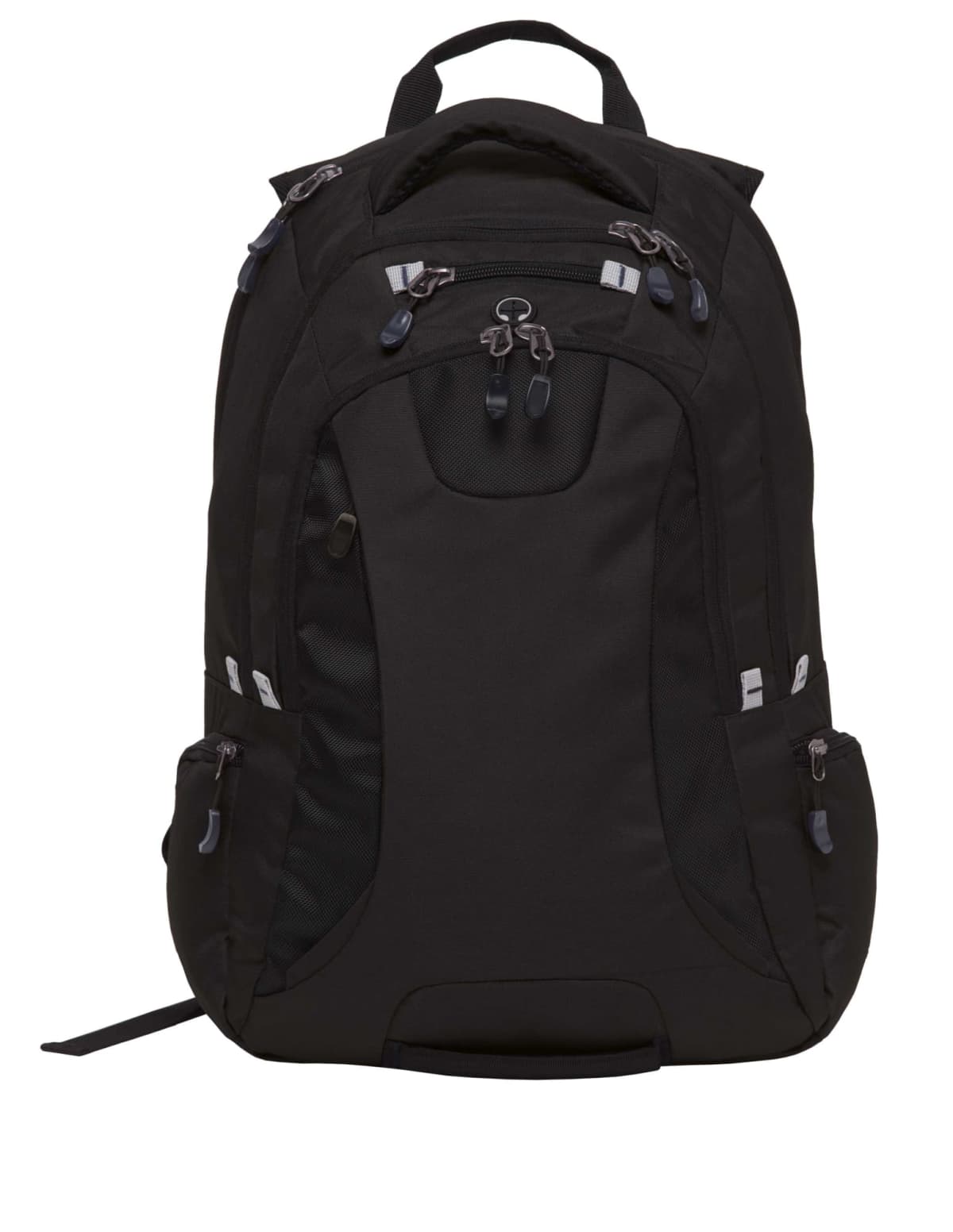
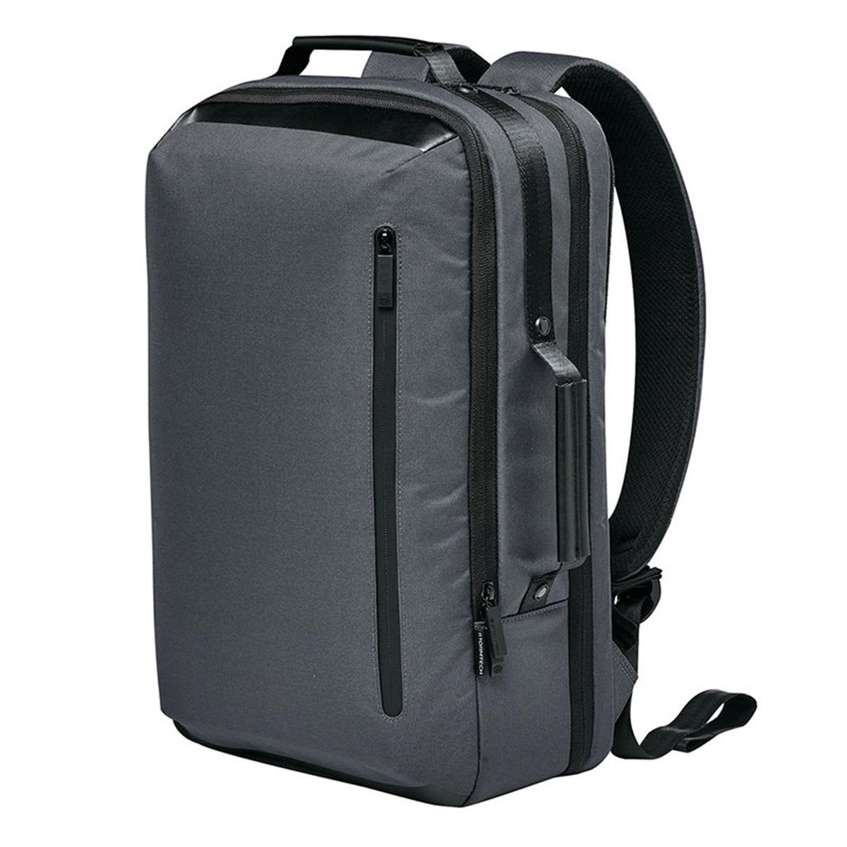
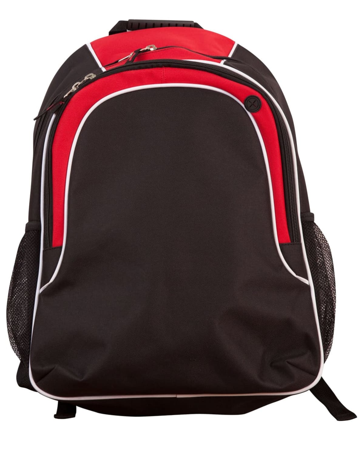
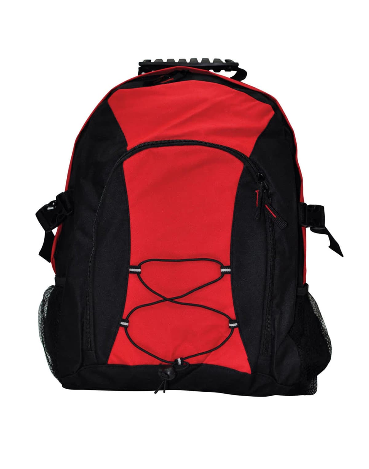
Backpacks
Prices From $39.24 -
Bergen Commuter Backpacks
Prices From $241.33 -
Brookline Canvas Backpacks
Prices From $28.62 -
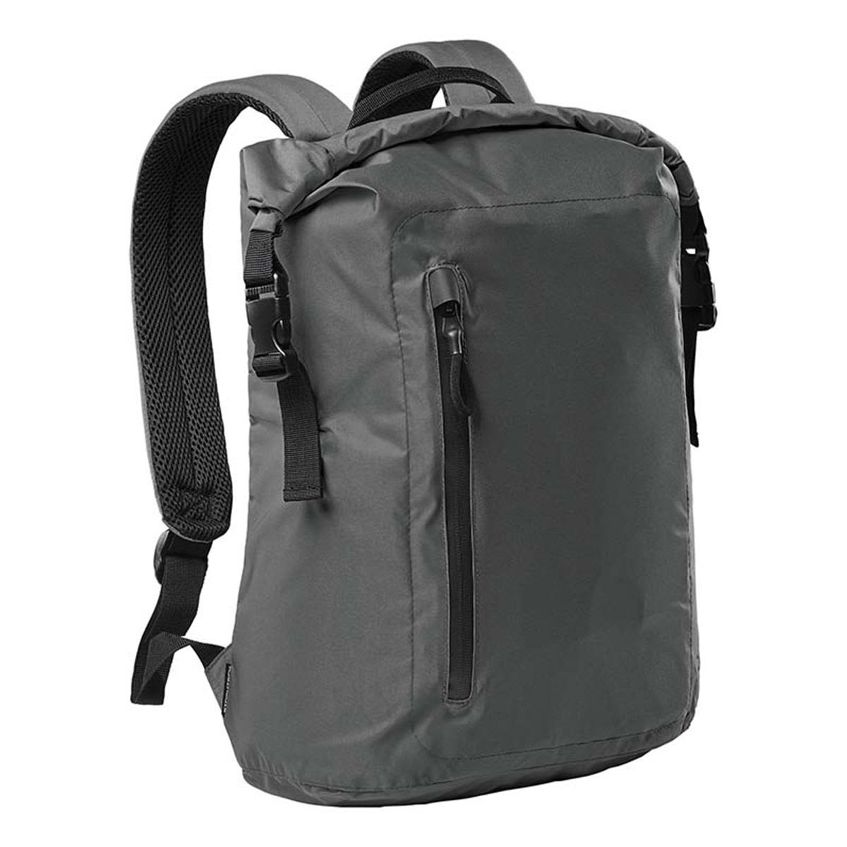
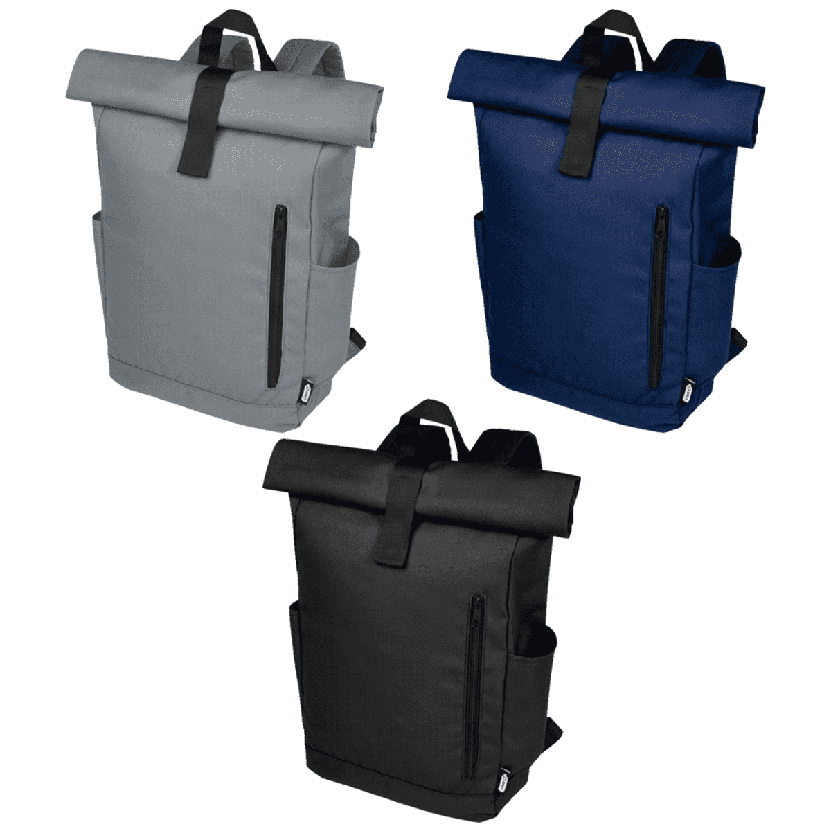
Byron 15.6″ Grs Rpet Roll-Top Backpack 18L
Prices From $14.14 -
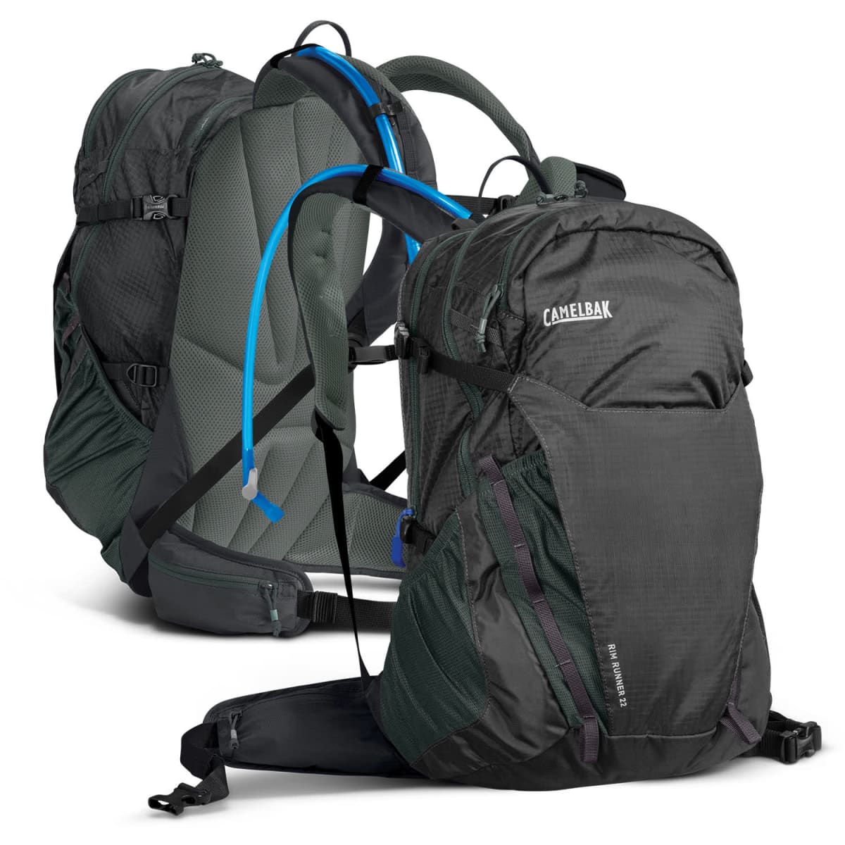
CamelBak Magnus Hydration Packs
Prices From $149.24 -
Champion Backpacks
Prices From $18.58 -
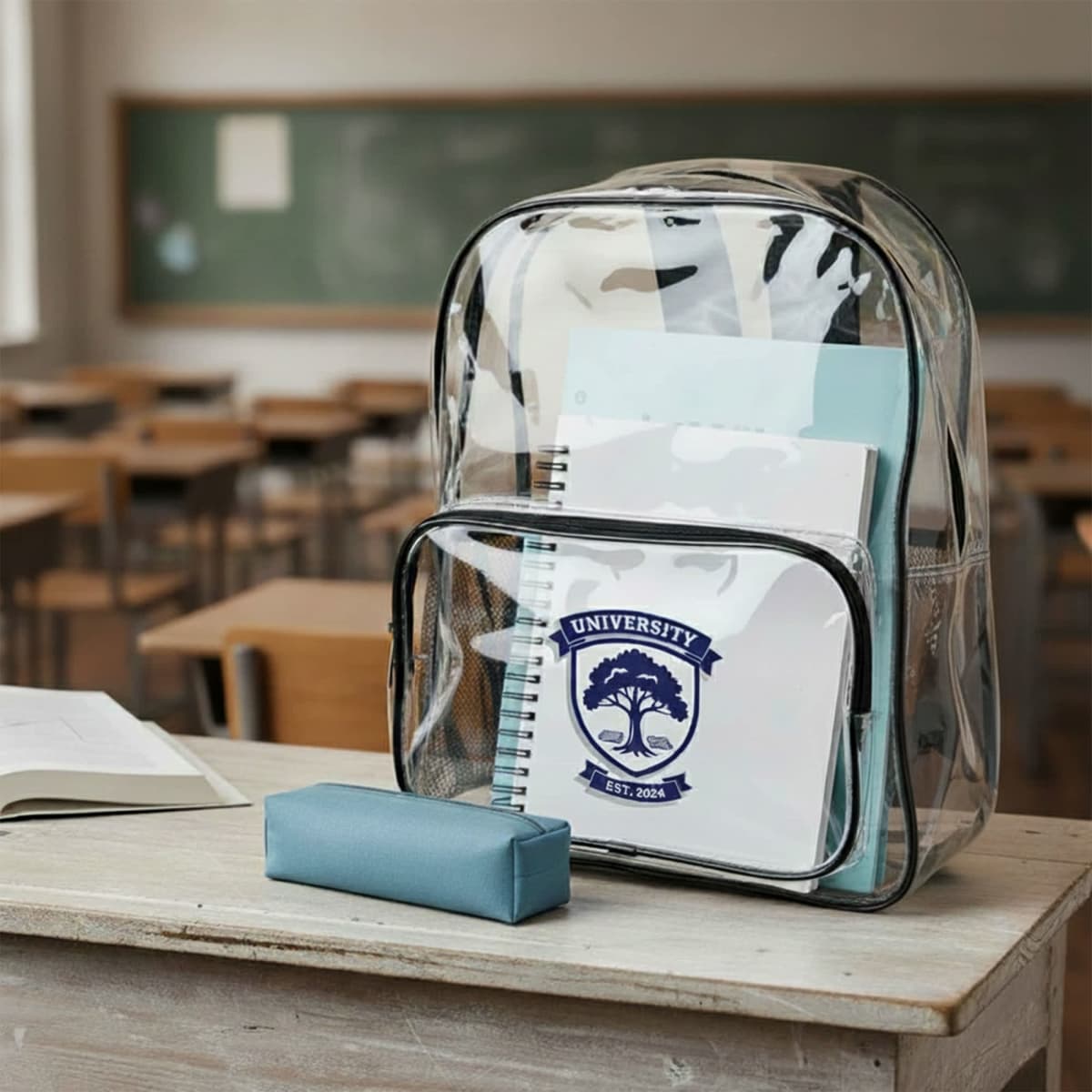
Clear Doxy Backpacks
Prices From $10.60 -
Climber Personalised Backpacks
Prices From $20.48 -
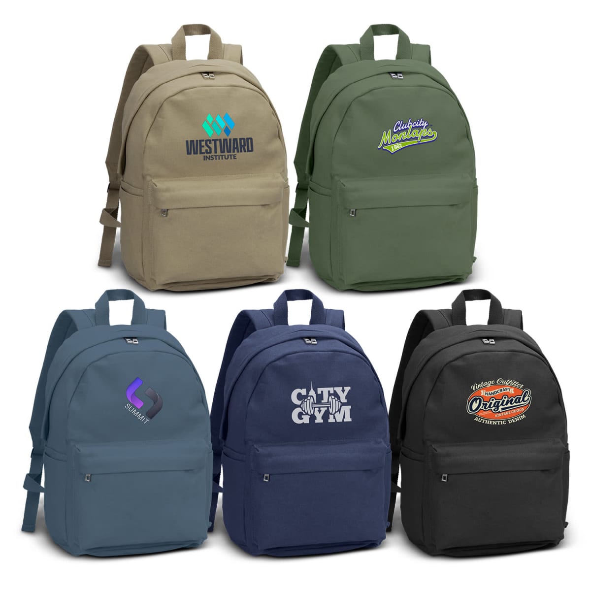
Coloured Backpacks
Prices From $17.14 -
Colter Cooler Backpacks
Prices From $28.18 -
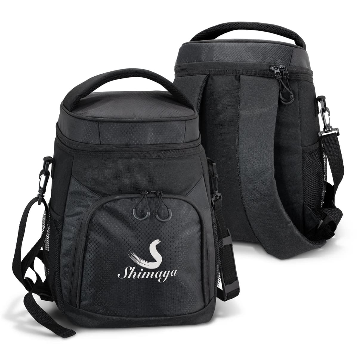
Cooler Backpack
Prices From $20.92 -

Corolla Reflex Backpacks
Prices From $33.75 -

Cullen Backpacks
Prices From $29.04 -
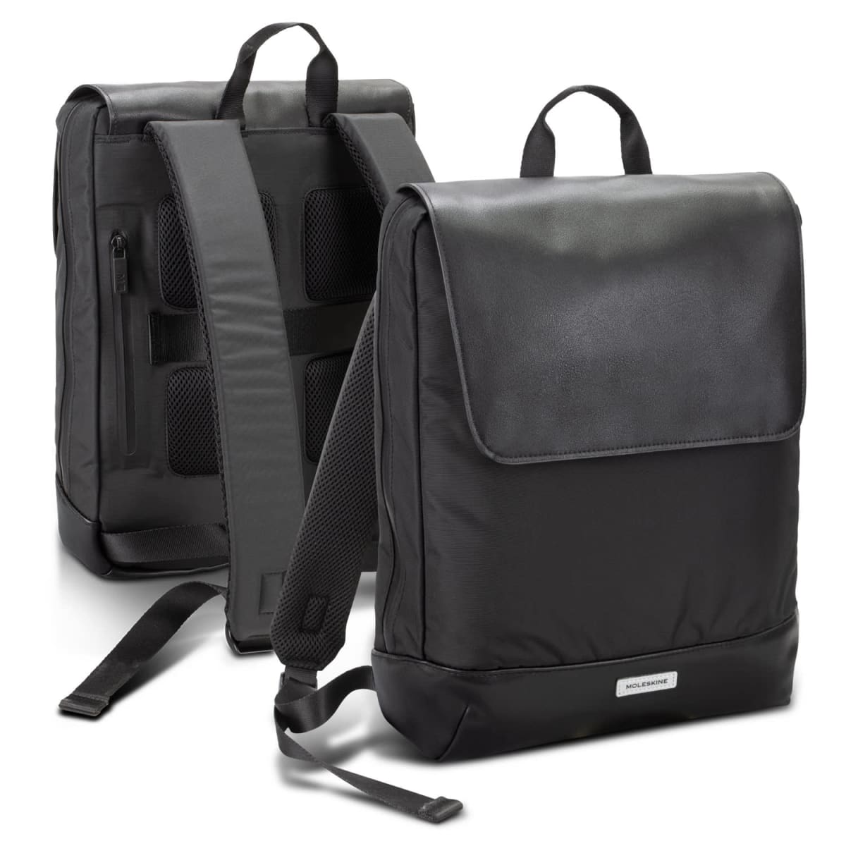
Custom Moleskine Slim Backpacks
Prices From $154.01 -
Custom Travel Backpack
Prices From $6.93 -
Darani Grs Recycled Canvas Backpacks Totes 24L
Prices From $27.22


Comparison on Which Type of Bag to Choose
Our Supply Performance
(All data compiled from 06/01/2025 – 06/01/2026)
Why Consider Bulk Buying?
For millions of workers and students around Australia, they are the go-to essential bag for carrying items throughout the day.
- Practical and Everyday Use – Backpacks for work, study, and travel offer ongoing brand exposure.
- Large Branding Area—Unlike many other items, backpacks provide a large space for logos and messaging.
- Diverse Styles – Choose from professional laptop bags, durable sports backpacks, lightweight travel designs, or cost-effective custom drawstring models.
It is essential to buy backpack bags that are made ethically. That is why we offer:
- Ethical Manufacturing – All our suppliers follow strict ethical guidelines, ensuring fair wages and safe working environments.
- Sustainable Options – We offer textile recycling for end-of-life backpacks and supply eco-friendly materials where possible.
Common Use
Many of our clients use printed backpacks. We supply backpacks used for:
- Corporate Gifting – Impress clients and employees with premium branded laptop bags.
- University & School Promotions – Provide students with durable daily bags featuring your institution’s branding.
- Trade Show Giveaways – Fill lightweight drawstring bags with promotional materials. Great as show bags
- Retail & Merchandising – Create branded backpacks for resale or membership perks. Consider using them as Concert merchandise.
Case Study: NSW Government
NSW Goverment, wanted to take their commute awareness campaign to the streets. See the full NSW Government case study for insight into how everyday-use merchandise supported stronger campaign visibility.
Who We’ve Supplied To

How We Custom Brand?
We ensure your logo is applied with precision, using industry-leading techniques:
- Embroidery adds a premium, textured finish to fabric-based backpacks. It is ideal for corporate and retail designs. Embroidery uses coloured thread to decorate your backpack.
- Screen Printing – A cost-effective method for simple logos and large designs using ink pushed through a mesh screen.
- Heat Transfer Full Colour Printed Backpacks
What are the pros of sports backpacks compared to casual backpacks?
- Specialised storage: Sports backpacks often include compartments for shoes, wet gear, or water bottles, which casual backpacks usually lack.
- Durable materials: Many sports styles use water-resistant fabrics and reinforced stitching to handle outdoor conditions.
- Comfort in movement: Sports backpacks commonly feature mesh panels, padded straps, and ventilation systems to make them more comfortable during physical activity.
By contrast, casual backpacks are suitable for everyday use but do not provide the same level of functionality for athletic or outdoor settings.
Learn Buying Tips
Branded backpacks carry your logo far. Watch our video to see designs and uses for teams or clients.
FAQs: Everything You Need to Know 🤓
Do you ship backpacks outside Australia?
What is your returns policy for branded backpacks?
Returns are only accepted for defective or incorrectly produced backpacks. You can cancel or modify an order only before production begins. Change‑of‑mind returns aren’t accepted after artwork approval. For full terms and conditions, please view our Returns Policy.
Do you offer urgent or same-day branding services?
Yes, we offer an express dispatch service for our bags, with dispatch within 24 hours. Please allow additional time for delivery.
- For metro areas in NSW, VIC, QLD, and ACT, delivery takes 1 business day after dispatch.
- For other Australian cities and regional centres, delivery may take up to 6 business days.
What is the minimum order quantity (MOQ) for promotional bacpacks?
Do you offer product samples of your bags?
Yes, we offer product samples upon request. To see product samples, you can choose:
- Unbranded Samples (free, we only charge the cost of freight)
- Branded Samples (cost: $75). This $75 cost will be refunded via a deduction from your total invoice should you proceed with a wholesale purchase order.
You may also check our product samples section for more information.
What artwork file formats do you accept, and can you match Pantone colours?
- Embroidery: We accept files in the following formats for embroidery: AI, EPS, PDF, JPEG, and PNG.
- Screen‑printing artwork must be supplied as AI/EPS/PDF with vectorised outlines.
- Digital full-colour printing (including transfer printing): We accept high-resolution JPEGs, Adobe Illustrator, and Adobe Photoshop files.
Pantone colours can be matched when you provide the Pantone code.
What is the setup fee for custom printing?
Where to buy cheap promotional backpacks?
Will I see what my personalised backpack will look like prior to printing production?
Can you custom print my logo onto backpacks?
Is your range of backpacks ethically sustainably sourced?
What kind of discounts do you offer for bulk backpack orders?
How can I build a complete promotional kit around this category?
Combine branded backpacks with items like custom drink bottles or promotional notebooks to create a promotional kit, fit for different events.