The Brand Visibility Blog
To explore more articles by different authors, click on their names. For related topics, browse through our blog categories.
Featured Blogs


All Blogs
How to Be the Exhibitor Everyone Talks About After the Event
Have you ever wondered why some booths stay...

Talks about Dominating Your Next Event for Under $5
You don’t need a big budget for great...

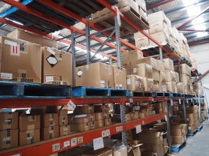
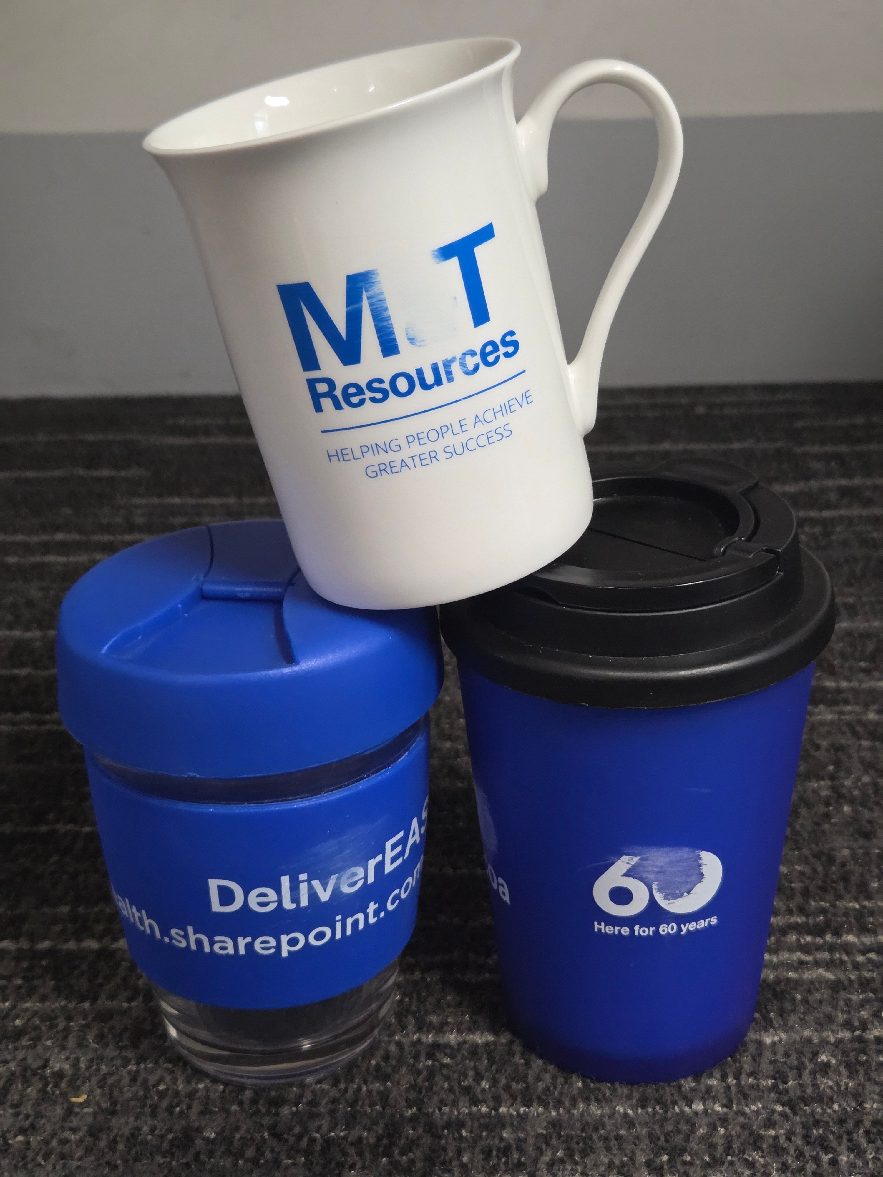
Why Supplying Event Merch Goes Beyond Booking a Courier
Wendy and I found ourselves loading a van...

How Uniforms Solve the First Impression Problem Instantly
Princeton researchers Janine Willis and Alexander Todorov found...

How to Stand Out at a Graduate Careers Fair When Everyone Has a Brochure
Eighty-eight point nine per cent of domestic bachelor’s...
How to Build a Strong Culture When Half Your Team Works From Home
It can be challenging to build a strong...
Ideas to Thank Your Best Clients Without Sending Another Gift Card
Every year, Australians leave about $70 million unused...
6 Giveaways Wineries Use to Turn Tastings Into Sales
Last year, Australians made 7.5 million trips that...

10 Melbourne Cup Merch Ideas for Corporate Sponsors
Last Updated: 14 July 2026 This 3rd of...
5 Giveaways That Work at Farmers Markets and Pop-Ups
Last Updated: 13 July 2026 A shopper walks...
6 Retirement Gifts Aussie Businesses Give Long-Term Staff
Last Updated: 10 July 2026 Most Australians change...

Why Global Companies Source Merchandise Locally for Their Australian Office
Last Updated: 10 July 2026 Many international companies...