
Logo Design for Branded Merchandise: The Complete Guide
Last Updated: 23 September 2026
Key Points
- Design the logo for the smallest or most restrictive branding area first.
- Prepare horizontal, stacked, icon-only, full-colour and single-colour versions before ordering merchandise.
- Use vector artwork and approved colour references so the logo stays consistent across different decoration methods.
A logo that looks sharp on a website can fail on a pen, embroidered cap or engraved bottle. Merchandise introduces different shapes, materials, print areas and decoration methods, so the artwork needs to work across all of them.
What Makes a Logo Work on Promotional Products?
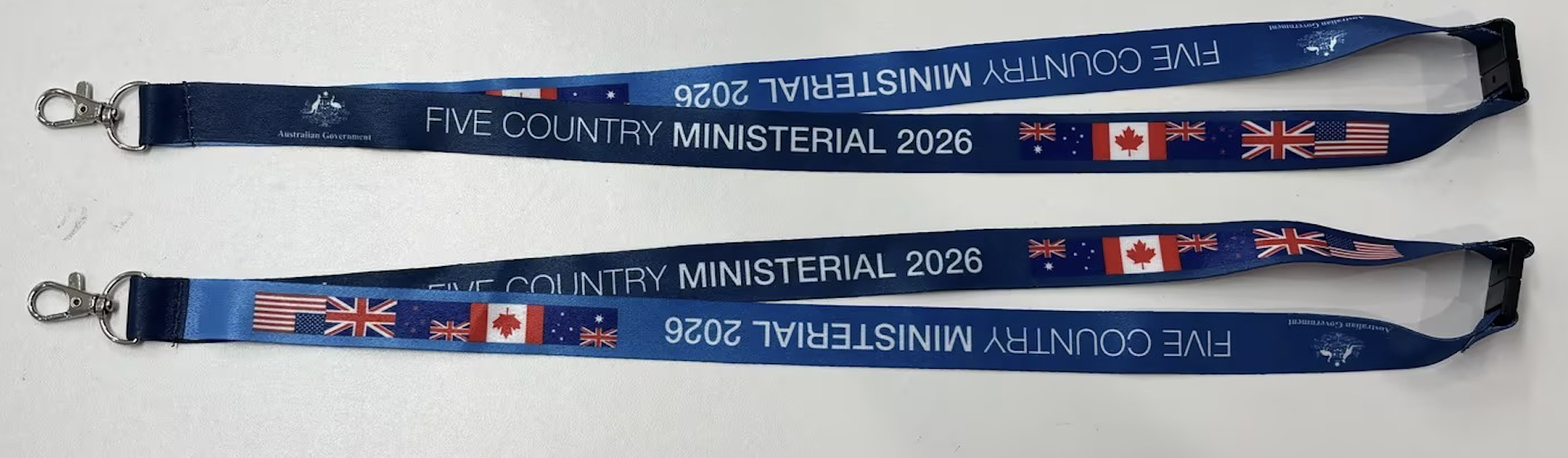
A merchandise-ready logo stays recognisable when it becomes smaller, changes orientation or loses its full-colour treatment. It also needs enough contrast against the product underneath, because the same artwork can look very different on white, navy, metal or fabric.
A single wide logo rarely works equally well across all these products. We prefer preparing approved versions before production so the artwork can change format without changing the identity.
How Do You Prepare a Logo for Merchandise?
1. Simplify the Core Design
Start with a mark that remains recognisable after unnecessary detail disappears. Thin lines, small taglines and decorative elements often fail when the logo moves onto pens, keyrings or embroidered apparel. Additionally, don’t forget the distinctive part of the identity, then remove details that add little at small sizes. This does not mean every logo needs to look minimal. It means the key elements still need to work when the available branding area shrinks.
2. Prepare Different Logo Layouts
Do not force one logo configuration into every available space. Prepare a small set of approved versions so the supplier can choose the format that fits the product. We recommend keeping:
- A horizontal version for wide branding areas.
- A stacked version for square or vertical areas.
- An icon-only version for very small spaces.
- A full-colour version for suitable print methods.
- A dark single-colour version for simple decoration.
- A white or reverse version for dark products.
A notebook can carry the complete wordmark, while a pen might only have room for the icon. Both versions should still look like the same organisation.
3. Plan Colour for Different Product Backgrounds
Keep the main brand colours consistent, then prepare alternatives for backgrounds where those colours lose contrast. A dark blue logo can look strong on a white notebook and almost disappear on navy apparel. For example, a white reverse version solves that problem without changing the identity. Provide Pantone references when exact spot-colour matching matters, because colours displayed on screens aren’t reliable production references.
A basic colour set normally includes:
- The approved full-colour logo.
- A black or dark single-colour version.
- A white reverse version.
- Pantone references for spot-colour printing.
- Rules for which background colours each version can use.
4. Test the Most Restrictive Product First
Check the logo on the smallest or most difficult branding area before approving the entire merchandise range. If the order includes pens, polos, bottles and notebooks, start with the pen or embroidered polo. These products expose fine detail, narrow spacing and small text first. If the tagline becomes unreadable, remove it from the small-format version instead of shrinking the whole logo until everything technically fits. Once the simplified artwork works on the difficult items, adapting it to larger print areas becomes easier.
5. Match the Artwork to the Decoration Method
The same logo behaves differently when printed, embroidered or engraved. Artwork that works perfectly for full-colour digital printing can lose detail when converted to stitching or laser engraving.
Do not choose the logo version based only on the product. The decoration method also affects which details will reproduce successfully.
6. Supply Production-Ready Artwork
Use vector artwork for the master logo files because it scales without becoming pixelated. We prefer EPS, AI, and suitable vector PDF files for production. Before sending the files:
- Convert text to outlines.
- Include the approved colour references.
- Keep the original vector artwork.
- Supply alternate logo versions where required.
- Avoid sending screenshots as production artwork.
PNG and JPEG files are useful for previews and selected decoration methods, but they are not ideal master files for repeated merchandise production.
What Can Famous Logos Teach Us About Merchandise Design?
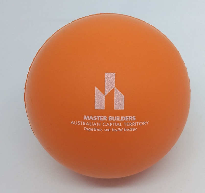
Older articles about hidden messages, famous logos, and logo evolution are useful when they show a practical design principle. Their strongest lesson is that the main shape needs to work before any clever secondary detail matters.
Many recognisable brands have simplified their identities over time because simpler shapes remain clearer across different applications. Hidden-message logos work for the same reason. The additional meaning stays secondary to a mark people can recognise immediately.
For merchandise, the lesson is straightforward:
- Keep the most recognisable element.
- Remove detail that disappears at production size.
- Treat hidden meanings as a bonus, not the main design.
- Check whether the mark still works without colour.
- Test recognition before adding extra visual elements.
How Do You Keep a Logo Consistent Across Different Merchandise?
Use approved logo versions, colour references and placement rules instead of redesigning the identity for every product. Consistency doesn’t mean placing the same artwork at the same size everywhere. A simple logo guide can give suppliers the information needed to reproduce the identity correctly. Here are what to pay attention to keep your logo consistent:
- Approved horizontal and stacked versions.
- Icon-only artwork.
- Full-colour, black and white versions.
- Pantone colour references.
- Minimum reproduction size.
- Clear space around the logo.
- Approved light and dark backgrounds.
- Instructions not to stretch, recolour or redraw the artwork.
The goal is to make the identity recognisable whether it appears on a bottle, cap, notebook or shirt. The format can change to suit the product, but the core shapes, colours and proportions stay consistent. Product quality also affects that presentation. A premium business using poor-quality merchandise can weaken the impression created by an otherwise polished identity.
What Does Charles Liu Recommend Before Artwork Approval?
Charles Liu, Co-Founder and Marketing Director of Cubic Promote, prefers seeing the full merchandise range before the artwork is finalised. His branding experience helps identify problems that only appear when the same identity needs to work across very different product shapes and decoration methods. If an order includes pens, embroidered polos, bottles and notebooks, we recommend testing the most restrictive item first. A simplified logo that stays readable on a pen and stitches cleanly onto apparel will usually adapt more easily to larger products.
Before artwork approval, send the supplier:
- The complete list of products being ordered.
- The approved logo variations.
- Pantone colour references.
- Any minimum-size rules.
- The preferred branding position.
- Any version of the logo that must not be altered.
For a logo with a long tagline, we would keep the full version for notebooks, bags and larger apparel areas. The icon or shortened version is a better fit for pens, keyrings and small engraved items.