
StickyNotes for Marketing: Creative Branding Ideas
Last Updated: 15 October 2026
Key Points
- Keep most of the note blank so recipients can still write on it easily.
- Use colour, shape or placement only when it supports the campaign idea.
- Sticky notes work especially well in workshops, welcome kits, desk packs and temporary displays.
Sticky notes work differently from most promotional stationery because recipients move them around during use. A branded note can start on a desk, then appear on a monitor, notebook, meeting wall or project board. That makes them useful for more than standard giveaways. Businesses can use them for workshops, internal campaigns, onboarding packs, and temporary displays, as long as the branding doesn’t interfere with the writing space.
Which Sticky-Note Marketing Ideas Work Best?
Consider how people will use it before settling on a format. For workshops, leave plenty of room for notes. If it’s for a campaign display, you can get a bit more creative with the colours and shape.
Use Them as Workshop Tools
Sticky notes work well for workshops because everyone can jot down an idea, move their notes around and sort similar responses into groups. There’s also room for your logo without it getting in the way. For strategy sessions, we’d suggest using different colours to keep things organised. You could use one colour for problems, another for ideas and a third for next steps. That way, the sticky notes serve a practical purpose beyond everyday stationery.
Add Them to Staff or Client Welcome Kits
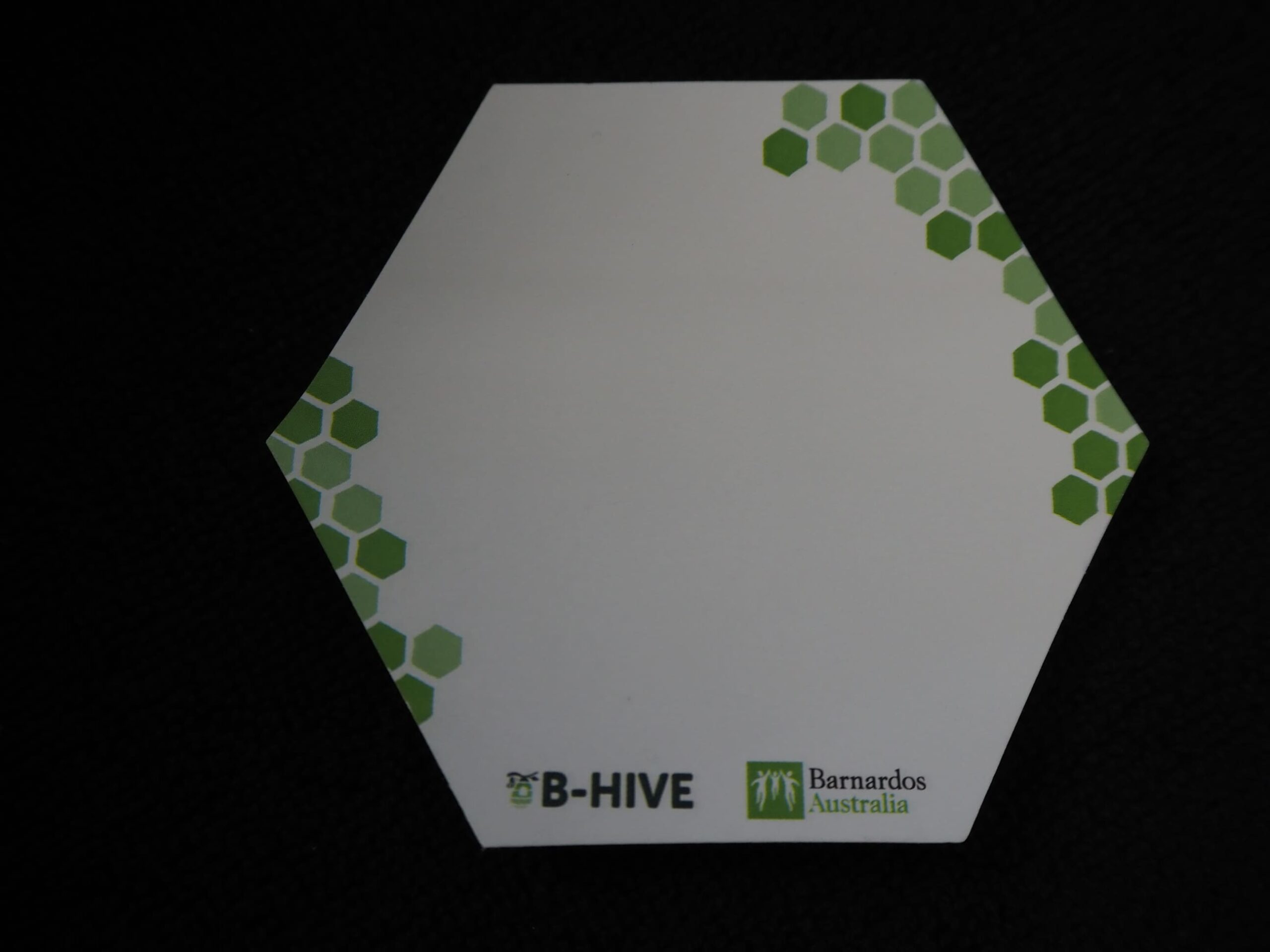
Sticky-note pads fit naturally beside notebooks and pens in desk-based welcome packs. However, the sheet still needs enough clear space for everyday notes. We recommend placing the logo in one corner or along the bottom edge. If artwork fills the centre of every sheet, the pad becomes harder to use and is less likely to stay on the desk.
Turn a Wall or Window Into Temporary Artwork
Sticky notes can also become the campaign material itself. Large installations have used thousands of coloured sheets as individual pixels to create characters, graphics and messages across office walls and windows. Businesses can use the same idea for a simple logo, event message or launch graphic without permanently changing the space. Keep the design bold because detailed photographs, thin lettering and small features do not translate well into a grid of square notes.
Use Notes as Campaign Prompts
Adding a question to a printed pad gives people something specific to respond to. For staff training, you could ask everyone to suggest one thing the business could do better. The same idea works for internal campaigns where you’re after feedback. Keep the question short so there’s plenty of room to write an answer. Something like “One thing we can improve” does the job without taking up half the page.
Use Custom Shapes When the Shape Adds Meaning
Custom-shaped sticky notes are worth considering if the design ties in with your message. A speech bubble makes sense for feedback sessions, or you could choose a shape that reflects your industry. Just bear in mind that unusual shapes leave less room to write. For workshops and everyday office use, we’d stick with square or rectangular pads. Save the custom shapes for occasions where you want the design to stand out.
How Do You Design Sticky Notes People Will Actually Use?
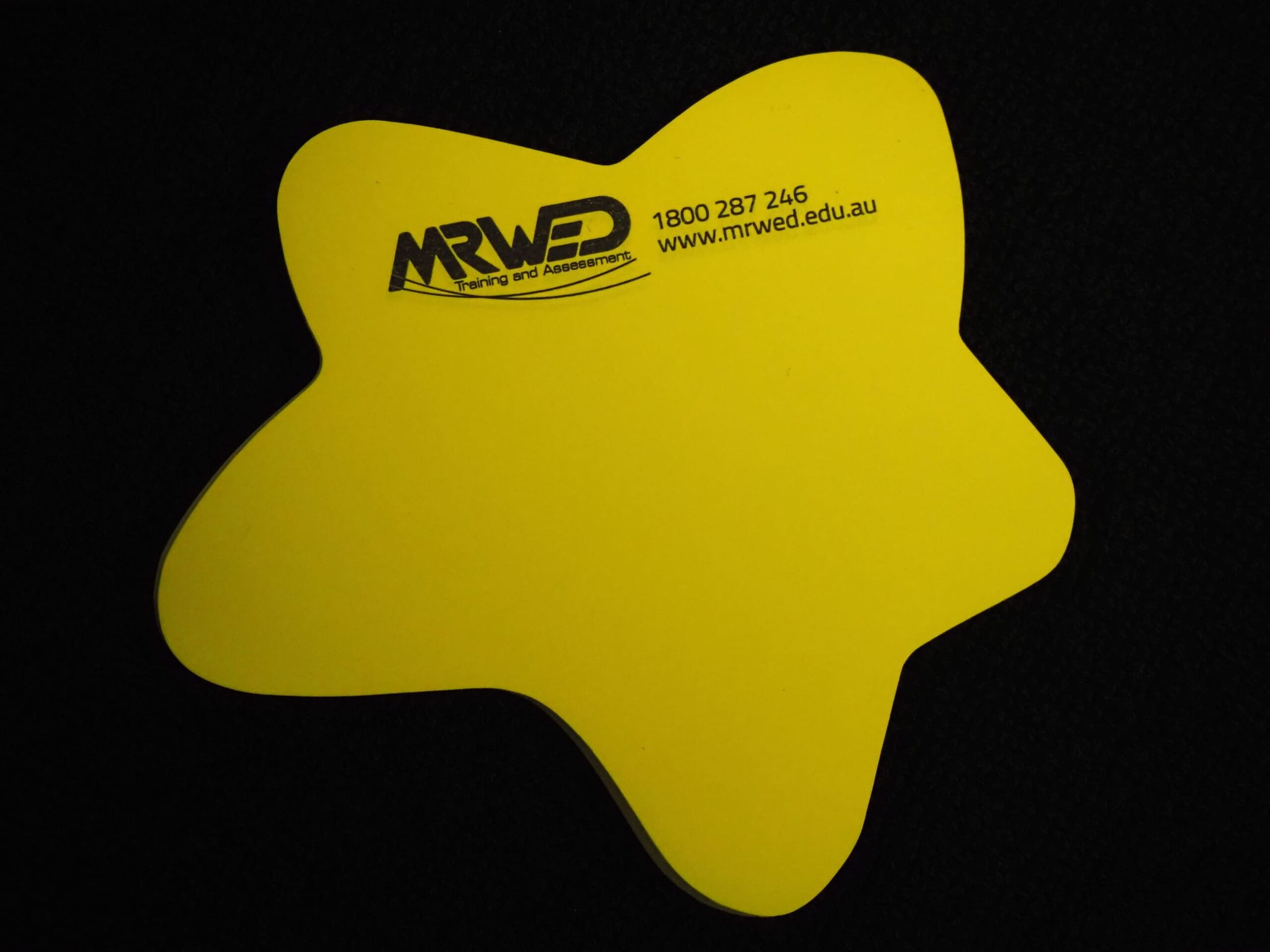
We recommend keeping your logo or printed design small enough to leave plenty of room for writing. After all, people use sticky notes to jot down quick reminders, so you don’t want the branding to get in the way.
Here’s what we’d suggest including:
- A logo in one corner or along the bottom edge.
- A short website or contact detail only when needed.
- Plenty of clear space for handwriting.
- Strong contrast between the artwork and paper.
- A simple layout that remains readable at actual size.
Brightly coloured paper already catches the eye, so there’s no need to fill the whole sheet with artwork. We’d suggest keeping your logo small and simple to leave plenty of room for notes and reminders.
How Can Colour Improve the Design?
Choose colours that stand out without making people’s notes hard to read. Lighter shades are usually a safer bet, as handwriting can be difficult to see on dark paper or heavily printed backgrounds.
If you’re using several colours for the same campaign, here’s what we’d recommend:
- Keep the logo position consistent on every pad.
- Use dark artwork on pale paper where possible.
- Avoid background colours that compete with handwriting.
- Give different colours a defined role when used together.
- Check that brand colours remain recognisable across the range.
For a simple desk giveaway, one colour is usually enough. Multiple colours add more value when they separate teams, tasks or stages within a workshop or internal program.
What Our Founder Recommends
Charles Liu, our Co-Founder and Marketing Director, has extensive experience with branding methods and prefers clear briefs before artwork begins. For sticky notes, we would tell the designer how the pad will be used before deciding how much branding to add. For an everyday desk pad, keep the logo small and protect the writing area. For a campaign activity, use the printed space for one short prompt or instruction. Branding should support the note’s function, not compete with it.