What Happens When Brand Guidelines Clash with Production Limitations?
Key Points: Brand guidelines can clash with production...
Branding Techniques and guide to custom branding methods, including embroidery, screen printing, and more.
To explore more articles by different authors, click on their names. For related topics, please browse through our blog categories.
Key Points: Brand guidelines can clash with production...
Key Points: Some materials don’t suit certain print...
Key Points: Common logo errors include blurry artwork,...
Last Updated: 08 May 2026 Key Points: Logos...
Key Points: Fast branding methods such as pad,...
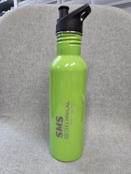
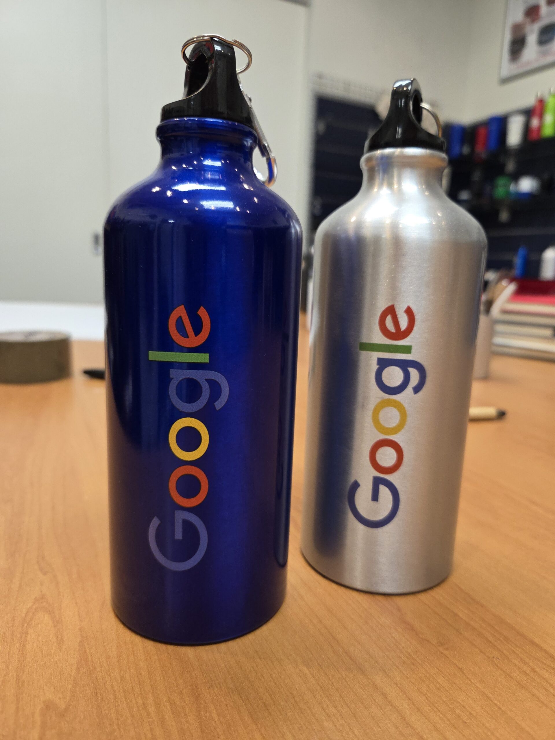
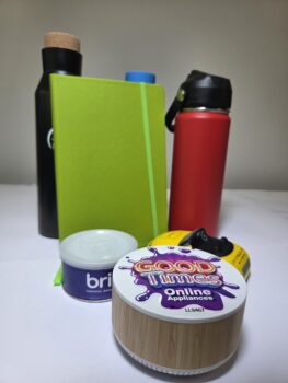
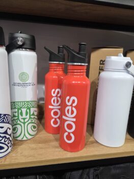
Key Points: Durable branded items made from stainless...
Key Points: EPS or vector PDF files with...
Last Updated: 11 May 2026 Key Points Printing...

Last Updated: 11 May 2026 Key Points Embroidery...
Last Updated: 11 May 2026 Key Points Colour...
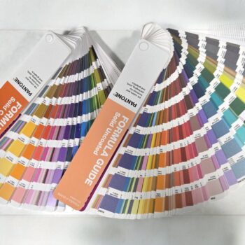
Last Updated: 11 May 2026 Key Points Colour...
Last Updated: 16 April 2026 Key Points Repetition...
Last Updated: 13 April 2026 Key Points: Big...

Last Updated: 13 April 2026 Key Points: Branded...

Last Updated: 13 April 2026 Key Points: Logos...
Last Updated: 25 May 2026 Key Points Plastic pens remained the most...