When it comes to designing a brand new logo, sometimes it can be incredibly difficult to start out. You know what you like to look at and what you don't, but how do you utilise that knowledge to make a logo that will really become memorable and promote your brand? We've come up with some great tips and examples below.

Logo Designs Perfect For Custom Branding
When starting out with designing a logo, you need to be clear what your business does. If you are unclear about the specific industry or products you will be dealing with, your logo will convey this confusion. Only when you're 100% sure about your goals as an organisation can your logo development truly begin. Next thing to note is that smart colour is essential. We've discussed the importance of colour for promotional branding before, but it's worth repeating that colour psychology vital to explore when designing your logo.
- Red: Suggests urgency, stimulates appetite and is often used for food brands, implies passion.
- Purple: Soothing and calming, popular for beauty brands and organisations wanting to promote wisdom.
- Blue: Popular in offices, associated with calmness, productivity and security.
- Orange: Confident and cheerful, often used to create action and excitement.
- Green: Denotes nature, health and wealth. Often used to imply wealth and productivity.
- Yellow: Suggests optimism and youthfulness, warm and cheerful, often used in window displays.


The Cook Finder logo takes advantage of confident, exciting colours and combines them with a design that links a chef's hat with a magnifying glass. Similarly, the "A" in Antarctica serves dually as a penguin against a secure and calm grey-blue background. Both of these designs use colour well, but also smartly suggest the meaning behind their brands with simple design and clear lettering.


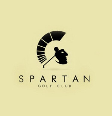
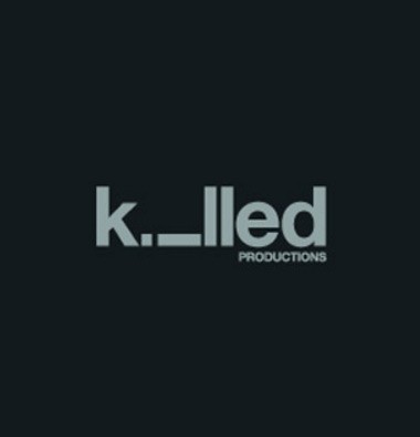
So once you have the colour down and you know you need to convey the meaning behind your brand in a very simple but captivating way, what do you do next? Well from there you can get seriously creative! The Killed Productions logo is nothing more than sans serif text that says "Killed Productions" but by having the "I" dropped to the ground as if dead, much more has been expressed through little more than the changing of a position. The Spartan Golf Club logo takes the ideas seen in Cook Finder and Antarctica and brings them to an elegant, refined new level. You can see immediately that they are a golf club, but you also feel connected to the name used as well.
From there, the sky is the limited! Use these smart, eye-catching logo designs as a base for your inspiration and get creating! When your logo is done, feel free to contact us for a product mock up or further advice - we'd love to hear from you.
Logos first spotted here: http://www.webdesigndev.com/logo-design-ideas/

