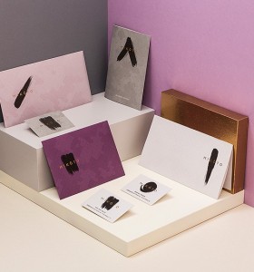
There can be no doubt that the Japanese have a minimalist visual style all of their own and it can be tough trying to replicate that in a Western rebrand. But what about when European agencies take on the rebranding of a high end Japanese restaurant? The result is an eye-catching set of custom print marketing materials that brings Japanese style right to the forefront of European branding.
Promotional Stationery Purple Rebrand

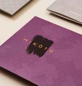
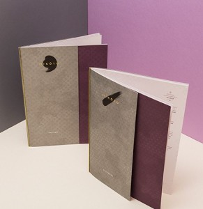
This particular marketing reset was produced for the MIKÔTO restaurant in Stuttgart, Germany. The eatery is known for its fine dining so the rebrand needed to focus on an upmarket, stylish new look. The resulting paper and cardboard marketing materials are a wonderful blend of greys, whites and purples with a black and gold logo.


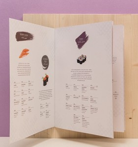
This mix of colours isn't merely an appealing coincidence; purple in Japan is linked to traditional ideas of wealth, power and imperial culture. The shade of purple selected as a prominent fixture of this rebrand is close to "Ayame-iro" or a purple the colour of the iris flower. The envelopes and menus feature this refined shade and offset it using the creamy whites and earthy greys found on the paper sheets and business cards.


Another great element of this rebrand is the use of a traditional tiled Japanese fan-style pattern that is used to great effect on the textured surfaces of the menus and business cards. Overall there are a lot of nods to established Japanese colour theory, but this rebrand also manages to appeal to the modern market too with its bold use of textured materials and a minimalist black logo. Definitely one to refer to if you're looking to expand your branding horizons.
Rebrand first spotted here: http://weandthecolor.com/mikoto-japanese-restaurant-branding/51212

