Some people don't think the role of the designer is that important to the success of a campaign or product. While we might be a little biased here at Cubic Promote (we love our design team!), we're pretty confident that sometimes you really just need a design professional to ensure you don't make any major mistakes. What kind of major mistakes? The kind that could mean your product or service is TOTALLY misinterpreted or laughed at. Uh-oh, it's time for some design fails!
- Research your audience for resonance.
- Create clear and cohesive branding.
- Place graphics and text strategically.
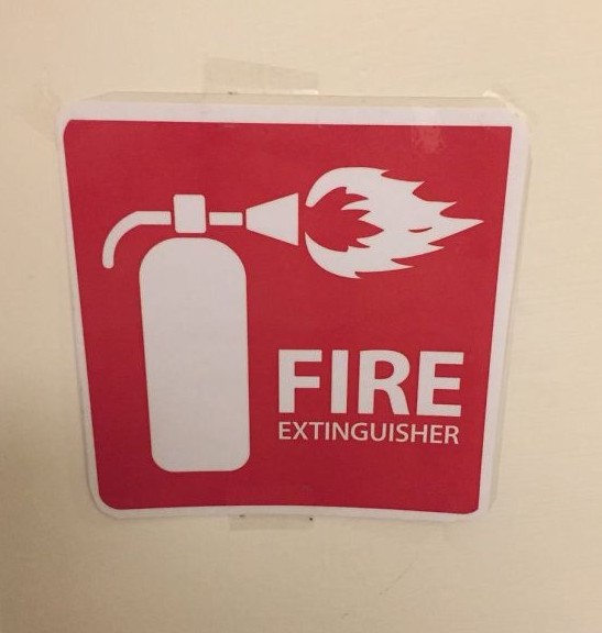
Branding Mistakes on Marketing Merchandise
I think we can all be confident that any fire extinguisher we want to use puts out flames, rather than shoots them directly at you! But a safety sign mistake is only the beginning of some designs that we've spotted on items that really need professional assistance...
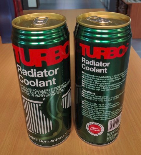
Promotional Packaging Mishap
Radiator coolant is highly toxic and while the graphic design here is quite nice, the cans themselves look almost exactly like beer of soft drink cans! Not a great idea, really!
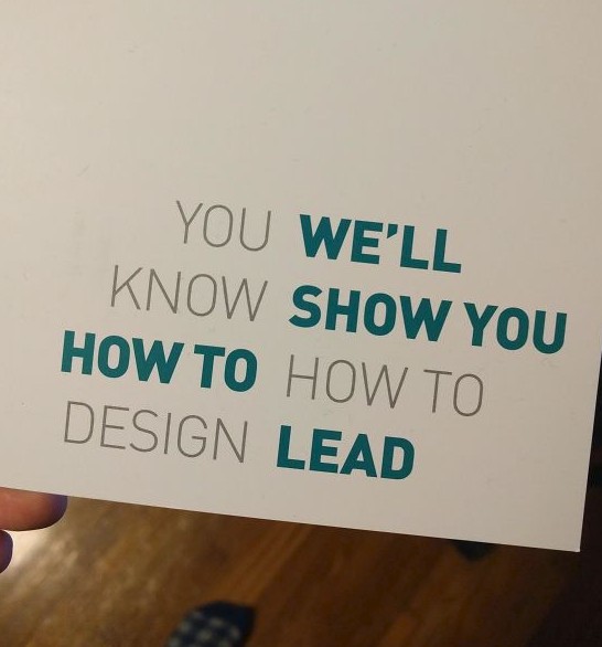
Designers Fail at Business Card Design
When you're a design educator, personal or tertiary, you don't want your promotional business cards or promotional pamphlets to look like an unreadable mess - and yet this is exactly what we see above. You-We'll-Know-Show-You-How-To-How-To-Design-Lead?? It shows that even the best of us can mess up and turn a solid idea into something a little less coherent.
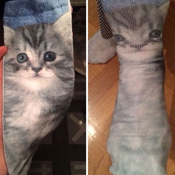
Full Colour Printed Sock Fail
Everyone loves super cute custom printed socks, especially when advances in full-colour printing mean we can have photographic quality prints of cute little kitties like the above. But when you put them on... Uh-oh, poor little kitten appears to be squished! Definitely not enough thought put into how the final product would be used.
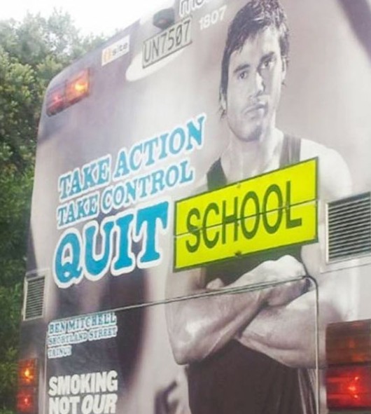
Print Positioning for Advertising
Sometimes a design by itself looks completely readable and fine, but add a simple piece of extra text to the mix and suddenly the whole thing takes on a completely new meaning. The above quit smoking advertising campaign told us to take action and quit smoking, but once the bus was labeled for school it morphed into a campaign to quit school!
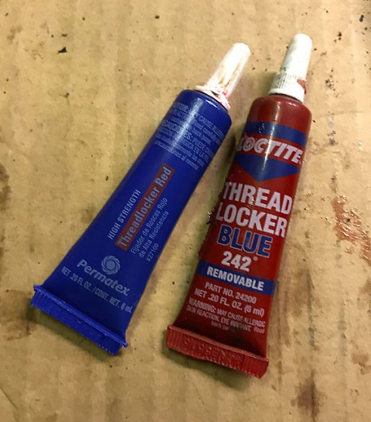
Red and Blue Labels for Paint
You'd think that common sense would dictate red paint gets packaged in a red container and blue paint gets packaged in a blue container, but the above paint tubes appear to show the exact opposite. The designer using the paint admitted they reached for the wrong one first and we're sure we can see why! Don't confuse your customers and keep your package design straight forward.
How to Avoid Design Fails
Here are some tips on how to avoid design fails on corporate giveaways:
- Understand Your Target Audience: Consider the demographics, preferences, and cultural nuances of your target audience. Tailor your design to resonate with them on a personal level. Conduct market research to gain insights into their tastes, trends, and expectations. This knowledge will inform your design decisions and prevent misinterpretation.
- Clear and Cohesive Branding: Maintain consistency in your branding elements, such as color schemes, typography, and logo placement. This consistency ensures recognition and reinforces your brand identity. Avoid cluttered designs that overwhelm the promotional item. Opt for a simple and streamlined approach that allows your brand message to shine through.
- Thoughtful Graphic Placement: Strategically consider the placement of graphics and text on the promotional item. Ensure that they are easily visible and do not overlap or obstruct important elements of the design. Make use of whitespace to create a clean and visually appealing composition. This will prevent any confusion or misinterpretation that may arise from overcrowded designs.
- Double-Check Product-Specific Details: If your promotional item is connected to a specific product or service, pay close attention to the design details. Ensure that any images or text accurately represent the product and its intended use. Avoid misrepresenting products or misinforming customers by thoroughly reviewing the design and its alignment with the product or service.
Summary
In conclusion, this article highlights the importance of avoiding design fails in corporate merchandising and giveaways. By understanding your target audience, maintaining clear branding, thoughtful graphic placement, and double-checking product-specific details, you can ensure your designs resonate and avoid any embarrassing mishaps. So, remember these tips and create designs that leave a lasting, positive impression!
Design fails first spotted here: http://www.boredpanda.com/funny-design-fails/


