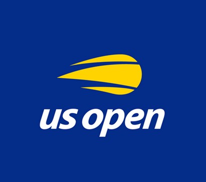
The US Open is one of the most prestigious grand slam events on the tennis calendar. Only the best players in the world compete at the US Open, and the prize money is truly dazzling, so it's little wonder that after 20 years the event organisers decided that their logo needed some updating for the modern multimedia world.
New Logo for Promotional Products and Marketing
While many sporting events have updated their logos several times in the past decade, it's taken quite some time for the US Open to upgrade from their classic blazing tennis ball and serif font logo from the late 90's. In this modern rebrand, the logo designers were looking to bring the event into the tech age with a slick, stylish logo that would work as a design for promotional products, print media, and online media (including apps).


The result is an outstanding logo design that simplifies the original and then enhances it with italic, lowercase sans serif lettering replacing the boxy old serif font and the slightly tacky blazing tennis ball simplified into a stylish three-piece yellow design. The logo presents an updated image for the US Open at a time when the event is seeking to get more young people interested in the game.


The range of swag and the banners in the logo laucnh seem to confirm that this new look will revitalise the brand. The yellow and white are striking against the blue background and the tennis ball element of the logo is a considerable upgrade on the old "flaming ball" motif.


We can't wait to see more interesting promotional products and backdrops in the lead up to the next US Open round in August/September of 2018.
First spotted here: https://www.underconsideration.com/brandnew/archives/new_logo_for_us_open_by_chermayeff_geismar_haviv.php


