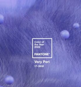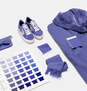
One of the more exciting events on the design calendar each year is the Pantone Colour of the Year announcement. For 2022, they've opted for a bold and courageous blue dubbed Very Peri (PMS 17-3938) which offers a deep undertone of violet red perfect for use on corporate branded gifts!
- Set design trends with Pantone Colors.
- Incorporate colors for consistent branding.
- Enhance visibility and brand memorability.

Why Pantone Colours of the Year Matter
Why should any of us care about these colour announcements? Because they help set the trend for design for the year ahead and undoubtedly we'll see some big companies adopting Very Peri as part of their go-to palette for graphic design in the coming months. In 2021 we saw two colours selected as Colour of the Year, both of which were a bit muted and sombre (reflecting the intensity of the pandemic). However, Very Peri is more vibrant in nature which we think sums up the combination of blues and violet-red shades well.

Using Pantone Colours on Promotional Products
If you're eager to utilise Very Peri as part of your next campaign, then don't worry, here at Cubic Promote we use the Pantone Matching System (PMS) and can ensure a close match for any prints featuring this colour. One of the great things about matching systems is they ensure that no matter what products your logo is printed on, we can match it -- which means your promotional gifts will feature consistent colour that fits with your branding guidelines.
Before they choose their Colour of the Year, Pantone does some real deep-dive research on trends in different fields like art, technology and social issues. The result is a colour, like Very Peri, that will really strike a chord with customers worldwide. So why do these colours matter so much when it comes to selling your stuff? The answer’s simple.
Colours like the ones selected by Pantone tap into what’s hot at any given time, making them super tempting to shoppers who want what’s trending or just something that feels cool right now. If you use those shades consistently across everything from packaging to promotional materials, people start associating those colours with your brand. And voila! That means way more sales because they know exactly who you are and how awesome your stuff is every time they spot that hue!
Pantone Branding Colour Benefits
Pantone Colors of the Year offer unique advantages when integrated into your branding strategy. Let's explore some of these benefits:
- Trendsetting: Pantone Colors of the Year set the tone for design trends, enabling you to stay ahead of the competition by adopting the latest color palettes. Incorporating these colors into your promotional products like custom tees or caps can help your brand appear fresh and current.
- Consistency in Branding: By using Pantone Matching System (PMS), you ensure consistency in color across various promotional products, ensuring your brand maintains a cohesive visual identity.
- Enhanced Perception: Utilizing Pantone Colors of the Year showcases your brand's awareness of current trends and commitment to quality design. It helps position your brand as contemporary and forward-thinking.
- Increased Memorability: Using the Pantone Color of the Year consistently across packaging, promotional materials, and online platforms creates a strong visual association with your brand. This aids in brand memorability, making it easier for consumers to recall your brand when making purchase decisions.
Conclusion
In summary, understanding the significance of Pantone Colors of the Year and incorporating them into your promotional products can enhance your brand's visibility, appeal, and overall marketing efforts. By considering the psychology of colors and the benefits of Pantone Colors, you can create promotional products that resonate with your target audience and reinforce your brand message. Stay on-trend, build consistency, and make a lasting impression with Pantone Colors this year and beyond
Speak with our friendly customer service team for more information on how colours are matched for branding and how you can start using Very Peri and other Pantone colours in your branding today!
Images and information from here: https://www.pantone.com/color-of-the-year-2022


